13.2: Midlatitude Cyclone Evolution - a Case Study
- Page ID
- 9611

\( \newcommand{\vecs}[1]{\overset { \scriptstyle \rightharpoonup} {\mathbf{#1}} } \)
\( \newcommand{\vecd}[1]{\overset{-\!-\!\rightharpoonup}{\vphantom{a}\smash {#1}}} \)
\( \newcommand{\id}{\mathrm{id}}\) \( \newcommand{\Span}{\mathrm{span}}\)
( \newcommand{\kernel}{\mathrm{null}\,}\) \( \newcommand{\range}{\mathrm{range}\,}\)
\( \newcommand{\RealPart}{\mathrm{Re}}\) \( \newcommand{\ImaginaryPart}{\mathrm{Im}}\)
\( \newcommand{\Argument}{\mathrm{Arg}}\) \( \newcommand{\norm}[1]{\| #1 \|}\)
\( \newcommand{\inner}[2]{\langle #1, #2 \rangle}\)
\( \newcommand{\Span}{\mathrm{span}}\)
\( \newcommand{\id}{\mathrm{id}}\)
\( \newcommand{\Span}{\mathrm{span}}\)
\( \newcommand{\kernel}{\mathrm{null}\,}\)
\( \newcommand{\range}{\mathrm{range}\,}\)
\( \newcommand{\RealPart}{\mathrm{Re}}\)
\( \newcommand{\ImaginaryPart}{\mathrm{Im}}\)
\( \newcommand{\Argument}{\mathrm{Arg}}\)
\( \newcommand{\norm}[1]{\| #1 \|}\)
\( \newcommand{\inner}[2]{\langle #1, #2 \rangle}\)
\( \newcommand{\Span}{\mathrm{span}}\) \( \newcommand{\AA}{\unicode[.8,0]{x212B}}\)
\( \newcommand{\vectorA}[1]{\vec{#1}} % arrow\)
\( \newcommand{\vectorAt}[1]{\vec{\text{#1}}} % arrow\)
\( \newcommand{\vectorB}[1]{\overset { \scriptstyle \rightharpoonup} {\mathbf{#1}} } \)
\( \newcommand{\vectorC}[1]{\textbf{#1}} \)
\( \newcommand{\vectorD}[1]{\overrightarrow{#1}} \)
\( \newcommand{\vectorDt}[1]{\overrightarrow{\text{#1}}} \)
\( \newcommand{\vectE}[1]{\overset{-\!-\!\rightharpoonup}{\vphantom{a}\smash{\mathbf {#1}}}} \)
\( \newcommand{\vecs}[1]{\overset { \scriptstyle \rightharpoonup} {\mathbf{#1}} } \)
\( \newcommand{\vecd}[1]{\overset{-\!-\!\rightharpoonup}{\vphantom{a}\smash {#1}}} \)
\(\newcommand{\avec}{\mathbf a}\) \(\newcommand{\bvec}{\mathbf b}\) \(\newcommand{\cvec}{\mathbf c}\) \(\newcommand{\dvec}{\mathbf d}\) \(\newcommand{\dtil}{\widetilde{\mathbf d}}\) \(\newcommand{\evec}{\mathbf e}\) \(\newcommand{\fvec}{\mathbf f}\) \(\newcommand{\nvec}{\mathbf n}\) \(\newcommand{\pvec}{\mathbf p}\) \(\newcommand{\qvec}{\mathbf q}\) \(\newcommand{\svec}{\mathbf s}\) \(\newcommand{\tvec}{\mathbf t}\) \(\newcommand{\uvec}{\mathbf u}\) \(\newcommand{\vvec}{\mathbf v}\) \(\newcommand{\wvec}{\mathbf w}\) \(\newcommand{\xvec}{\mathbf x}\) \(\newcommand{\yvec}{\mathbf y}\) \(\newcommand{\zvec}{\mathbf z}\) \(\newcommand{\rvec}{\mathbf r}\) \(\newcommand{\mvec}{\mathbf m}\) \(\newcommand{\zerovec}{\mathbf 0}\) \(\newcommand{\onevec}{\mathbf 1}\) \(\newcommand{\real}{\mathbb R}\) \(\newcommand{\twovec}[2]{\left[\begin{array}{r}#1 \\ #2 \end{array}\right]}\) \(\newcommand{\ctwovec}[2]{\left[\begin{array}{c}#1 \\ #2 \end{array}\right]}\) \(\newcommand{\threevec}[3]{\left[\begin{array}{r}#1 \\ #2 \\ #3 \end{array}\right]}\) \(\newcommand{\cthreevec}[3]{\left[\begin{array}{c}#1 \\ #2 \\ #3 \end{array}\right]}\) \(\newcommand{\fourvec}[4]{\left[\begin{array}{r}#1 \\ #2 \\ #3 \\ #4 \end{array}\right]}\) \(\newcommand{\cfourvec}[4]{\left[\begin{array}{c}#1 \\ #2 \\ #3 \\ #4 \end{array}\right]}\) \(\newcommand{\fivevec}[5]{\left[\begin{array}{r}#1 \\ #2 \\ #3 \\ #4 \\ #5 \\ \end{array}\right]}\) \(\newcommand{\cfivevec}[5]{\left[\begin{array}{c}#1 \\ #2 \\ #3 \\ #4 \\ #5 \\ \end{array}\right]}\) \(\newcommand{\mattwo}[4]{\left[\begin{array}{rr}#1 \amp #2 \\ #3 \amp #4 \\ \end{array}\right]}\) \(\newcommand{\laspan}[1]{\text{Span}\{#1\}}\) \(\newcommand{\bcal}{\cal B}\) \(\newcommand{\ccal}{\cal C}\) \(\newcommand{\scal}{\cal S}\) \(\newcommand{\wcal}{\cal W}\) \(\newcommand{\ecal}{\cal E}\) \(\newcommand{\coords}[2]{\left\{#1\right\}_{#2}}\) \(\newcommand{\gray}[1]{\color{gray}{#1}}\) \(\newcommand{\lgray}[1]{\color{lightgray}{#1}}\) \(\newcommand{\rank}{\operatorname{rank}}\) \(\newcommand{\row}{\text{Row}}\) \(\newcommand{\col}{\text{Col}}\) \(\renewcommand{\row}{\text{Row}}\) \(\newcommand{\nul}{\text{Nul}}\) \(\newcommand{\var}{\text{Var}}\) \(\newcommand{\corr}{\text{corr}}\) \(\newcommand{\len}[1]{\left|#1\right|}\) \(\newcommand{\bbar}{\overline{\bvec}}\) \(\newcommand{\bhat}{\widehat{\bvec}}\) \(\newcommand{\bperp}{\bvec^\perp}\) \(\newcommand{\xhat}{\widehat{\xvec}}\) \(\newcommand{\vhat}{\widehat{\vvec}}\) \(\newcommand{\uhat}{\widehat{\uvec}}\) \(\newcommand{\what}{\widehat{\wvec}}\) \(\newcommand{\Sighat}{\widehat{\Sigma}}\) \(\newcommand{\lt}{<}\) \(\newcommand{\gt}{>}\) \(\newcommand{\amp}{&}\) \(\definecolor{fillinmathshade}{gray}{0.9}\)13.2.1. Summary of 3 to 4 April 2014 Cyclone
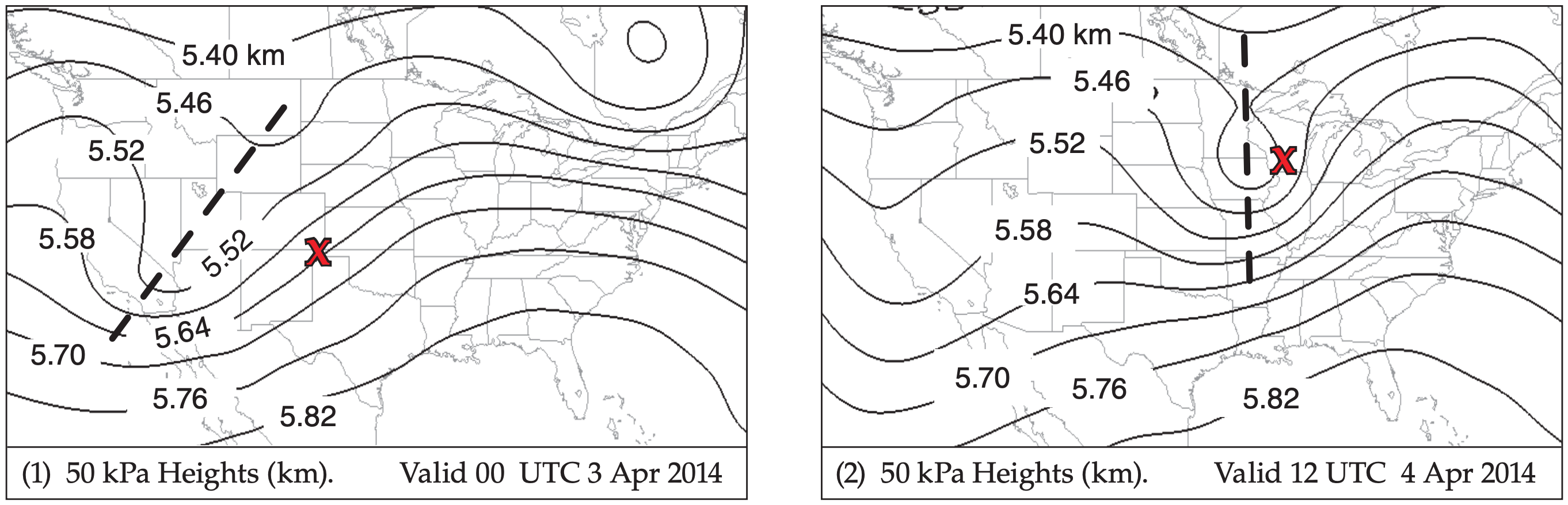
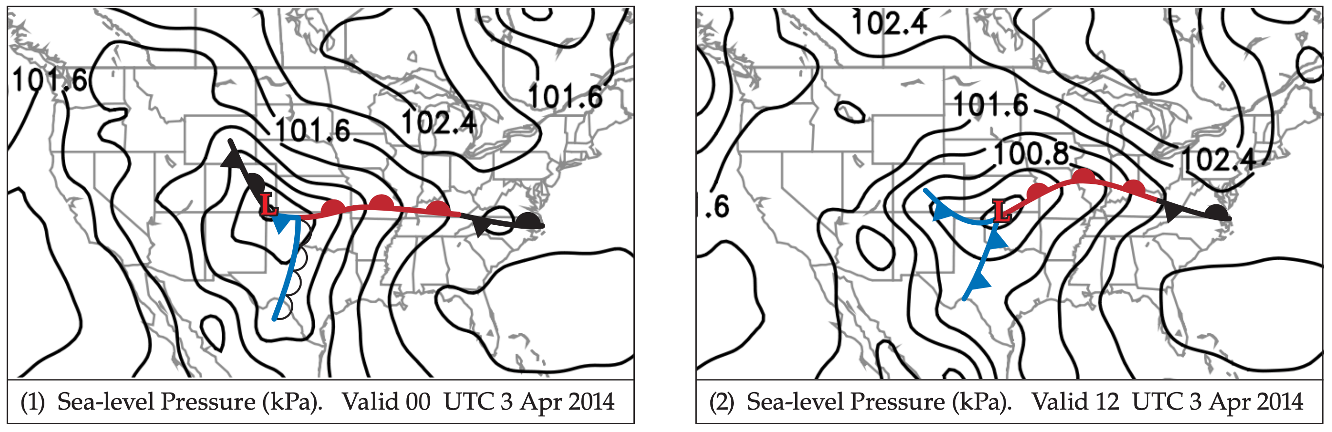
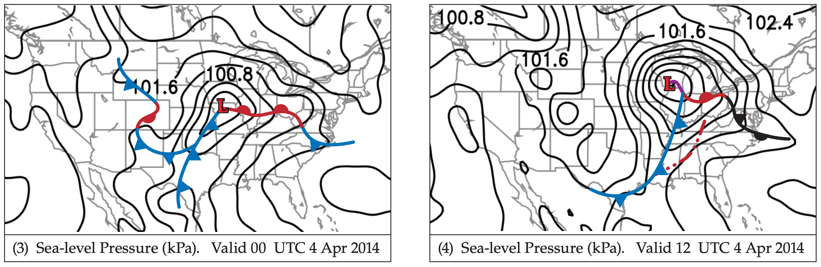
An upper-level trough (Fig. 13.10a) near the USA Rocky Mountains at 00 UTC on 3 April 2014 propagates eastward, reaching the Midwest and Mississippi Valley a day and a half later, at 12 UTC on 4 April 2014. A surface low-pressure center forms east of the trough axis (Fig. 13.10b), and strengthens as the low moves first eastward, then north-eastward.
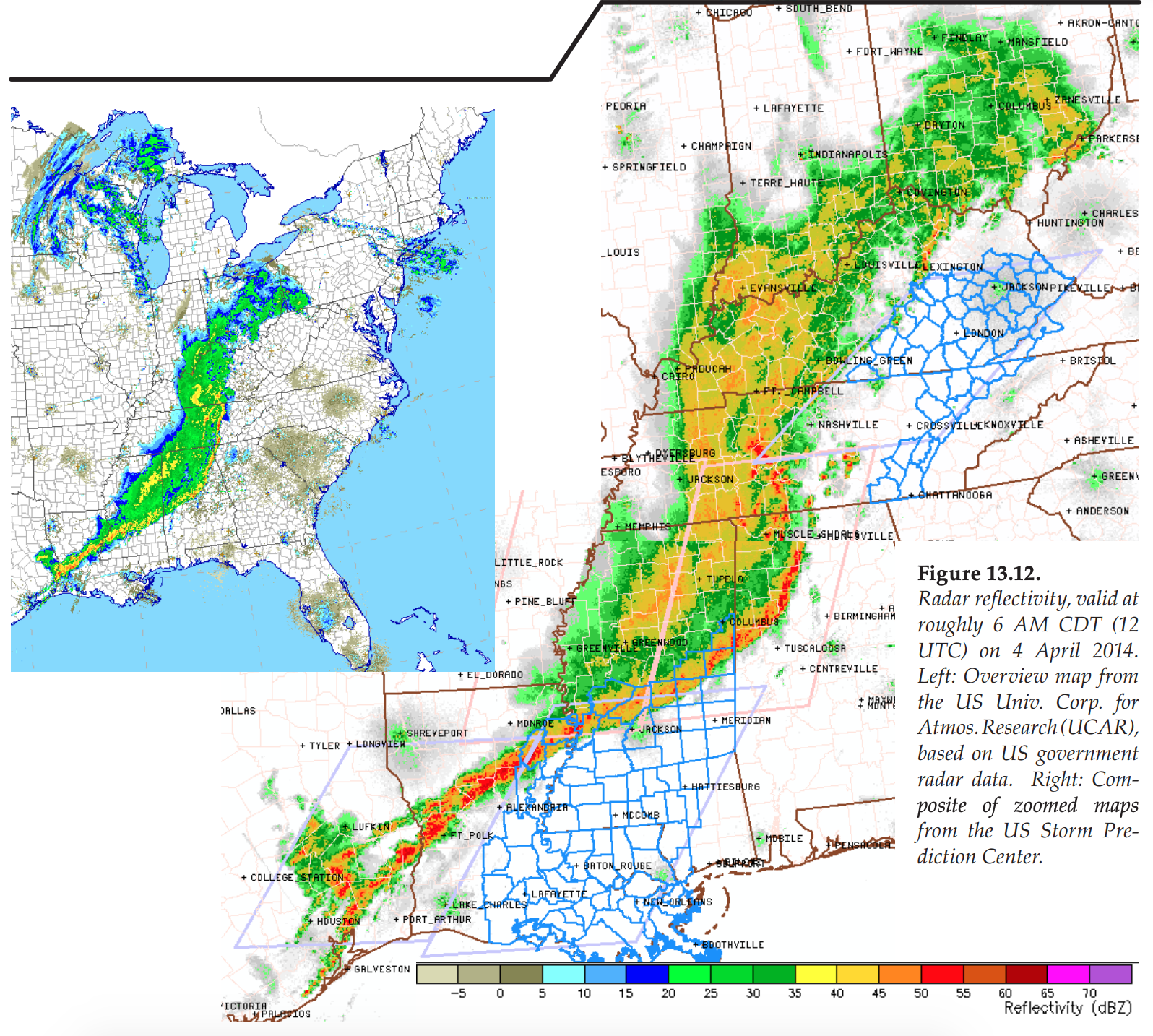
Extending south of this low is a dry line that evolves into a cold front (Figs. 13.10b & 13.11), which sweeps into the Mississippi Valley. Ahead of the front is a squall line of severe thunderstorms (Figs. 13.11 & 13.12). Local time there is Central Daylight Time (CDT), which is 6 hours earlier than UTC.
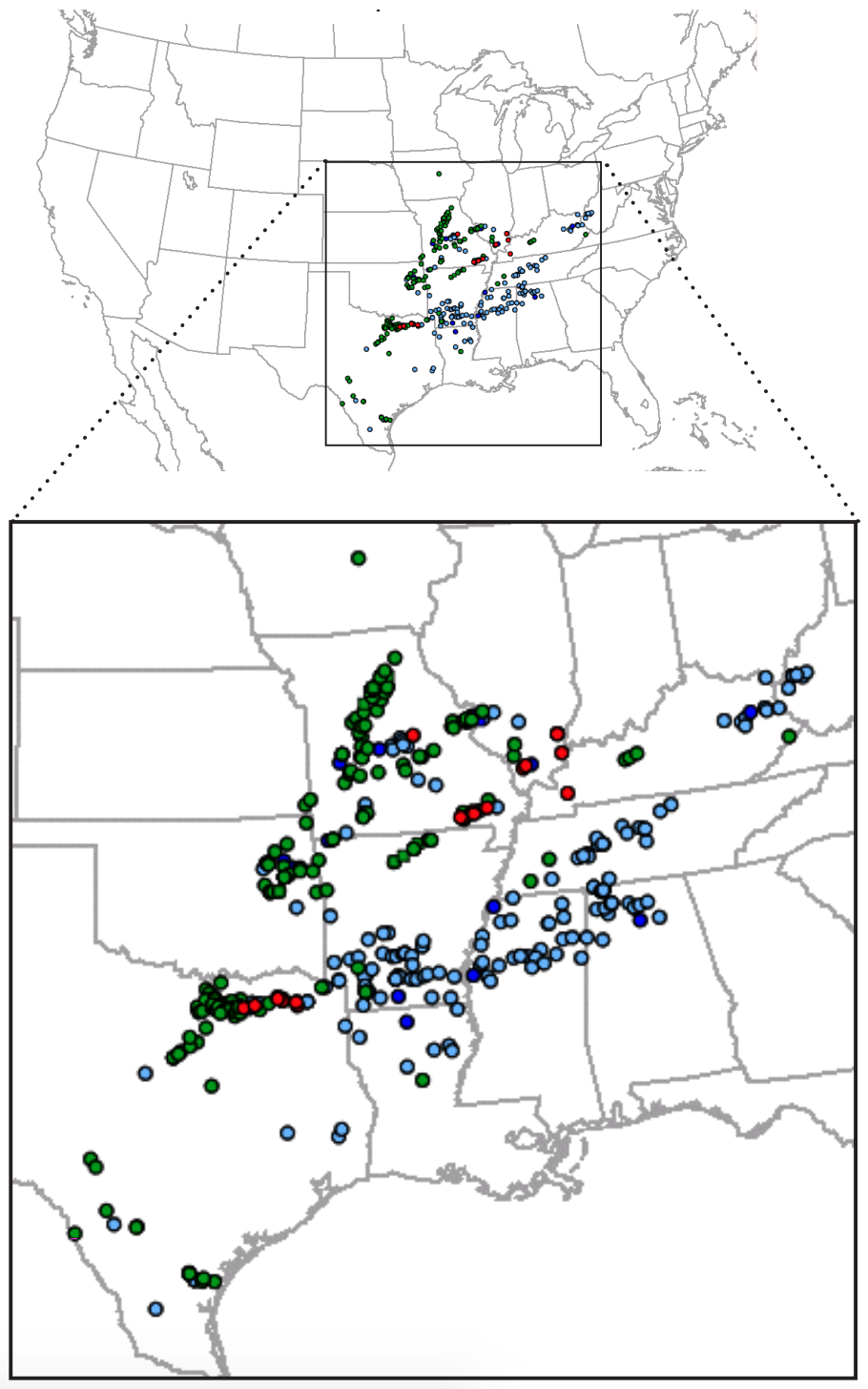
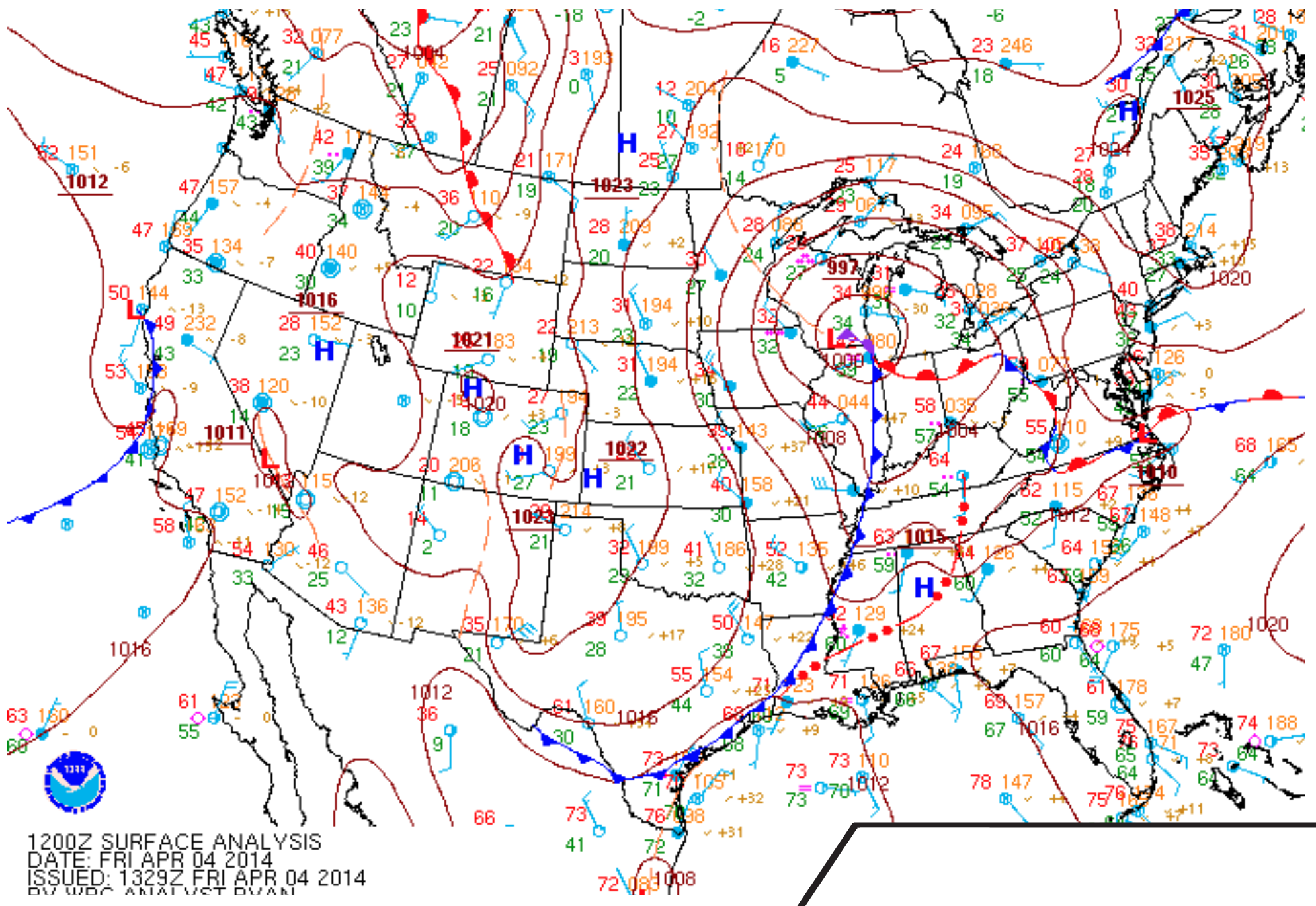
During the 24 hours starting at 6 AM CDT (12 UTC) on 3 April 2014 there were a total of 392 storm reports recorded by the US Storm Prediction Center (Fig. 13.9). This included 17 tornado reports, 186 hail reports (of which 23 reported large hailstones greater than 5 cm diameter), 189 wind reports (of which 2 had speeds greater than 33 m/s). Next, we focus on the 12 UTC 4 April 2014 weather (Figs. 13.13 - 13.19).
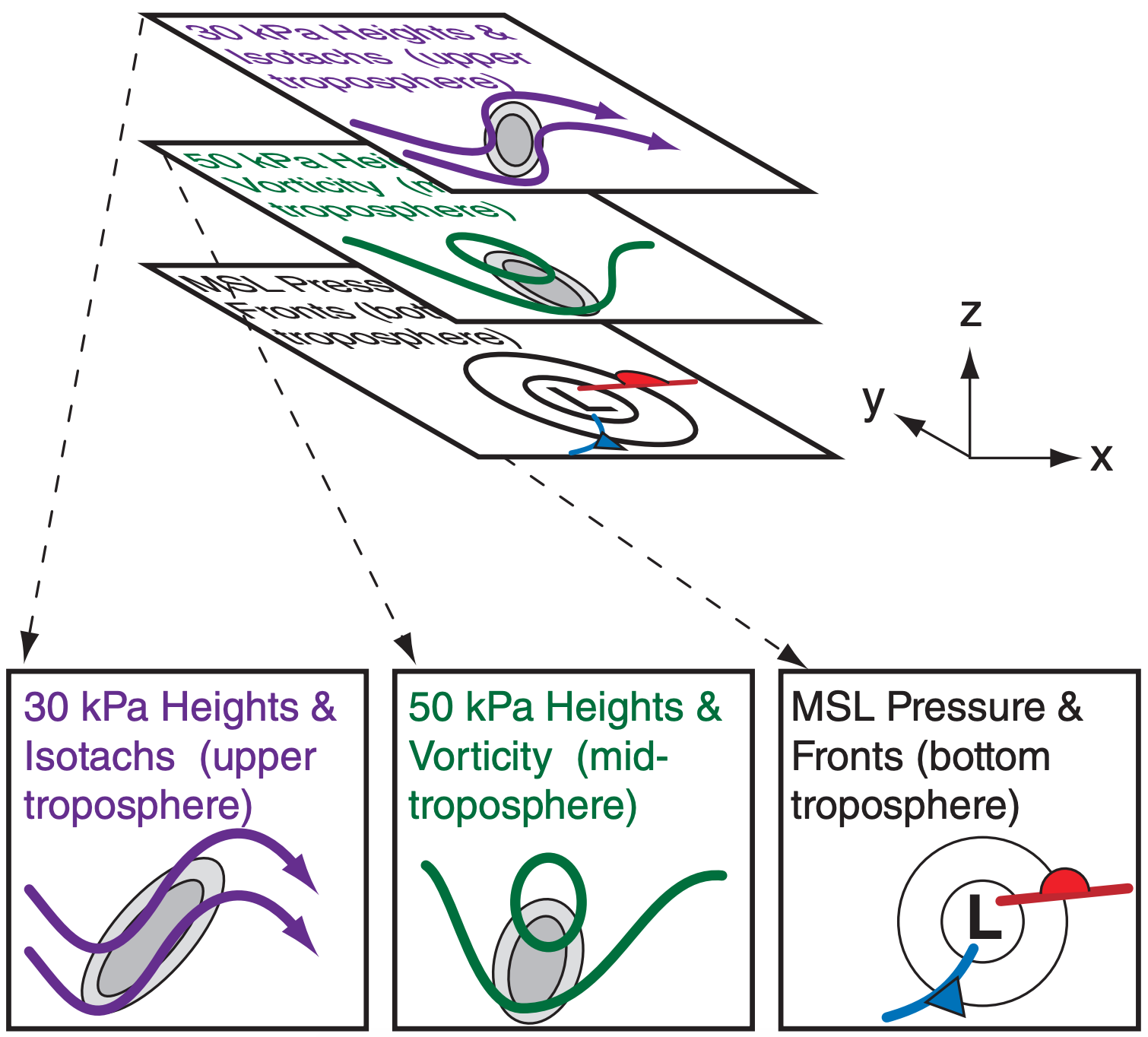
Lows and other synoptic features have five-dimensions (3-D spatial structure + 1-D time evolution + 1-D multiple variables). To accurately analyze and forecast the weather, you should try to form in your mind a multi-dimensional picture of the weather. Although some computer-graphics packages can display 5-dimensional data, most of the time you are stuck with flat 2-D weather maps or graphs.
By viewing multiple 2-D slices of the atmosphere as drawn on weather maps (Fig. c), you can picture the 5-D structure. Examples of such 2-D maps include:
- uniform height maps
- isobaric (uniform pressure) maps
- isentropic (uniform potential temperature) maps
- thickness maps
- vertical cross-section maps
- time-height maps
- time-variable maps (meteograms
Computer animations of maps can show time evolutions. In Chapter 1 is a table of other iso-surfaces.
Height
Mean-sea-level (MSL) maps represent a uniform height of z = 0 relative to the ocean surface. For most land areas that are above sea level, these maps are created by extrapolating atmospheric conditions below ground. (A few land-surface locations are below sea level, such as Death Valley and the Salton Sea USA, or the Dead Sea in Israel and Jordan).
Meteorologists commonly plot air pressure (reduced to sea level) and fronts on this uniform-height surface. These are called “MSL pressure” maps.
Pressure
Recall that pressure decreases monotonically with increasing altitude. Thus, lower pressures correspond to higher heights.
For any one pressure, such as 70 kPa (which is about 3 km above sea level on average), that pressure is closer to the ground (i.e., less than 3 km) in some locations and is further from the ground in other locations, as was discussed in the Forces and Winds chapter. If you conceptually draw a surface that passes through all the points that have pressure 70 kPa, then that isobaric surface looks like rolling terrain with peaks, valleys (troughs), and ridges.
Like a topographic map, you could draw contour lines connecting points of the same height. This is called a “70 kPa height” chart. Low heights on an isobaric surface correspond to low pressure on a uniform-height surface.
Back to the analogy of hilly terrain, suppose you went hiking with a thermometer and measured the air temperature at eye level at many locations within a hilly region. You could write those temperatures on a map and then draw isotherms connecting points of the same temperature. But you would realize that these temperatures on your map correspond to the hilly terrain that had ridges and valleys.
You can do the same with isobaric charts; namely, you can plot the temperatures that are found at different locations on the undulating isobaric surface. If you did this for the 70 kPa isobaric surface, you would have a “70 kPa isotherm” chart. You can plot any variable on any isobaric surface, such as “90 kPa isohumes”, “50 kPa vorticity”, “30 kPa isotachs”, etc.
You can even plot multiple weather variables on any single isobaric map, such as “30 kPa heights and isotachs” or “50 kPa heights and vorticity” (Fig. c). The first chart tells you information about jet-stream speed and direction, and the second chart can be used to estimate cyclogenesis processes.
Thickness
Now picture two different isobaric surfaces over the same region, such as sketched a the top of Fig. c. An example is 100 kPa heights and 50 kPa heights. At each location on the map, you could measure the height difference between these two pressure surfaces, which tells you the thickness of air in that layer. After drawing isopleths connecting points of equal thickness, the resulting contour map is known as a “100 to 50 kPa thickness” map.
You learned in the General Circulation chapter that the thermal-wind vectors are parallel to thickness contours, and that these vectors indicate shear in the geostrophic wind. That chapter also showed that the 100-50 kPa thickness is proportional to average temperature in the bottom half of the troposphere.
Potential Temperature
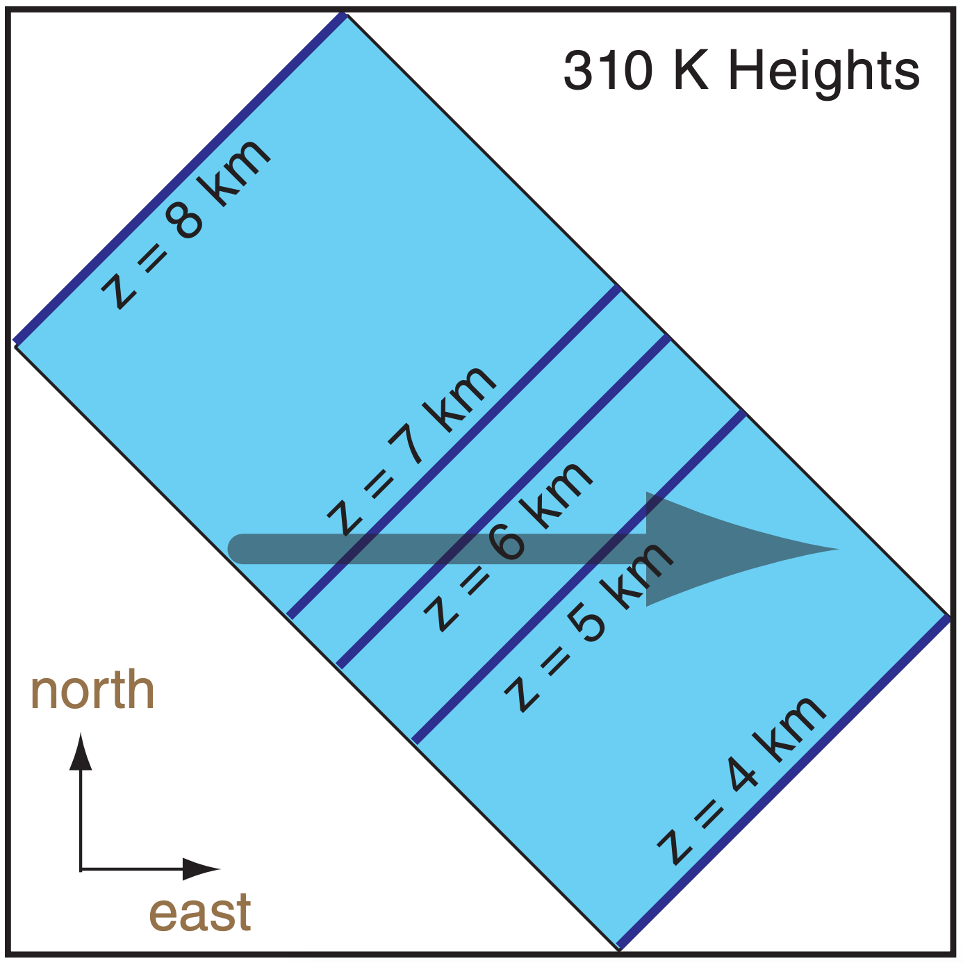
On average, potential temperature θ increases toward the equator and with increasing height. Day-today variability is superimposed on that average. Over any region for any valid time you can create a surface called an isentropic surface that follows any desired potential temperature, such as the θ = 310 K isentropic surface shaded in blue in Fig. d. below.
As was done for isobaric surfaces, you can also plot contours of the height of that surface above mean sea level (e.g., “310 K heights”). Or you can plot other weather variables on that surface, such as “310 K isohumes”.
If you were to look straight down from above the top diagram in Fig. d, you would see a view such as shown in the bottom of Fig. d. This bottom diagram is the isentropic chart that would be presented as a weather map.
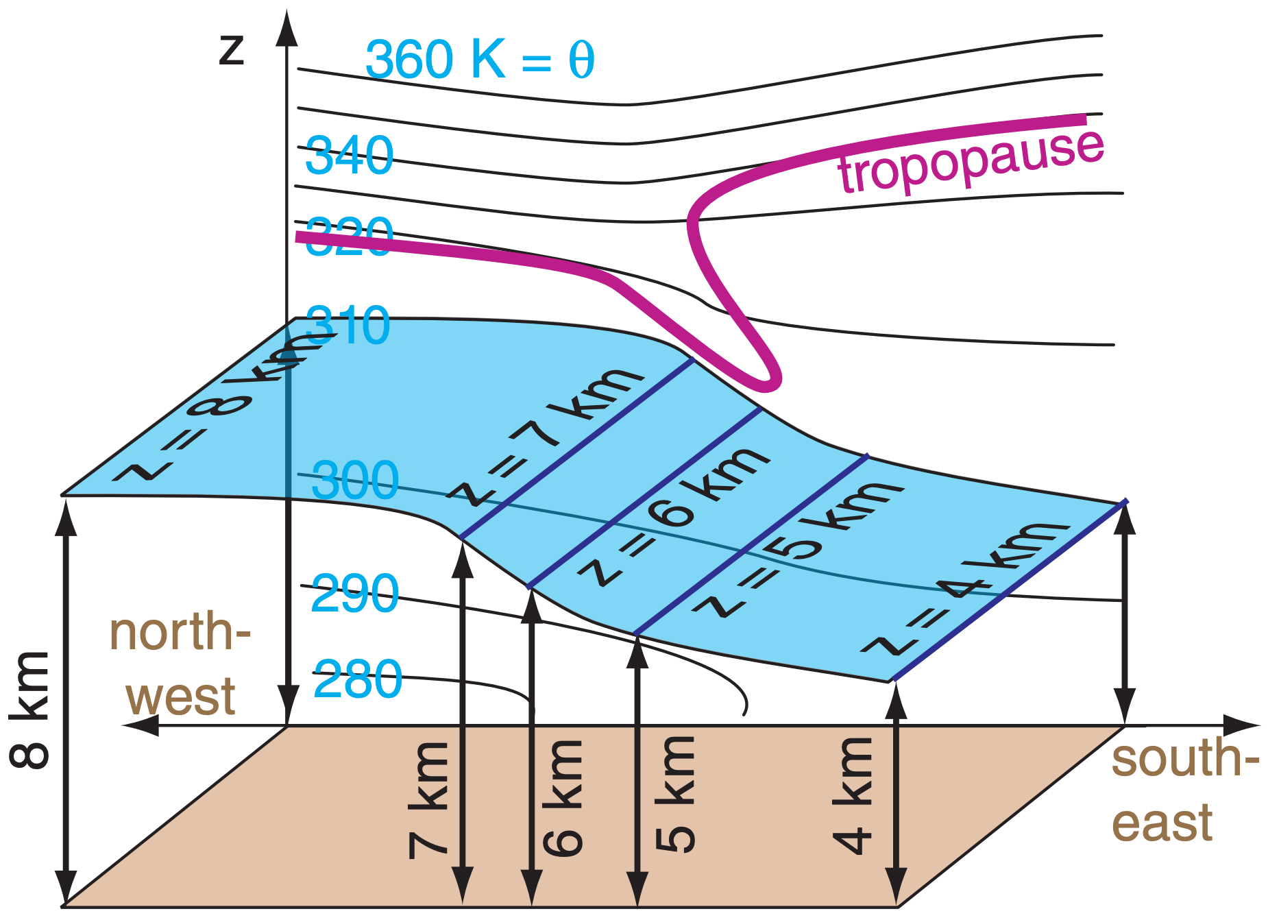
For adiabatic processes, unsaturated air parcels that are blown by the wind tend to follow the isentropic surface that corresponds to the parcel’s potential temperature. The reason is that if the parcel were to stray off of that surface, then buoyant forces would move it back to that surface.
For example, if an air parcel has θ = 310 K and is located near the tail of the arrow in the bottom of Fig. d, then as the parcel moves with the wind it will the 310 K isentropic surface. In this illustration, the parcel descends (and its temperature would warm adiabatically while its θ is constant). Because of adiabatic warming and cooling, winds descending along an isentrope will warm and be cloud free, while winds rising along isentropes will cool and become cloudy.
Turbulence, condensation and radiation are not adiabatic (i.e., are diabatic), and cause the parcel’s θ to change. This would cause the parcel to shift to a different isentropic surface (one that matches the parcel’s new θ).
Potential Vorticity (PVU)
Recall the definition of isentropic potential vorticity from the General Circulation chapter. That chapter also defined potential vorticity units (PVU) for this variable. PVUs are very large in the stratosphere, and small in the troposphere, with the tropopause often at about 1.5 PVU.
Thus, contour plots of the height of the 1.5 PVU surface approximate the altitude of the tropopause at different locations. The tropopause could be relatively low (at z ≈ 6 km MSL, at P ≈ 35 kPa) near the poles, and relatively high near the equator (z ≈ 15 - 18 km MSL, and P ≈ 10 kPa). This contour plot can indicate features such as tropopause folds where stratospheric air can be injected into the troposphere.
Surface
The “surface weather map” shows weather at the elevation of the Earth’s surface. Namely, it follows the terrain up and down, and is not necessarily at mean sea level.
Rules
It is impossible to have two different pressures, or two different potential temperatures, at the same point in space at any instant. For this reason, isobaric surfaces cannot cross other isobaric surfaces (e.g., the 70 kPa and 60 kPa isobaric surfaces cannot intersect). Similar rules apply for isentropic surfaces. But isobaric surfaces can cross isentropes, and they both can intersect the ground surface.


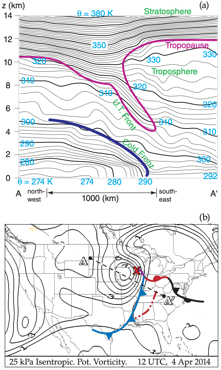
(b) Isopleths are of isentropic potential vorticity in potential vorticity units (PVU). These are plotted on the 25 kPa isobaric surface. Values greater than 1.5 PVU usually are associated with stratospheric air. The diagonal straight dotted line shows the cross section location plotted in (a). The “bulls eye” just west of the surface low “X” indicates a tropopause fold, where stratospheric air descends closer to the ground. Surface fronts are also drawn on this map.
Special thanks to Drs. Greg West and David Siuta for creating many of the case-study maps in Figs. 13.10 - 13.19 and elsewhere in this chapter.
13.2.2. Weather-map Discussion for this Case
As recommended for most weather discussions, we will start with the big picture, and will progress toward the details. Also, we will work downward from the top of the troposphere.
13.2.2.1. • Hemispheric Map — Top of Troposphere
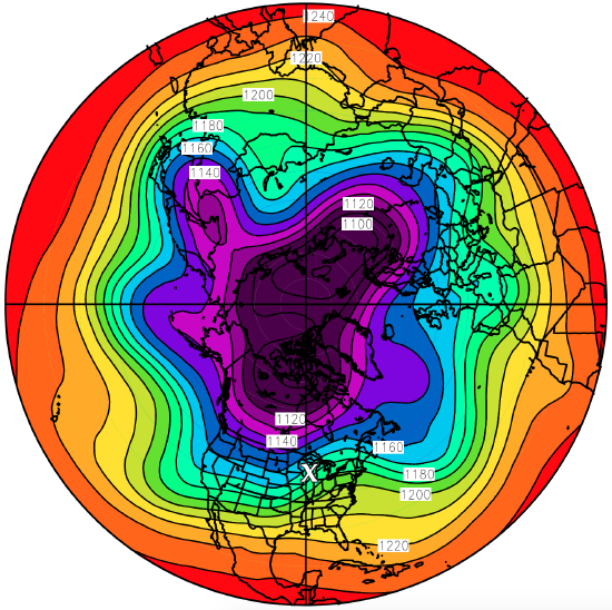
Starting with the planetary scale, Fig. 13.18 shows Hemispheric 20 kPa Geopotential Height Contours. It shows five long Rossby-wave troughs around the globe. The broad trough over N. America also has two short-wave troughs superimposed — one along the west coast and the other in the middle of N. America. The jet stream flows from west to east along the height contours plotted in this diagram, with faster winds where the contours are packed closer together.
Next, zoom to the synoptic scale over N. America. This is discussed in the next several subsections using Figs. 13.13 - 13.15.
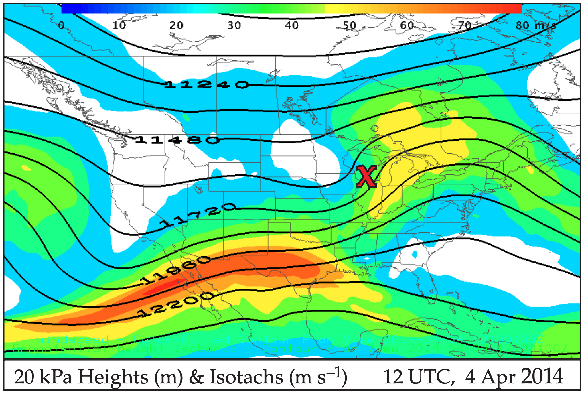
13.2.2.2. • 20 kPa Charts — Top of Troposphere (z ≈ 11.5 km MSL)
Focus on the top row of charts in Figs. 13.13 - 13.15. The thick dashed lines on the 20 kPa Height contour map show the two short-wave trough axes. The trough over the central USA is the one associated with the case-study cyclone. This trough is west of the location of the surface low-pressure center (“X”). The 20 kPa Wind Vector map shows generally westerly winds aloft, switching to southwesterly over most of the eastern third of the USA. Wind speeds in the 20 kPa Isotach chart show two jet streaks (shaded in yellow) — one with max winds greater than 70 m s–1 in Texas and northern Mexico, and a weaker jet streak over the Great Lakes.
The 20 kPa Temperature chart shows a “bullseye” of relatively warm air (–50°C) aloft just west of the “X”. This is associated with an intrusion of stratospheric air down into the troposphere (Fig. 13.19). The 20 kPa Divergence map shows strong horizontal divergence (plotted with the blue contour lines) along and just east of the surface cold front and low center.
13.2.2.3. • 50 kPa Charts — Middle of Troposphere (z ≈5.5 km MSL)
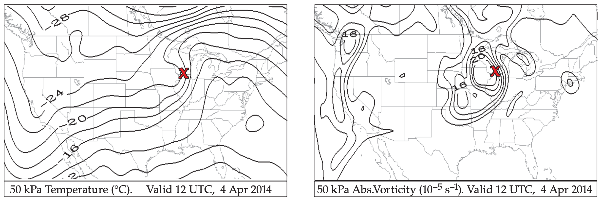
Focus on the second row of charts in Figs. 13.13 - 13.14. The 50 kPa Height chart shows a trough axis closer to the surface-low center (“X”). This low-pressure region has almost become a “closed low”, where the height contours form closed ovals. 50 kPa Wind Vectors show the predominantly westerly winds turning in such a way as to bring colder air equatorward on the west side of the low, and bringing warmer air poleward on the east side of the low (shown in the 50 kPa Temperature chart). The 50 kPa Absolute Vorticity chart shows a bulls-eye of positive vorticity just west of the surface low.
13.2.2.4. • 70 kPa Charts — (z ≈ 3 km MSL)
The second row of charts in Fig. 13.15 shows a closed low on the 70 kPa Height chart, just west of the surface low. At this altitude the warm air advection poleward and cold-air advection equatorward are even more obvious east and west of the low, respectively, as shown on the 70 kPa Temperature chart.
13.2.2.5. • 85 kPa Charts — (z ≈ 1.4 km MSL)
Focus on the third row of charts in Figs. 13.13 - 13.14. The 85 kPa Height chart shows a deep closed low immediately to the west of the surface low. Associated with this system is a complete counterclockwise circulation of winds around the low, as shown in the 85 kPa Wind Vector chart.
The strong temperature advection east and west of the low center are creating denser packing of isotherms along the frontal zones, as shown in the 85 kPa Temperature chart. The cyclonically rotating flow causes a large magnitude of vorticity in the 85 kPa Absolute Vorticity chart.
13.2.2.6. • 100 kPa & other Near-Surface Charts
Focus on the last row of charts in Figs. 13.13-13.14. The approximate surface-frontal locations have also been drawn on most of these charts. The 100 kPa Height chart shows the surface low that is deep relative to the higher pressures surrounding it. The 10 m Wind Vectors chart shows sharp wind shifts across the frontal zones.
Isentropes of 2 m Equivalent Potential Temperature clearly demarcate the cold and warm frontal zones with tightly packed (closely spaced) isentropes. Recall that fronts on weather maps are drawn on the warm sides of the frontal zones. Southeast of the low center is a humid “warm sector” with strong moisture gradients across the warm and cold fronts as is apparent by the tight isohume packing in the 2 m Water Vapor Mixing Ratio chart.
Next, focus on row 3 of Fig. 13.15. The high humidities also cause large values of Precipitable water (moisture summed over the whole depth of the atmosphere), particularly along the frontal zones. So it is no surprise to see the rain showers in the MSL Pressure, 85 kPa Temperature and 1-h Precipitation chart.
13.2.2.7. • 100 to 50 kPa Thickness
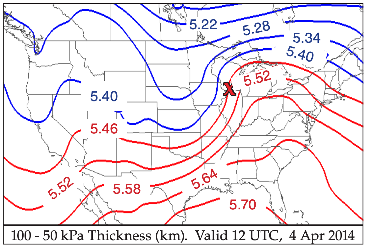
Fig. 13.16 shows the vertical distance between the 100 and 50 kPa isobaric surfaces. Namely, it shows the thickness of the 100 to 50 kPa layer of air. This thickness is proportional to the average temperature in the bottom half of the troposphere, as described by the hypsometric eq. The warm-air sector (red isopleths) southeast of the surface low, and the cold air north and west (blue isopleths) are apparent. Recall that the thermal wind vector (i.e., the vertical shear of the geostrophic wind) is parallel to the thickness lines, with a direction such that cold air (thin thicknesses) is on the left side of the vector.
13.2.2.8. • Tropopause & Vertical Cross Section
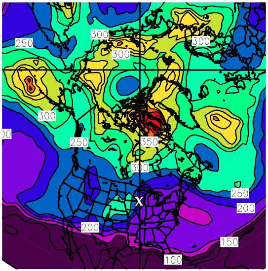
Fig. 13.17 shows the pressure altitude of the tropopause. A higher tropopause would have lower pressure. Above the surface low (”X”) the tropopause is at about the 20 kPa (= 200 hPa) level. Further to the south over Florida, the tropopause is at even higher altitude (where P ≈ 10 kPa = 100 hPa). North and west of the “X” the tropopause is at lower altitude, where P = 30 kPa (=300 hPa) or greater. Globally, the tropopause is higher over the subtropics and lower over the sub-polar regions.
Fig. 13.19 shows a vertical slice through the atmosphere. Lines of uniform potential temperature (isentropes), rather than absolute temperature, are plotted so as to exclude the adiabatic temperature change associated with the pressure decrease with height. Tight packing of isentropes indicates strong static stability, such as in the stratosphere, upper-tropospheric (U.T.) fronts (also called tropopause folds), and surface fronts.
In the next sections, we see how dynamics can be used to explain cyclone formation and evolution.
Most of the weather maps presented in the previous case study contained plots of only one field, such as the wind field or height field. Because many fields are related to each other or work together, meteorologists often plot multiple fields on the same chart.
To help you discriminate between the different fields, they are usually plotted differently. One might use solid lines and the other dashed. Or one might be contoured and the other shaded (see Fig. e, Fig. 13.7a, or Fig. 13.15-right map). Look for a legend or caption that describes which lines go with which fields, and gives units.