1.5: Visualization and manipulation of satellite images
- Page ID
- 17276
\( \newcommand{\vecs}[1]{\overset { \scriptstyle \rightharpoonup} {\mathbf{#1}} } \)
\( \newcommand{\vecd}[1]{\overset{-\!-\!\rightharpoonup}{\vphantom{a}\smash {#1}}} \)
\( \newcommand{\id}{\mathrm{id}}\) \( \newcommand{\Span}{\mathrm{span}}\)
( \newcommand{\kernel}{\mathrm{null}\,}\) \( \newcommand{\range}{\mathrm{range}\,}\)
\( \newcommand{\RealPart}{\mathrm{Re}}\) \( \newcommand{\ImaginaryPart}{\mathrm{Im}}\)
\( \newcommand{\Argument}{\mathrm{Arg}}\) \( \newcommand{\norm}[1]{\| #1 \|}\)
\( \newcommand{\inner}[2]{\langle #1, #2 \rangle}\)
\( \newcommand{\Span}{\mathrm{span}}\)
\( \newcommand{\id}{\mathrm{id}}\)
\( \newcommand{\Span}{\mathrm{span}}\)
\( \newcommand{\kernel}{\mathrm{null}\,}\)
\( \newcommand{\range}{\mathrm{range}\,}\)
\( \newcommand{\RealPart}{\mathrm{Re}}\)
\( \newcommand{\ImaginaryPart}{\mathrm{Im}}\)
\( \newcommand{\Argument}{\mathrm{Arg}}\)
\( \newcommand{\norm}[1]{\| #1 \|}\)
\( \newcommand{\inner}[2]{\langle #1, #2 \rangle}\)
\( \newcommand{\Span}{\mathrm{span}}\) \( \newcommand{\AA}{\unicode[.8,0]{x212B}}\)
\( \newcommand{\vectorA}[1]{\vec{#1}} % arrow\)
\( \newcommand{\vectorAt}[1]{\vec{\text{#1}}} % arrow\)
\( \newcommand{\vectorB}[1]{\overset { \scriptstyle \rightharpoonup} {\mathbf{#1}} } \)
\( \newcommand{\vectorC}[1]{\textbf{#1}} \)
\( \newcommand{\vectorD}[1]{\overrightarrow{#1}} \)
\( \newcommand{\vectorDt}[1]{\overrightarrow{\text{#1}}} \)
\( \newcommand{\vectE}[1]{\overset{-\!-\!\rightharpoonup}{\vphantom{a}\smash{\mathbf {#1}}}} \)
\( \newcommand{\vecs}[1]{\overset { \scriptstyle \rightharpoonup} {\mathbf{#1}} } \)
\( \newcommand{\vecd}[1]{\overset{-\!-\!\rightharpoonup}{\vphantom{a}\smash {#1}}} \)
\(\newcommand{\avec}{\mathbf a}\) \(\newcommand{\bvec}{\mathbf b}\) \(\newcommand{\cvec}{\mathbf c}\) \(\newcommand{\dvec}{\mathbf d}\) \(\newcommand{\dtil}{\widetilde{\mathbf d}}\) \(\newcommand{\evec}{\mathbf e}\) \(\newcommand{\fvec}{\mathbf f}\) \(\newcommand{\nvec}{\mathbf n}\) \(\newcommand{\pvec}{\mathbf p}\) \(\newcommand{\qvec}{\mathbf q}\) \(\newcommand{\svec}{\mathbf s}\) \(\newcommand{\tvec}{\mathbf t}\) \(\newcommand{\uvec}{\mathbf u}\) \(\newcommand{\vvec}{\mathbf v}\) \(\newcommand{\wvec}{\mathbf w}\) \(\newcommand{\xvec}{\mathbf x}\) \(\newcommand{\yvec}{\mathbf y}\) \(\newcommand{\zvec}{\mathbf z}\) \(\newcommand{\rvec}{\mathbf r}\) \(\newcommand{\mvec}{\mathbf m}\) \(\newcommand{\zerovec}{\mathbf 0}\) \(\newcommand{\onevec}{\mathbf 1}\) \(\newcommand{\real}{\mathbb R}\) \(\newcommand{\twovec}[2]{\left[\begin{array}{r}#1 \\ #2 \end{array}\right]}\) \(\newcommand{\ctwovec}[2]{\left[\begin{array}{c}#1 \\ #2 \end{array}\right]}\) \(\newcommand{\threevec}[3]{\left[\begin{array}{r}#1 \\ #2 \\ #3 \end{array}\right]}\) \(\newcommand{\cthreevec}[3]{\left[\begin{array}{c}#1 \\ #2 \\ #3 \end{array}\right]}\) \(\newcommand{\fourvec}[4]{\left[\begin{array}{r}#1 \\ #2 \\ #3 \\ #4 \end{array}\right]}\) \(\newcommand{\cfourvec}[4]{\left[\begin{array}{c}#1 \\ #2 \\ #3 \\ #4 \end{array}\right]}\) \(\newcommand{\fivevec}[5]{\left[\begin{array}{r}#1 \\ #2 \\ #3 \\ #4 \\ #5 \\ \end{array}\right]}\) \(\newcommand{\cfivevec}[5]{\left[\begin{array}{c}#1 \\ #2 \\ #3 \\ #4 \\ #5 \\ \end{array}\right]}\) \(\newcommand{\mattwo}[4]{\left[\begin{array}{rr}#1 \amp #2 \\ #3 \amp #4 \\ \end{array}\right]}\) \(\newcommand{\laspan}[1]{\text{Span}\{#1\}}\) \(\newcommand{\bcal}{\cal B}\) \(\newcommand{\ccal}{\cal C}\) \(\newcommand{\scal}{\cal S}\) \(\newcommand{\wcal}{\cal W}\) \(\newcommand{\ecal}{\cal E}\) \(\newcommand{\coords}[2]{\left\{#1\right\}_{#2}}\) \(\newcommand{\gray}[1]{\color{gray}{#1}}\) \(\newcommand{\lgray}[1]{\color{lightgray}{#1}}\) \(\newcommand{\rank}{\operatorname{rank}}\) \(\newcommand{\row}{\text{Row}}\) \(\newcommand{\col}{\text{Col}}\) \(\renewcommand{\row}{\text{Row}}\) \(\newcommand{\nul}{\text{Nul}}\) \(\newcommand{\var}{\text{Var}}\) \(\newcommand{\corr}{\text{corr}}\) \(\newcommand{\len}[1]{\left|#1\right|}\) \(\newcommand{\bbar}{\overline{\bvec}}\) \(\newcommand{\bhat}{\widehat{\bvec}}\) \(\newcommand{\bperp}{\bvec^\perp}\) \(\newcommand{\xhat}{\widehat{\xvec}}\) \(\newcommand{\vhat}{\widehat{\vvec}}\) \(\newcommand{\uhat}{\widehat{\uvec}}\) \(\newcommand{\what}{\widehat{\wvec}}\) \(\newcommand{\Sighat}{\widehat{\Sigma}}\) \(\newcommand{\lt}{<}\) \(\newcommand{\gt}{>}\) \(\newcommand{\amp}{&}\) \(\definecolor{fillinmathshade}{gray}{0.9}\)Most of this course will deal with the typical kind of ‘satellite image’ you might see on the news or on Google Earth, in other words the kind of image produced by passive optical sensors. These images can in many ways be considered to be similar to the photos you take with your phone, so you can do similar things to them to make them better. Except in the context of remote sensing ‘better’ doesn’t mean photoshopping them to remove red eyes and create more vibrant colours, it means showing them in ways that help interpreting them better for specific purposes. This is a form of scientific visualization, a process in which displaying data helps explore and understand them. The reason exploring data visually can be more useful than running them through a computer algorithm is that humans are exceptionally adept at interpreting spatial patterns. As an example, just imagine you’re walking through a field in Eastern Canada and see the scene below. You are immediately able to realize that the dark part of the image seems ‘out of place’ and thus might be important, the shape suggests to you that it is a large animal, and you can bring all kinds of context (the time of year, the environment, the fact that bears are known to live in the area) to help in your interpretation of what is going on.
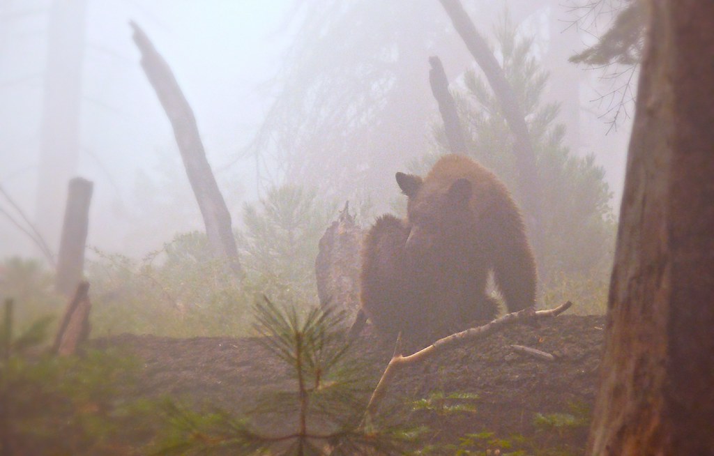
29: People are exceptionally good at recognizing structures in images, and while computer vision is in rapid development, the human brain still often outperforms artificial intelligence in this field. A Bear In The Woods by Linda Tanner, Flickr, CC BY-NC-ND 2.0.
Un-enhanced greyscale display
A lot goes on behind the scenes when you display an image on a computer screen. To look at the details we will take the simplest possible example first, an 8-bit greyscale image, but keep in mind that the same principles apply to data of different kinds. An 8-bit greyscale image (commonly, but misleadingly, also called a black-and-white image) corresponds to a single two-dimensional data layer with values ranging from 0 to 255. Digitally, the image file (e.g. a jpg, png, tif, or other image file) contains a bunch of numbers, as well as some information about the dimensions of the image. In the example below, the image contains 16 pixels arranged in 4 rows and 4 columns, and a value between 0 and 255 is associated with each cell. This is the Digital Number (DN) value. Most computer screens are able to display 256 different intensities of light, and use three colours (red, green and blue) to do so, which enables the production of 256 * 256 * 256 = 16.8 million colours. Think of there being three little ‘coloured light guns’ inside each pixel in the computer screen, which determine how much light to produce, of each colour, in each pixel. When displaying greyscale images, the intensity of light produced in red, green, and blue is all the same, allowing 256 shades of grey. The darkest of these (0 light intensity in red, 0 in green, and 0 in blue) produces a black colour on the screen, and the brightest (255 in red, 255 in green and 255 in blue) produces white. The example shown in Figure 30 is thus the simplest visualization (on the right) of the DN values in the file (on the left).
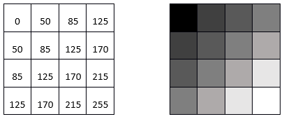
30: Single-layer greyscale image, showing the digital numbers on the left, and their visualization on the right. By Anders Knudby, CC BY 4.0.
Un-enhanced true-colour display
Most images have more than a single data layer, and can thus be used to produce colour images. Phone cameras record image files with three layers, corresponding to red, green, and blue, so visualizing these files is easy with the three ‘colour guns’ in your computer screen. A true-colour visualization is, not surprisingly, one in which you display the ‘red’ data layer using the red ‘colour gun’, and so on. For example:
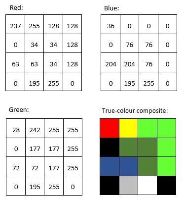
31: DN values in the red, green, and blue bands, and their direct display in a true-colour composite. By Anders Knudby, CC BY 4.0.
Un-enhanced false-colour display
Most passive optical sensors on satellites record light in more than three ‘bands’, and thus produce image files with more than three data layers. Some of these bands may be different shades of visible light (e.g. violet), while others, such as infrared and ultraviolet, fall outside the spectrum that is visible to humans. To show such data, false-colour visualizations are used. The name false-colour simply states that what is shown does not represent what the images area would look like to a human, it does not imply that there is anything wrong with the image (in fact false-colour displays are very useful). False-colour displays come in many flavours – just imagine the number of different combinations of three bands you can make with data from a sensors that has more than 200 bands… The most common false-colour visualization is often called ‘colour-infrared’, and it displays a ‘near-infrared’ band using the red colour gun, a ‘red’ band using the green colour gun, and a ‘green’ band using the blue colour gun. Figure 32 provides a side-by-side comparison of true-colour and a false-colour display of a Landsat image containing Zanzibar Town.
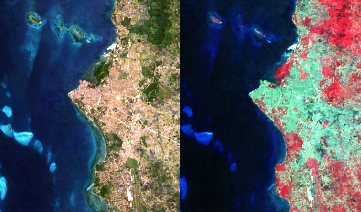
32: True-colour and colour-infrared displays of a Landsat image containing Zanzibar Town. By Anders Knudby, CC BY 4.0.
Image enhancement
In the preceding examples, we have imagined that the images always contained values between 0 and 255, neatly providing the 256 different possible values that the colour guns in a typical computer screen can display. There are two situations in which using the DN value found in the image file directly to determine the intensity of light produced by a colour gun is not the best option:
- Not all sensors record data using 8 bits per pixel (per colour). For (older) sensors that use less than 8 bits, or (newer) sensors that use more than 8 bits, a conversion between the DN value and the intensity with which it should be displayed is typically necessary.
- If the sensor has produced an image over a particularly bright or dark area, or at least if such an area is of specific interest, the values found over that area (e.g. between 50 and 80) can be displayed using a wider range of intensities on the screen (e.g. between 20 and 110), thus improving the visual contrast over the area of interest.
To better understand these issues, we need to consider how the DN values are stored in computer memory. We will consider a single pixel and its DN value for a single band. For an 8-bit sensor, this DN value is stored in 8 bits, each of which can either be ON (1) or OFF (0). The value is encoded as illustrated in Figure 33. In that example, the bits representing values of 128, 32, 16, 8 and 2 are all ON, while the others are OFF. The DN value of the pixel is therefore calculated as 128 + 32 + 16 + 8 + 2 = 186. The range of possible values with 8 bits goes from 0 (all bits are OFF) to 255 (all bits are ON), for a total of 256 possible values. In fact, the number of possible values, given the number of bits, is easily calculated as 2n, where n is the number of bits.

33: This example illustrates an 8-bit pixel with the value 186. By Anders Knudby, CC BY 4.0.
This is the reason why sensors that use fewer than 8 bits to store the DN for each pixel cannot produce 256 different values. However, just for the sake of argument, if we were to display 4-bit DN values (DN values ranging between 0 and 15) directly without transformation, we would only see very dark shades of grey (no actual sensors record information using only 4 bits, but the first Landsat sensors used only 6 bits, and the issue is the same).
On the other hand, sensors that use 12 bits to store each DN value (as many modern sensors do), contain values ranging from 0 to 212-1 = 4095. To display this range of values, we need to transform them to all fit between 0 and 255, which is most easily done by simply dividing by 16 and rounding down. Note that in this case, while the computer screen is not capable of displaying the data in all its detail, image processing algorithms will still be able to make use of it.
Things get more interesting when we have an image in which a specific range of values are of greatest interest. A common example is the kind of image seen in Figure 32, which contains some water (very dark), land (relatively dark and largely green), and clouds (very bright). Unless we are specifically interested in studying the clouds in this image, we don’t really need to be able to distinguish between pixels with DN values of 245 vs. 250 vs. 255. What we can do, then, is to display all ‘bright’ pixels that we don’t really care about with the same colour (white), and thus ‘reserve’ more of the different brightnesses with which we can display pixels for the DN values we care more about. Mathematically, this means creating a table that translates each DN value, for each band, into an equivalent brightness value with which it is going to be displayed on screen. Graphically, we can show this as done below in Figure 34, where the DN values are shown on the x axis, and the brightness with which they are displayed is shown on the y axis. The blue line represents the direct use of the DN value, without contrast enhancement. The orange line represents a linear contrast enhancement, in which all DN values less than 50 are displayed with a brightness of 0, and all DN values greater than 240 are displayed with a brightness of 255. This allows us to use the remaining 254 possible brightness values to better display the smaller differences between pixels with DN values between 50 and 240. The grey line is a square root transformation that keeps some contrast along the entire range of DN values, but focuses on displaying differences between pixels with low DN values, at the expense of those with high DN values. Examples of what such contrast enhancement can look like in practice are shown in Figures 35-37:
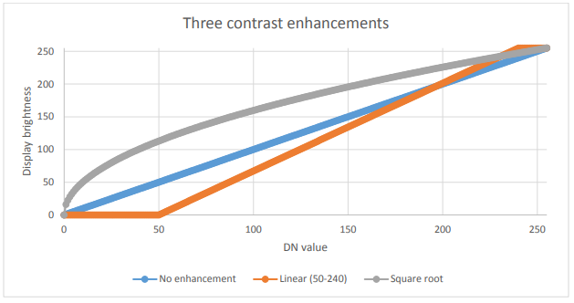
34: Three options for displaying 8-bit data. By Anders Knudby, CC BY 4.0.
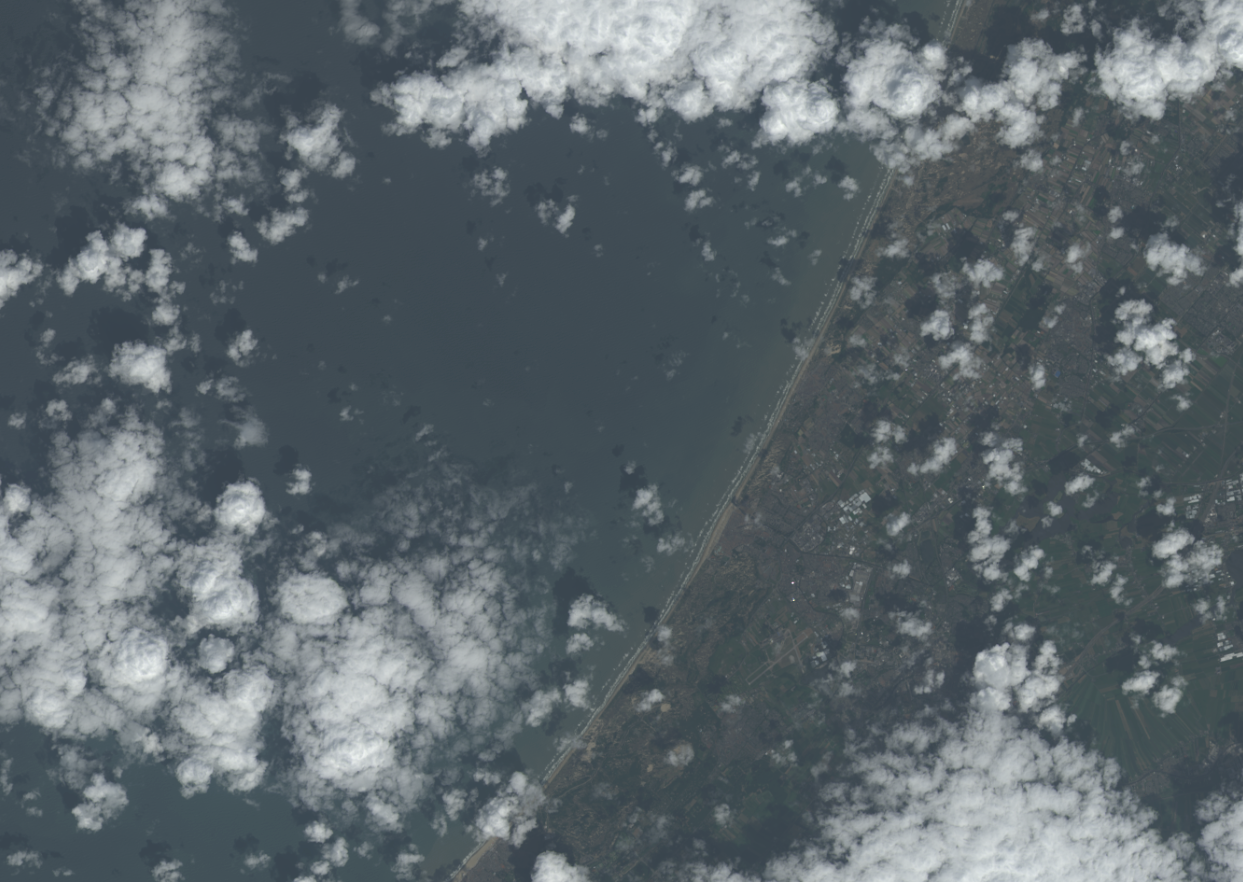
35: No contrast enhancement. By Anders Knudby, CC BY 4.0.
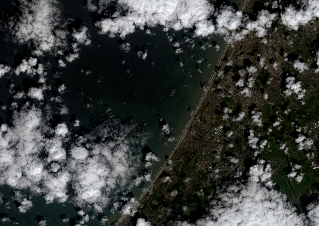
36: Linear contrast enhancement using the minimum and maximum values of the image in place of 50 and 240 in the above example. By Anders Knudby, CC BY 4.0.
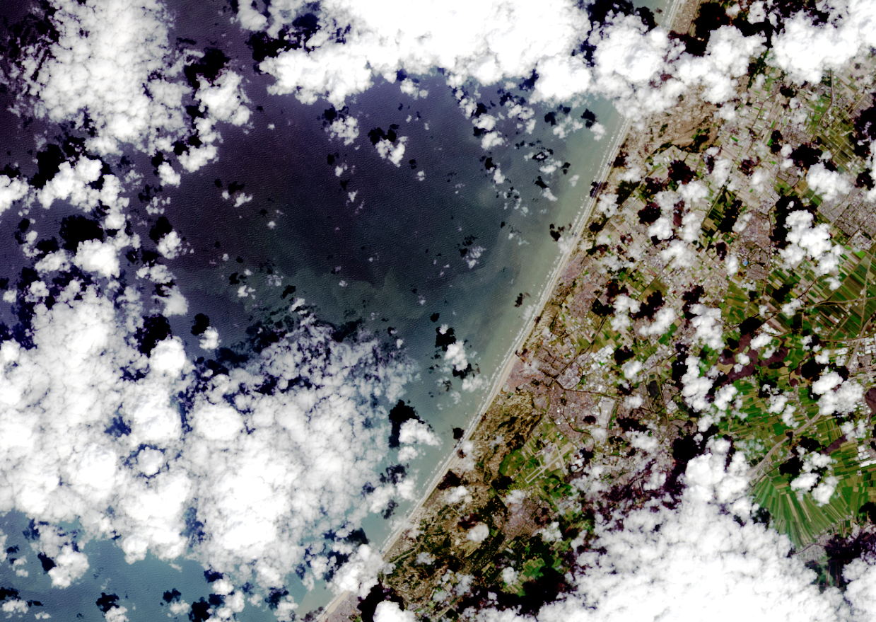
37: Contrast enhancement known as histogram equalization. This is mathematically more complex than the examples shown above, but often provides good results. By Anders Knudby, CC BY 4.0.
Pan-sharpening
When you watch Hollywood movies and the CIA analyst or the surprisingly good-looking police officer clicks a button to ‘enhance’ footage from a surveillance camera, thus revealing facial features from what was previously a blurry blob, well, that’s Hollywood. The thing about images is that they are just data, and you can’t make detail (new data) appear where none exists in the original data. There’s a funny explanation of this general idea here. However, with some satellite imagery there is one kind of ‘enhancement’ that actually kind of works (although it wreaks havoc in subtle ways on the image radiometry). The technique in question is called pan-sharpening, which refers to the fact that most passive optical satellite sensors have a ‘pan-chromatic’ band that records data on brightness across all the visible bands and at higher spatial resolution than the individual colour bands. For example, the sensors on Landsat satellites 4-7 have blue, green and red bands, all with 30 meter spatial resolution, and a pan-chromatic band that records blue and green as well as red light, with 15 meter spatial resolution. For modern high-resolution sensors, the difference in spatial resolution is even greater, with WorldView-2 having colour bands at 2 meter resolution and a pan-chromatic band at 50 cm resolution. Broadly speaking, we can therefore combine the colour information from the individual colour bands with the spatial detail from the pan-chromatic band, to get something like what you see in Figure 38.
There are several algorithms that can be used to perform this operation, and each employs a different set of assumptions and rules for how to generate colour information for each of the pixels in the pan-sharpened image. While context determines which algorithm is superior for a given image, the results of most algorithms are impressive and can greatly aid in visual interpretation of satellite imagery. Most commercial image processing software packages have one or more algorithms for pan-sharpening, so while the process itself is fairly complex, actually applying it to an image is done with the click of a button.

Band ratios and other band math
The previous sections have mostly dealt with different ways of displaying the DN values found in each band – in greyscale or colour, directly or transformed through contrast enhancement, pan-sharpened or not. An alternative is to create new bands using a process commonly called ‘Band Math’.
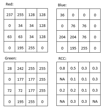
For example, we might want to produce a band that quantifies how ‘red’ something is. The problem with the original ‘red’ band in a typical satellite image is seen by comparing the ‘red’ DN values from the top left part of Figure 31 with the colours shown in the bottom right part of the same figure. Arguably, the pixel that is in the top left corner is what most people would consider ‘red’, but the two pixels with the highest DN values in the ‘red’ band are the yellow and white pixels (both have ‘red’ DN values of 255). Despite their high ‘red’ DN value, these pixels do not appear ‘red’ because they also have high DN values in one or more of the other colours. To better quantify the ‘red’ appearance of each pixel, we can calculate something called the ‘red chromatic coordinate’ (RCC). For each pixel, this is calculated as RCC = Red / (Red + Green + Blue), where Red, Green and Blue represent the respective DN values in each pixel. As you can see from the calculations in Figure 39, the red pixel in the top left corner has a higher RCC value than any of the other pixels, followed by yellow pixel next to it (because yellow is ‘close to’ red). Note that band math operates on each pixel individually, and completes the same mathematical operation on all pixels in an image. In doing so, it produces a new band that is a function of the original bands. Other common uses of band math is to calculate ‘band ratios’, such as the vegetation index called the ‘Simple Ratio’ that is calculated as SR = NIR / Red, where NIR is a value (ideally the TOA reflectance) in the near-infrared band, and Red is the same value in the red band. Because healthy plants reflect near-infrared light very effectively, while they absorb most red light (and thus reflect very little red light for the sensor to detect), areas with vegetation tend to have high reflectance and DN values in the near-infrared band and low values in the red band. This leads areas with vegetation to have very high Simple Ratio values, and this band ratio can therefore be used to quickly and easily produce a visualization that helps people distinguish between vegetated and un-vegetated areas. An even more popular vegetation index is the Normalized Difference Vegetation Index (NDVI), which is calculated as NDVI = (NIR – Red) / (NIR + Red).
Band math can be used to calculate new bands with any combination of input bands you can think of, and different kinds of band math are used, among many other applications, to monitor global deforestation, track seasonal changes in snow cover, map water depth, and monitor urban sprawl.
Tasseled cap transformation (TCT)
A particular application of band math called the tasseled cap transformation has been developed for Landsat data, and is now commonly used to produce a standardized and readily interpretable set of bands from the original data. It was originally developed for an instrument called Landsat MSS (which does not operate anymore), and has since been updated for Landsat TM (the sensors on Landsat 4 and 5), ETM+ (the sensor on Landsat 7), and OLI (the passive optical sensor on Landsat 8). The idea behind the tasseled cap transformation is to produce three new bands, ‘greenness’, ‘brightness’ and ‘wetness’, that describe the actual variations in those parameters across the image. In a typical satellite image of a rural landscape, areas covered by water (blue dots) and bare soil (red dots) will form a “line” in two-dimensional (NIR / RED) space, while vegetation (green dots) will lie away from the line and various stages of plant growth together will form a shape roughly like a tasseled cap (Figure 40). The three new bands are created by effectively rotating the axes of the coordinate system, so ‘brightness’ is determined along the ‘line of soils’ in Figure 40, ‘greenness’ is determined along an axis that departs from the line of soils and increases in value as it moves toward the top of the ‘tasseled cap’, and ‘wetness’ is determined along a third axis (not shown in Figure 40) perpendicular to the first two. An example of the results, based on an IKONOS image from Idaho, USA, is shown in Figure 41. In practical terms, each component of the tasseled cap is calculated as a weighted sum of the values in the original bands. For example, for Landsat TM data, the ‘brightness’ is calculated as BR = 0.3037 * BLUE + 0.2793 * GREEN + 0.4343 * RED + 0.5585 * NIR + 0.5082 * SWIR1 + 0.1863 * SWIR2 (SWIR1 and SWIR2 are two shortwave infrared bands also present on Landsat TM sensors).
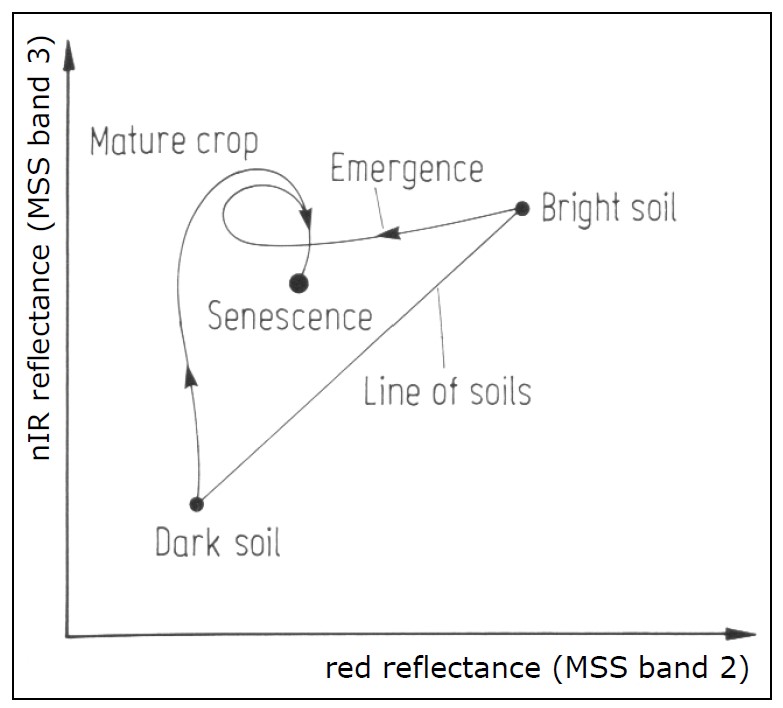
40: The principle of the tasseled cap transformation. Bare soils of varying brightness fall along a line when plotted with their values in the RED and NIR bands, while vegetation of increasing density is found within the ‘cap’, up and left from the line of soils. Vegetation at various growth stages, growing on soils of different brightness, thus form a shape that looks like a tasseled cap. The original formulation of the tasseled cap included a third dimension, using the green band. Tasseled Cap Transformation for bright and dark soil by Gurkengräber (adapted from Richards and Jia), Wikimedia Commons, CC BY-SA 4.0.
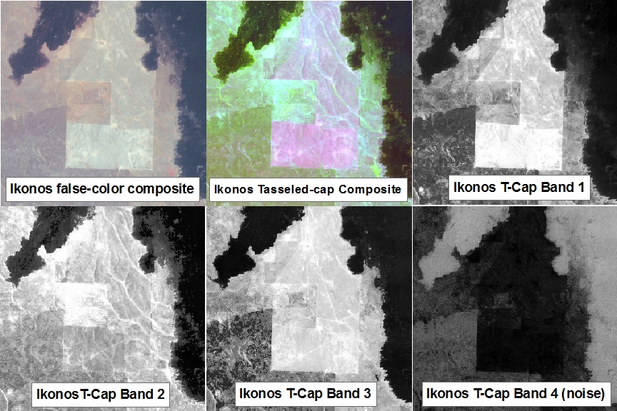
41: An example of the tasseled cap transformation applied to an IKONOS image from Idaho, USA. tcap_example by Jason Karl, The Landscape Toolbox, CC0 1.0.
Principal Components Analysis (PCA)
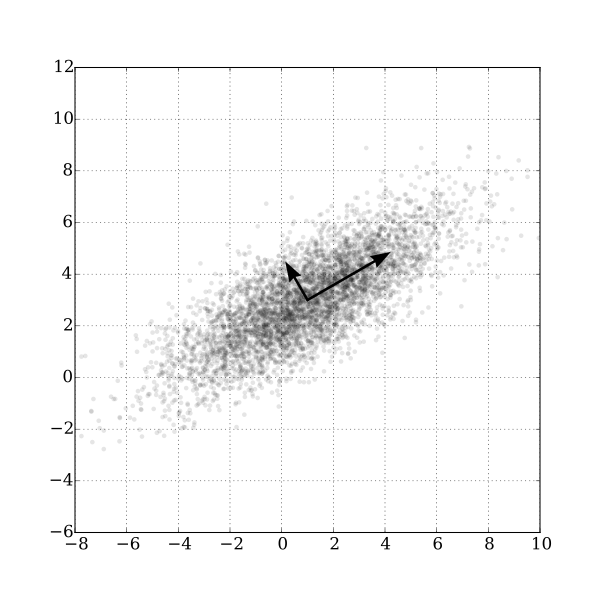
42: A two-dimensional example of Principal Components Analysis. GaussianScatterPCA by Nicoguaro, Wikimedia Commons, CC BY 4.0.
The last kind of band math we will look at in this chapter is similar to the tasseled cap transformation in that the calculation involves a weighted sum of the original bands, but it is different in the sense that the weights are determined from the properties of the image itself, and as such they vary from image to image. Figure 42 provides a good illustration of how it works. We can imagine that each points in the scatter plot is a pixel from our image, and that it is plotted according to its value in one band on the x-axis and another band on the y-axis. It is clear from the distribution of points in Figure 42 that points with high values in the one band tend to also have high values in the other band, and that most of the distribution of the points runs along an imaginary line from the bottom left to the top right of the plot. The orientation of this imaginary line is called the first principal component (PC1), and is illustrated with the longest arrow. But there is also some variation orthogonally (perpendicular) to PC1. This is the orientation of the second principal component, PC2, illustrated with the shorter arrow. Depending on how many bands are in an image, one could continue to find new such lines in the third, fourth etc. dimensions, each oriented along the greatest distribution of points in any orientation perpendicular to all previous principal components. In Figure 42 the original data set had only two dimensions, so two principal components were created. The length of each arrow corresponds to the amount of total distribution captured by each principal component, and it is clear that PC2 has captured rather little of the distribution in the original points. This can be interpreted as PC2 containing very little information, and often the higher-numbered principal components can be removed entirely with little loss of information. With this knowledge, new bands can be created, in which the value of each pixel is no longer its DN value in the original bands, but rather its value along each of the principal component axes. This is the main strength of PCA: that it allows you to transform the data into a smaller number of bands (thus taking up less hard disk space, and allowing quicker reading and processing) without losing much information. Research has even shown that for some kinds of images (e.g. a cloud-free Landsat image of an agricultural area), specific principal components tend to correspond to specific environmental variables, such as soil humidity, vegetation cover, and so on. However, a note of caution is important here. Because the orientation of the principal components (the arrows in Figure 42) depend on the distribution of the totality of pixel values in each individual image, the principal component values of a pixel are not directly interpretable, and may vary dramatically between images, even for identical pixels. PCA can thus help you to reduce the data volume of an image, but it destroys (or at least complicates) interpretation in the process. Another really good explanation of PCA, including an animated scatterplot that I think explains things really well, is found here.


