
1.6: Classification
- Page ID
- 17277

\( \newcommand{\vecs}[1]{\overset { \scriptstyle \rightharpoonup} {\mathbf{#1}} } \)
\( \newcommand{\vecd}[1]{\overset{-\!-\!\rightharpoonup}{\vphantom{a}\smash {#1}}} \)
\( \newcommand{\dsum}{\displaystyle\sum\limits} \)
\( \newcommand{\dint}{\displaystyle\int\limits} \)
\( \newcommand{\dlim}{\displaystyle\lim\limits} \)
\( \newcommand{\id}{\mathrm{id}}\) \( \newcommand{\Span}{\mathrm{span}}\)
( \newcommand{\kernel}{\mathrm{null}\,}\) \( \newcommand{\range}{\mathrm{range}\,}\)
\( \newcommand{\RealPart}{\mathrm{Re}}\) \( \newcommand{\ImaginaryPart}{\mathrm{Im}}\)
\( \newcommand{\Argument}{\mathrm{Arg}}\) \( \newcommand{\norm}[1]{\| #1 \|}\)
\( \newcommand{\inner}[2]{\langle #1, #2 \rangle}\)
\( \newcommand{\Span}{\mathrm{span}}\)
\( \newcommand{\id}{\mathrm{id}}\)
\( \newcommand{\Span}{\mathrm{span}}\)
\( \newcommand{\kernel}{\mathrm{null}\,}\)
\( \newcommand{\range}{\mathrm{range}\,}\)
\( \newcommand{\RealPart}{\mathrm{Re}}\)
\( \newcommand{\ImaginaryPart}{\mathrm{Im}}\)
\( \newcommand{\Argument}{\mathrm{Arg}}\)
\( \newcommand{\norm}[1]{\| #1 \|}\)
\( \newcommand{\inner}[2]{\langle #1, #2 \rangle}\)
\( \newcommand{\Span}{\mathrm{span}}\) \( \newcommand{\AA}{\unicode[.8,0]{x212B}}\)
\( \newcommand{\vectorA}[1]{\vec{#1}} % arrow\)
\( \newcommand{\vectorAt}[1]{\vec{\text{#1}}} % arrow\)
\( \newcommand{\vectorB}[1]{\overset { \scriptstyle \rightharpoonup} {\mathbf{#1}} } \)
\( \newcommand{\vectorC}[1]{\textbf{#1}} \)
\( \newcommand{\vectorD}[1]{\overrightarrow{#1}} \)
\( \newcommand{\vectorDt}[1]{\overrightarrow{\text{#1}}} \)
\( \newcommand{\vectE}[1]{\overset{-\!-\!\rightharpoonup}{\vphantom{a}\smash{\mathbf {#1}}}} \)
\( \newcommand{\vecs}[1]{\overset { \scriptstyle \rightharpoonup} {\mathbf{#1}} } \)
\(\newcommand{\longvect}{\overrightarrow}\)
\( \newcommand{\vecd}[1]{\overset{-\!-\!\rightharpoonup}{\vphantom{a}\smash {#1}}} \)
\(\newcommand{\avec}{\mathbf a}\) \(\newcommand{\bvec}{\mathbf b}\) \(\newcommand{\cvec}{\mathbf c}\) \(\newcommand{\dvec}{\mathbf d}\) \(\newcommand{\dtil}{\widetilde{\mathbf d}}\) \(\newcommand{\evec}{\mathbf e}\) \(\newcommand{\fvec}{\mathbf f}\) \(\newcommand{\nvec}{\mathbf n}\) \(\newcommand{\pvec}{\mathbf p}\) \(\newcommand{\qvec}{\mathbf q}\) \(\newcommand{\svec}{\mathbf s}\) \(\newcommand{\tvec}{\mathbf t}\) \(\newcommand{\uvec}{\mathbf u}\) \(\newcommand{\vvec}{\mathbf v}\) \(\newcommand{\wvec}{\mathbf w}\) \(\newcommand{\xvec}{\mathbf x}\) \(\newcommand{\yvec}{\mathbf y}\) \(\newcommand{\zvec}{\mathbf z}\) \(\newcommand{\rvec}{\mathbf r}\) \(\newcommand{\mvec}{\mathbf m}\) \(\newcommand{\zerovec}{\mathbf 0}\) \(\newcommand{\onevec}{\mathbf 1}\) \(\newcommand{\real}{\mathbb R}\) \(\newcommand{\twovec}[2]{\left[\begin{array}{r}#1 \\ #2 \end{array}\right]}\) \(\newcommand{\ctwovec}[2]{\left[\begin{array}{c}#1 \\ #2 \end{array}\right]}\) \(\newcommand{\threevec}[3]{\left[\begin{array}{r}#1 \\ #2 \\ #3 \end{array}\right]}\) \(\newcommand{\cthreevec}[3]{\left[\begin{array}{c}#1 \\ #2 \\ #3 \end{array}\right]}\) \(\newcommand{\fourvec}[4]{\left[\begin{array}{r}#1 \\ #2 \\ #3 \\ #4 \end{array}\right]}\) \(\newcommand{\cfourvec}[4]{\left[\begin{array}{c}#1 \\ #2 \\ #3 \\ #4 \end{array}\right]}\) \(\newcommand{\fivevec}[5]{\left[\begin{array}{r}#1 \\ #2 \\ #3 \\ #4 \\ #5 \\ \end{array}\right]}\) \(\newcommand{\cfivevec}[5]{\left[\begin{array}{c}#1 \\ #2 \\ #3 \\ #4 \\ #5 \\ \end{array}\right]}\) \(\newcommand{\mattwo}[4]{\left[\begin{array}{rr}#1 \amp #2 \\ #3 \amp #4 \\ \end{array}\right]}\) \(\newcommand{\laspan}[1]{\text{Span}\{#1\}}\) \(\newcommand{\bcal}{\cal B}\) \(\newcommand{\ccal}{\cal C}\) \(\newcommand{\scal}{\cal S}\) \(\newcommand{\wcal}{\cal W}\) \(\newcommand{\ecal}{\cal E}\) \(\newcommand{\coords}[2]{\left\{#1\right\}_{#2}}\) \(\newcommand{\gray}[1]{\color{gray}{#1}}\) \(\newcommand{\lgray}[1]{\color{lightgray}{#1}}\) \(\newcommand{\rank}{\operatorname{rank}}\) \(\newcommand{\row}{\text{Row}}\) \(\newcommand{\col}{\text{Col}}\) \(\renewcommand{\row}{\text{Row}}\) \(\newcommand{\nul}{\text{Nul}}\) \(\newcommand{\var}{\text{Var}}\) \(\newcommand{\corr}{\text{corr}}\) \(\newcommand{\len}[1]{\left|#1\right|}\) \(\newcommand{\bbar}{\overline{\bvec}}\) \(\newcommand{\bhat}{\widehat{\bvec}}\) \(\newcommand{\bperp}{\bvec^\perp}\) \(\newcommand{\xhat}{\widehat{\xvec}}\) \(\newcommand{\vhat}{\widehat{\vvec}}\) \(\newcommand{\uhat}{\widehat{\uvec}}\) \(\newcommand{\what}{\widehat{\wvec}}\) \(\newcommand{\Sighat}{\widehat{\Sigma}}\) \(\newcommand{\lt}{<}\) \(\newcommand{\gt}{>}\) \(\newcommand{\amp}{&}\) \(\definecolor{fillinmathshade}{gray}{0.9}\)While visual interpretation of a satellite image may suffice for some purposes, it also has significant shortcomings. For example, if you want to find out where all the urban areas are in an image, a) it will take a long time for even an experienced image analyst to look through an entire image and determine which pixels are ‘urban’ and which aren’t, and b) the resulting map of urban areas will necessarily be somewhat subjective, as it is based on the individual analyst’s interpretation of what ‘urban’ means and how that is likely to appear in the image. A very common alternative is to use a classification algorithm to translate the colour observed in each pixel into a thematic class that describes its dominant land cover, thus turning the image into a land cover map. This process is called image classification.
You can identify two categories of approaches to image classification. The traditional and easiest way is to look at each pixel individually, and determine which thematic class corresponds to its colour. This is typically called per-pixel classification, and it’s what we will look at first. A newer and increasingly popular method is to first split the image into homogeneous segments, and then determine which thematic class corresponds to the attributes of each segment. These attributes may be the colour of the segment as well as other things like shape, size, texture, and location. This is typically called object-based image analysis, and we’ll look at that in the second half of this chapter.
Even in the category of per-pixel classification, two different approaches are available. One is called ‘supervised’ classification, because the image analyst ‘supervises’ the classification by providing some additional information in its early stages. The other is called ‘unsupervised’ classification, because an algorithm does most of the work (almost) unaided, and the image analyst only has to step in at the end and finish things up. Each has its advantages and disadvantages, which will be outlined in the following.
Supervised per-pixel classification
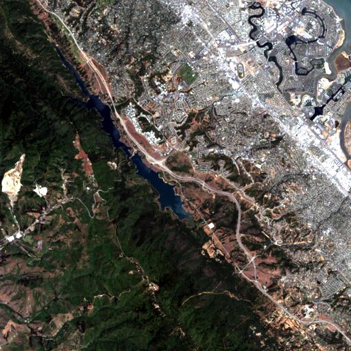
The idea behind supervised classification is that the image analyst provides the computer with some information that allows calibration of a classification algorithm. This algorithm is then applied to every pixel in the image to produce the required map. How this works is best explained with an example. The image shown in Figure 44 is from California, and we want to translate this image into a classification with the following three (broad) classes: “Urban”, “Vegetation”, and “Water”. The number of classes, and the definition of each class, can have great impact on the success of the classification – in our example we are ignoring the fact that substantial parts of the area seem to consist of bare soil (and so does not really fall into any of our three classes). And we may realize that the water in the image has very different colour depending on how turbid it is, and that some of the urban areas are very bright while others are a darker shade of grey, but we are ignoring those issues for now.
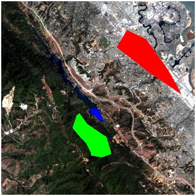
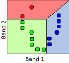
The “supervision” in supervised classification almost always comes in the form of a calibration data set, which consists of a set of points and/or polygons that are known (or believed) to belong to each class. In Figure 45, such a data set has been provided in the form of three polygons. The red polygon outlines an area known to be “Urban”, and similarly the blue polygon is “Water” and the green polygon is “Vegetation”. Note that the example in Figure 45 is not an example of best practice – it is preferable to have more and smaller polygons for each class spread out throughout the image, because it helps the polygons to only cover pixels of the intended class, and also to incorporate spatial variations in e.g. vegetation density, water quality etc.
Now let’s look at how those polygons help us turn the image into a map of the three classes. Basically, the polygons tell the computer “look at the pixels under the red polygon – that’s what ‘Urban’ pixels look like”, and the computer can then go and find all the other pixels in the image that also look like that, and label them “Urban”. And so on for the other classes. However, some pixels may look a bit “Urban” and a bit like “Vegetation”, so we need a mathematical way to figure out which class each pixel resembles the most. We need a classification algorithm.
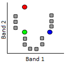
If we take all the values of all the pixels in Landsat bands 3 and 4 and show them on a scatterplot, we get something like Figure 46. This image has an 8-bit radiometric resolution, so values in each band theoretically range from 0 to 255, although in reality we see that the smallest values in the image are greater than 0. Values from band 3 are shown on the x-axis, and values from band 4 on the y-axis.
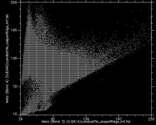
Now, if we colour all the points that come from pixels under the red polygon (i.e. pixels we “know” to be “Urban”), and do the same with pixels under the blue and green polygons, we get something like Figure 47. There are a few important things to note in Figure 47. All the blue points (“Water”) are found in the bottom left corner of the figure, below the yellow circle, with low values in band 3 and low values in band 4. This is indeed typical of water, because water absorbs incoming radiation in the red (band 3) and near-infrared (band 4) wavelengths very effectively, so very little is reflected to be detected by the sensor. The green points (“Vegetation”) form a long area along the left hand side of the figure, with low values in band 3 and moderate to high values in band 4. Again, this seems reasonable, as vegetation absorbs incoming radiation in the red band effectively (using it for photosynthesis) while reflecting incoming radiation in the near-infrared band. The red points (“Urban”) form a larger area near the centre of the figure, and cover a much wider range of values than either of the two other classes. While their values are similar to those of “Vegetation” in band 4, they are generally higher in band 3.
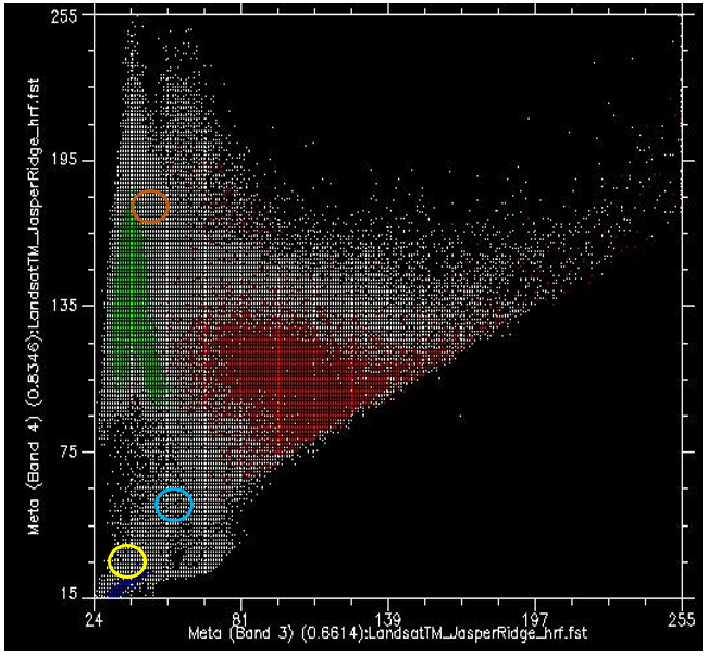
What we want the supervised classification algorithm to do now, is to take all the other pixels in the image (i.e. all the white points on the scatter plot) and assign them to one of the three classes based on their colour. For example, which class do you think the white dots in the yellow circle in Figure 47 should be assigned to? Water, probably. And what about those in the light brown circle? Vegetation, probably. But what about those in the light blue circle? Not quite so easy to determine.
Note: The classification algorithm can make use of all the bands in the Landsat image, as well as any other information we provide for the entire image (like a digital elevation model), but because it is easiest to continue to show this in two dimensions using bands 3 and 4 only we will continue to do so. Just keep in mind that the scatter plot is in reality an n-dimensional plot, where n is equal to the number of bands (and other data layers) we want to use in the classification.
Minimum distance classifier
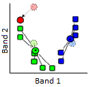
One way to estimate which class each pixel belongs to is to calculate the “distance” between the pixel and the centre of all the pixels known to belong to each class, and then assign it to the closest one. By “distance”, what we mean here is the distance in “feature space”, in which dimensions are defined by each of the variables we are considering (in our case bands 3 and 4), as opposed to physical distance. Our feature space, therefore, is two-dimensional, and distances can be calculated using a standard Euclidian distance.
As an example, for the points in Figure 48 we have calculated the mean values of all green, red, and blue pixels for bands 3 and 4, and indicated them with large dots. Let’s say they have the following values:
Table 3: Mean values in bands 3 and 4 for the “Urban”, “Vegetation” and “Water” classes show in Figure 49.
|
Mean values |
Red points (“Urban”) |
Green points (“Vegetation”) |
Blue points (“Water”) |
|
Band 3 |
100 |
40 |
35 |
|
Band 4 |
105 |
135 |
20 |
Then let’s say a pixel indicated by the yellow dot in Figure 48 has a value of 55 in band 3, and 61 in band 4. We can then calculate the Euclidian distance between the point and the mean value of each class:
Distance to red mean: (100-55)2+(105-61)2 = 62.9
Distance to green mean: (40-55)2+(135-61)2 = 75.5
Distance to blue mean: (35-55)2+(20-61)2 = 45.6
Because the Euclidian distance is shortest to the centre of the blue points, the minimum distance classifier will assign this particular point to the “Blue” class. While the minimum distance classifier is very simple and fast and often performs well, this example illustrates one important weakness: In our example, the distribution of values for the “Water” class is very small – water is basically always dark and blue-green, and even turbid water or water with lots of algae in it basically still looks dark and blue-green. The distribution of values for the “Vegetation” class is much greater, especially in band 4, because some vegetation is dense and some not, some vegetation is healthy and some not, some vegetation may be mixed in with dark soil, bright soil, or even some urban features like a road. The same goes for the “Urban” class, which has a wide distribution of values both in bands 3 and 4. In reality, the yellow dot in Figure 48 is not very likely to be water, because water that has such high values in both bands 3 and 4 basically doesn’t exist. It is much more likely to be an unusual kind of vegetation, or an unusual urban area, or (even more likely) a mix between those two classes. The next classifier we will look at explicitly takes into account the distribution of values in each class, to remedy this problem.
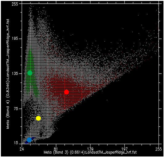
48: The minimum distance classifier assigns the class whose centre is nearest (in feature space) to each pixel. The mean value of all the red points, in bands 3 and 4, is indicated by the large red dot, and similarly for the green and blue points. The yellow dot indicates a pixel that we wish to assign to one of the three classes. Scatterplot created using ENVI software. By Anders Knudby, CC BY 4.0.
Maximum likelihood classifier
Until around 10 years ago, the maximum likelihood classifier was the go-to algorithm for image classification, and it is still popular, implemented in all serious remote sensing software, and typically among the best-performing algorithms for a given task. Mathematical descriptions of how it works can seem complicated because they rely on Bayesian statistics applied in multiple dimensions, but the principle is relatively simple: Instead of calculating the distance to the centre of each class (in feature space) and thus finding the closest class, we will calculate the probability that the pixel belongs to each class, and thus find the most probable class. What we need to do to make the math work is to make a few assumptions.
- We will assume that before we know the colour of the pixel, the probability of it belonging to one class is the same as the probability of it belonging to any other class. This seems reasonable enough (although in our image there is clearly much more “Vegetation” than there is “Water” so one could argue a pixel with unknown colour is more likely to be vegetation than water… this can be incorporated into the classifier, but rarely is, and we will ignore it for now)
- We will assume that the distribution of values in each band and for each class is Gaussian, i.e. follows a normal distribution (a bell curve).
To start with a one-dimensional example, our situation could look like this if we had only two classes:
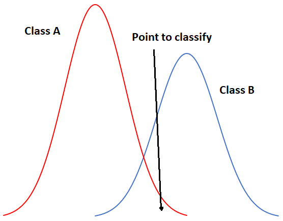
49: One-dimensional example of maximum likelihood classification with two classes. By Anders Knudby, CC BY 4.0.
In Figure 49, the x-axis represents values in an image band, and the y-axis shows the number of pixels in each class that has a given value in that band. Clearly, Class A typically has low values, and Class B typically has high values, but the distribution of values in each band is significant enough that there is some overlap between the two. Because both distributions are Gaussian, we can calculate both the mean and the standard deviation for each class, and we can then calculate the z-score (how many standard deviations we are away from the mean). In Figure 49, the two classes have the same standard deviation (the ‘bells’ have the same ‘width’), and because the point is located a little closer to the mean of Class B than it is to Class A, its z-score would be lowest for Class B and it would be assigned to that class. A slightly more realistic example is provided below in Figure 50, where we have two dimensions and three classes. The standard deviations in band 4 (x-axis) and band 3 (y-axis) are shown as equiprobability contours. The challenge for the maximum likelihood classifier in this case is to find the class for which the point lies within the equiprobability contour closest to the class centre. See for example that the contours for Class A and Class B overlap, and that the standard deviations of Class A are larger than those of Class B. As a result, the red dot is closer (in feature space) to the centre of Class B than it is to the centre of Class A, but it is on the third equiprobability contour of Class B and on the second of Class A. The minimum distance classifier would classify this point as “Class B” based on the shorter Euclidian distance, while the maximum likelihood classifier would classify it as “Class A” because of its greater probability of belonging to that class (as per the assumptions employed). Which is more likely to be correct? Most comparisons between these classifiers suggest that the maximum likelihood classifier tends to produce more accurate results, but that is not a guarantee that it is always superior.
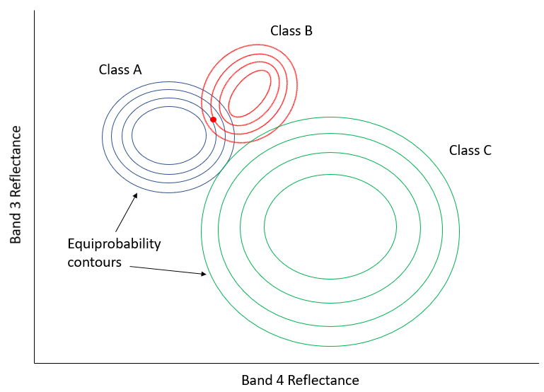
50: Two-dimensional example of the maximum likelihood classification situation, with six classes that have unequal standard distributions. By Anders Knudby, CC BY 4.0.
Non-parametric classifiers
Within the last decade or so, remote sensing scientists have increasingly looked to the field of machine learning to adopt new classification techniques. The idea of classification is fundamentally very generic – you have some data about something (in our case values in bands for a pixel) and you want to find out what it is (in our case what the land cover is). A problem could hardly be more generic, so versions of it are found everywhere: A bank has some information about a customer (age, sex, address, income, loan repayment history) and wants to find out whether (s)he should be considered a “low risk”, “medium risk” or “high risk” for a new $100,000 loan. A meteorologist has information about current weather (“rainy, 5 °C”) and atmospheric variables (“1003 mb, 10 m/s wind from NW”), and needs to determine whether it will rain or not in three hours. A computer has some information about fingerprints found at a crime scene (length, curvature, relative position, of each line) and needs to find out if they are yours or somebody else’s). Because the task is generic, and because users outside the realm of remote sensing have vast amounts of money and can use classification algorithms to generate profit, computer scientists have developed many techniques to solve this generic task, and some of those techniques have been adopted in remote sensing. We will look at a single example here, but keep in mind that there are many other generic classification algorithms that can be used in remote sensing.
The one we will look at is called a decision tree classifier. As with the other classifiers, the decision tree classifier works in a two-step process: 1) Calibrate the classification algorithm, and 2) apply it to all pixels in the image. A decision tree classifier is calibrated by recursively splitting the entire data set (all the pixels under the polygons in Figure 45) to maximize the homogeneity of the two parts (called nodes). A small illustration: let’s say we have 7 data points (you should never have only seven data points when calibrating a classifier, this small number is used for illustration purposes only!):
|
Data point |
Band 1 value |
Band 2 value |
Actual class |
|
1 |
10 |
30 |
A |
|
2 |
20 |
40 |
A |
|
3 |
30 |
40 |
A |
|
4 |
15 |
55 |
B |
|
5 |
35 |
40 |
B |
|
6 |
40 |
35 |
B |
|
7 |
45 |
35 |
B |
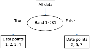
The first task is to find a value, either in band 1 or in band 2, that can be used to split the data set into two nodes such that, to the extent possible, all the points of Class A are in one node and all the points in Class B are in the other. Algorithmically, the way this is done is by testing all possible values and quantifying the homogeneity of the resulting classes. So, we see that the smallest value in Band 1 is 10, and the largest is 45. If we split the data set according to the rule that “All points with Band 1 < 11 go to node X, and all others go to node Y”, we will end up with points split like this:
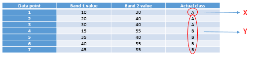
51: Points split according to threshold value 11 in band 1. By Anders Knudby, CC BY 4.0.
As we can see, this leaves us with a single “A” point in the one node (X), and two “A” points and four “B” points in the other node (Y). To find out if we can do better, we try to use the value 12 instead of 11 (which gives us the same result), 13 (still the same), and so on, and when we have tested all the values in band 1 we keep going with all the values in band 2. Eventually, we will find that using the value 31 in band 1 gives us the following result:
52: Points spit according to threshold value 31 in band 1. By Anders Knudby, CC BY 4.0.
This is almost perfect, except that we have a single “B” in node X. But ok, pretty good for a first split. We can depict this in a “tree” form like this:
53: The emerging “tree” structure from splitting the data on threshold value 31 in band 1. Each collection of data points is called a node. The ‘root node’ contains all the data points. ‘Leaf nodes’ are also called ‘terminal nodes’, they are the end points. By Anders Knudby, CC BY 4.0.
The node with data points 5, 6, and 7 (all have band 1 values above 31) is now what is called a “pure node” – it consists of data points of only one class, so we don’t need to split it anymore. Nodes that are end points are also called “leafs”. The node with data points 1, 2, 3 and 4 is not “pure”, because it contains a mix of Class A and Class B points. So we go through again and test all the different possible values we can use as a threshold to split that node (and only that node), in both bands. It so happens that the point from Class B in that node has a value in band 2 that is higher than all the other points, so a split value of 45 works well, and we can update the tree like this:
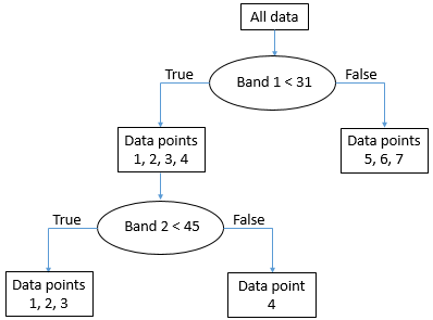
54: The final “tree” structure. All nodes (final parts of the data set) are now pure. By Anders Knudby, CC BY 4.0.
With the “tree” in place, we can now take every other pixel in the image and “drop it down” the tree to see which leaf it lands in. For example, a pixel with values of 35 in band 1 and 25 in band two will “go right” at the first test and thus land in the leaf that contains data points 5, 6 and 7. As all these points were from Class B, this pixel will be classified as Class B. And so on.
Note that leafs do not have to be “pure”, some trees stop splitting nodes when they are smaller than a certain size, or using some other criterion. In that case, a pixel landing in such a leaf will be assigned the class that has the most points in that leaf (and the information that it was not a pure leaf may even be used to indicate that the classification of this particular pixel is subject to some uncertainty).
The decision tree classifier is just one out of many possible examples of non-parametric classifiers. It is rarely used directly in the form shown above, but forms the basis for some of the most successful classification algorithms in use today. Other popular non-parametric classification algorithms include neural networks and support vector machines, both of which are implemented in much remote sensing software.
Unsupervised per-pixel classification
What if we don’t have the data necessary to calibrate a classification algorithm? If we don’t have the polygons shown in Figure 45, or the data points shown in Table 4? What do we do then? We use an unsupervised classification instead!
Unsupervised classification proceeds by letting an algorithm split pixels in an image into “natural clusters” – combinations of band values that are commonly found in the image. Once these natural clusters have been identified, the image analyst can then label them, typically based on a visual analysis of where these clusters are found in the image. The clustering is largely automatic, although the analyst provides a few initial parameters. One of the most common algorithms used to find natural clusters in an image is the K-Means algorithm, which works like this:
1) The analyst determines the desired number of classes. Basically, if you want a map with high thematic detail, you can set a large number of classes. Note also that classes can be combined later on, so it is often a good idea to set the number of desired classes to be slightly higher than what you think you will want in the end. A number of “seed” points equal to the desired number of classes is then randomly placed in feature space.
55: K-Means classification step 1. A number of “seed” points (coloured dots) are randomly distributed in feature space. Grey points here represent pixels to be clustered. Modified from K Means Example Step 1 by Weston.pace, Wikimedia Commons, CC BY-SA 3.0.
2) Clusters are then generated around the “seed” points by allocating all other points to the nearest seed.
56: A cluster is formed around each seed by allocating all points to the nearest seed. Modified from K Means Example Step 2 by Weston.pace, Wikimedia Commons, CC BY-SA 3.0.
3) The centroid (geographic centre) of the points in each cluster becomes the new “seed”.
57: The seeds are moved to the centroid of each cluster. The centroid is calculated as the geographic centre of each cluster, i.e. it becomes located at the mean x value of all points in the cluster, and the mean y value of all points in the cluster. Modified from K Means Example Step 3 by Weston.pace, Wikimedia Commons, CC BY-SA 3.0.
4) Repeat steps 2 and 3 until stopping criterion. The stopping criterion can be that no point moves to another cluster, or that the centroid of each cluster moves less than a pre-specified distance, or that a certain number of iterations have been completed.
Other unsupervised classification algorithms do the clustering slightly differently. For example, a popular algorithm called ISODATA also allows for splitting of large clusters during the clustering process, and similarly for merging of small nearby clusters. Nevertheless, the result of the clustering algorithm is that each pixel in the entire image is part of a cluster. The hope, then, is that each cluster represents a land cover type that can be identified by the image analyst, e.g. by overlaying the location of all pixels in the cluster on the original image to visually identify what that cluster corresponds to. That is the final step in unsupervised classification – labeling of each of the clusters that have been produced. This is the step where it can be convenient to merge clusters, if e.g. you have one cluster that corresponds to turbid water and another that corresponds to clear water. Unless you are specifically interested in water quality, differentiating the two is probably not important, and merging them will provide a clearer map product. Also, you may simply have two clusters that both seem to correspond to healthy deciduous forest. Even if you work for a forest service, unless you can confidently figure out what the difference is between these two clusters, you can merge them into one and call them “deciduous forest”.
As an example, the image below shows the original image in the background, and the central pixels coloured according to the product of an unsupervised classification. It is clear that the “blue” area corresponds to pixels covered by water, and the green area corresponds largely to vegetation. More detailed analysis of the image would be necessary to label each area, especially the red and grey ones, appropriately.
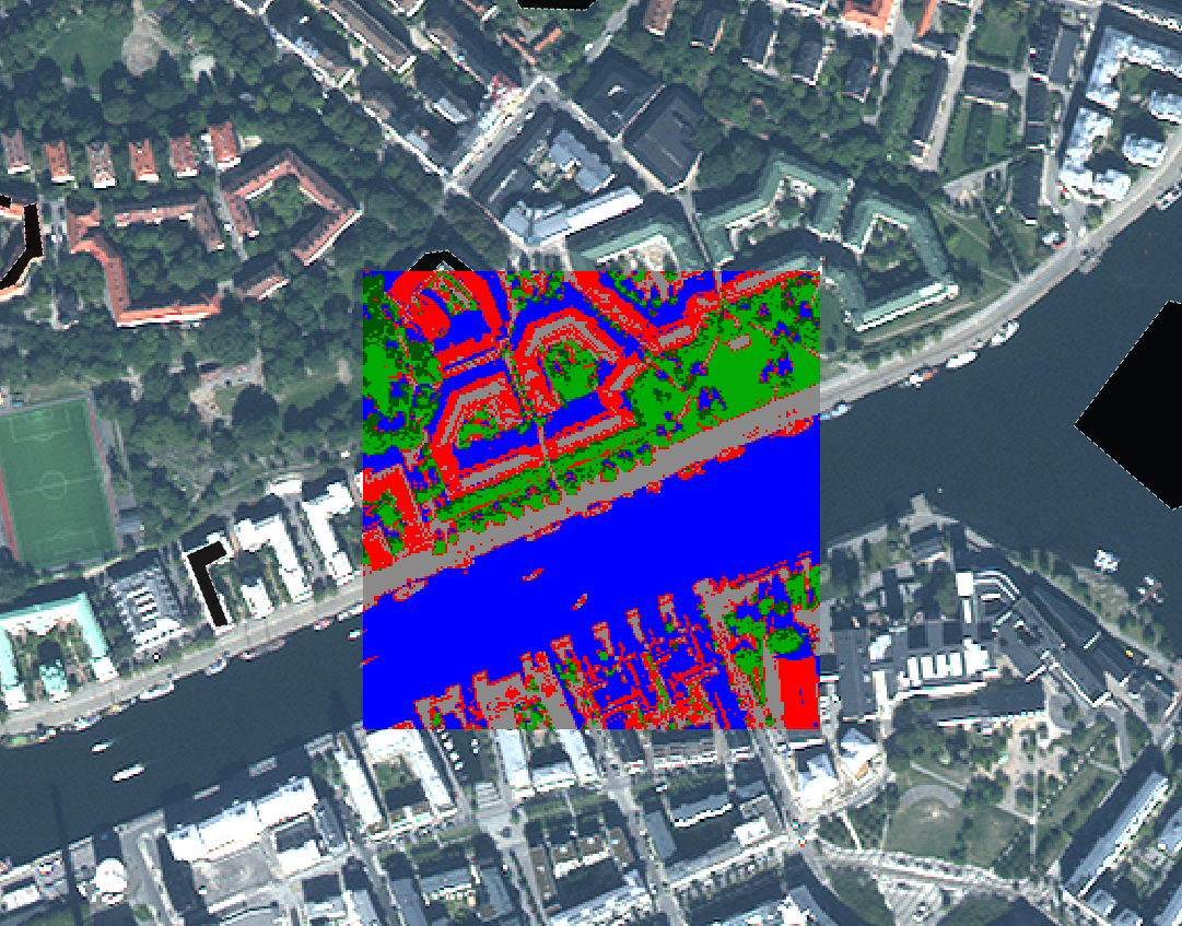
58: Example of correspondence between the original image and the clusters formed in an unsupervised classification process. By Anders Knudby, CC BY 4.0.
Land cover classification is one of the oldest uses of remote sensing, and is something many national governments do for their territory on a regular basis. For example, in Canada the Canada Centre for Remote Sensing works with partners from the US and Mexico to create a North American Land Cover map. Global land cover maps are also produced by various institutions, like the USGS, the University of Maryland, ESA, and China, to name just a few.
One of the typical shortcomings of image classification schemes that operate on a pixel-by-pixel level is that images are noisy, and the land cover maps made from images inherit that noise. Another more important shortcoming is that there is information in an image beyond what is found in the individual pixels. An image is the perfect illustration of the saying that “the whole is greater than the sum of its parts”, because images have structure, and structure is not taken into account when looking at each pixel independent from the context provided by all of the neighbouring pixels. For example, even without knowing the colour of a pixel, if I know that all of its neighbouring pixels are classified as “water”, I can say with great confidence that the pixel in question is also “water”. I will be wrong occasionally, but right most of the time. We will now look at a technique called object-based image analysis that takes context into account when generating image classifications. This advantage often allows it to outperform the more traditional pixel-by-pixel classification methods.
Object-based Image Analysis (OBIA)
Many new advances in the remote sensing world come from the hardware side of things. A new sensor is launched, and it has better spatial or spectral resolution than previous sensors, or it produces less noisy images, or it is made freely available when the alternatives were at cost. Drones are another example: the kind of imagery they produce is not substantially different from what was previously available from cameras on manned aircraft – in fact it is often inferior in quality – but the low cost of drones and the ease with which they can be deployed by non-experts has created a revolution in terms of the amount of available imagery from low altitudes, and the cost of obtaining high-resolution imagery for a small site.
One of the few substantial advances that have come from the software side is the development of object-based image analysis (OBIA). The fundamental principle in OBIA is to consider an image to be composed of objects rather than pixels. One advantage of this is that people tend to see the world as composed of objects, not pixels, so an image analysis that adopts the same view produces results that are more easily interpreted by people. For example, when you look at Figure 59, you probably see the face of a man, (if you know him you will also recognize who the man is).

59: Robert De Niro. Or, if you’re a pixel-based image analysis software, a three-band raster with 1556 columns and 2247 lines, each pixel and band displaying a varying level of brightness. Robert De Niro KVIFF portrait by Petr Novák (che), Wikimedia Commons, CC BY-SA 2.5.
Because this is a digital image, we know that it is actually composed of a number of pixels arranged neatly in columns and rows, and that the brightness (i.e. the intensity of the red, green and blue colour in each pixel) can be represented by three numbers. So we could classify the bright parts of the image as “skin” and the less bright parts as “other”, a mixed class comprising eyes, hair, shadows, and the background. That’s not a particularly useful or meaningful classification, though! What would be more meaningful would be to classify the image into classes like “eye”, “hand”, “hair”, “nose”, etc.
An example somewhat more relevant to remote sensing is seen below in Figure 60, in which an urban area has been classified into objects, including an easy-recognizable stadium, streets, individual buildings, vegetation etc.
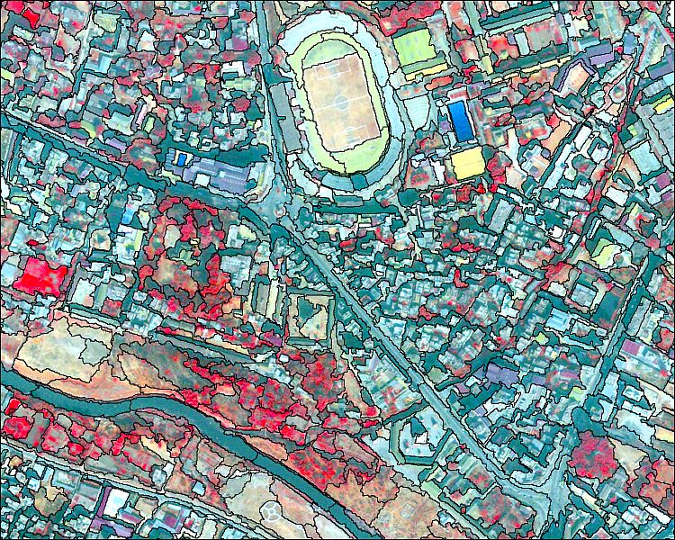
60: Classification of an urban area using object-based image analysis. Object based image analysis by Uddinkabir, Wikimedia Commons, CC BY-SA 4.0.
Image segmentation
The purpose of image segmentation is to take all the pixels in the image and divide them into segments – contiguous parts of the image that have similar colour. Image segmentation is useful because it takes us away from analyzing the image on a pixel-by-pixel basis and instead allows us to analyze the individual segments. There are a couple of very important advantages to this. First of all, we can look at the “average colour” of a segment and use that to classify that segment, rather than using the colour of each individual pixel to classify that pixel. If we are dealing with noisy imagery (and we always are!), using segment averages reduces the influence the noise has on the classification. Secondly, segments have a number of attributes that may be meaningful and can be used to help classify them – attributes pixels do not have. For example, an image segment is made up of a number of pixels, and we can thus quantify its size. Since not all segments will have the same size, there is information in the attribute ‘segment size’ that may be used to help classify the segments. For example, in Figure 60, notice that the segment covering the lake is quite large compared to all of the segments on land. That is because the lake is a very homogeneous part of the image. The same difference is seen between different parts of the land area – the segments just west of the lake are generally larger than those southwest of the lake, again this is because they are more homogeneous, and that homogeneity may tell us something important about what kind of land cover is found there. Apart from size, segments have a large number of other attributes that may or may not be helpful in a classification. Each segment has a specific number of neighbouring segments, and each segment is also darker or lighter or somewhere in the middle compared to its neighbours. See this page for a list of the attributes you can calculate for segments in ENVI’s Feature Extraction Module (which is not the most comprehensive such module, by far). The ability to get all this information about segments can help to classify them, and this information is not all available for pixels (e.g. all pixels have exactly four neighbours, unless they are located on an image edge, so the number of neighbours is not helpful for classifying a pixel).
Different kinds of segmentation algorithms exist, and all are computationally complicated. Some are open source, while others are proprietary, so we don’t even really know how they work. We will therefore not go into detail with the specifics of the segmentation algorithms, but they do have a few things in common that we can consider.
- Scale: All segmentation algorithms require a ‘scale factor’, which the user sets to determine how large (s)he wants the resulting segments to be. The scale factor does not necessarily equal a certain number of pixels, or a certain number of segments, but is usually to be considered a relative number. What it actually means in terms of the on-the-ground size of the resulting segments is typically found by a process of trial and error.
- Colour vs. shape: All segmentation algorithms need to make choices about where to draw the boundaries of each segment. Because it is usually desirable to have segments that are not too oddly shaped, this often involves a trade-off between whether to add a pixel in an existing segment if a) that pixel makes the colour of the segment more homogeneous but also results in a weirder shape, or b) if that pixel makes the colour of the segment less homogeneous but results in a more compact shape. One or more parameters usually control this trade-off, and as for the ‘scale’ parameter finding the best setting is a matter of trial and error.
In an ideal world, the image segmentation would produce segments that each correspond to one, and exactly one, real-world object. For example, if you have an image of an urban area and you want to map out all the buildings, the image segmentation step would ideally result in each building being its own segment. In practice that is usually impossible because the segmentation algorithm doesn’t know that you are looking for buildings… if you were looking to map roof tiles, having segments correspond to an entire roof would be useless, as it would be if you were looking to map city blocks. “But I could set the scale factor accordingly” you might say, and that is true to some extent. But not all roofs are the same size! If you are mapping buildings in an image that contains both your own house as well as the Pentagon, you are unlikely to find a scale factor that gives you exactly one segment covering each building… The solution to this problem is typically some manual intervention, in which the segments produced by the initial segmentation are modified according to specific rules. For example you might select a scale factor that works for your house and leave the Pentagon divided into 1000 segments, and then subsequently merge all neighbouring segments that have very similar colours. Assuming that the Pentagon’s roof is fairly homogeneous, that would merge all of those segments, and assuming that your own house is surrounded by something different-looking, like a street, a backyard, or a driveway, your own roof would not be merged with its neighbouring segments. This ability to manually fiddle with the process to achieve the desired results is both a great strength and an important weakness of object-based image analysis. It is a strength because it allows an image analyst to produce results that are extremely accurate, but a weakness because it takes even expert analysts a long time to do this for each image. An example of a good segmentation is shown in Figure 61, which also illustrates the influence of changes in the segmentation parameters (compare the bottom left and the bottom right images).
It is worth noting here that object-based image analysis was initially developed and widely used in the medical imaging field, to analyse x-ray images, cells seen under microscopes, and so on. Two things are quite different between medical imaging and remote sensing: In medical imaging, people’s health are very directly affected by the image analysis, so the fact that it takes extra time to get an accurate result is less of a constraint than it is in remote sensing, where the human impacts of poor image analysis are very difficult to assess (although they may ultimately be just as important). The other issue is that the images studied by doctors are created in highly controlled settings, with practically no background noise, the target of the image always in focus, and can be redone if difficult to analyze. In remote sensing, if haze, poor illumination, smoke, or other environmental factors combine to create a noisy image, our only option is to wait until the next time the satellite passes over the area again.
Segment classification
Segment classification could in theory follow the supervised and unsupervised approaches outlined in the chapter on per-pixel classification. That is, areas with known land cover could be used to calibrate a classifier based on a pre-determined set of segment attributes (supervised approach), or a set of pre-determined attributes could be used in a clustering algorithm to define natural clusters of segments in the image, which could then be labeled by the image analyst (unsupervised approach). However, in practice object-based image analysis often proceeds in a more interactive fashion. One common approach is that an analyst develops a rule-set that is structured as a decision tree, sees what result that rule-set produces, modifies or adds to it, and checks again, all in a very user-intensive iterative process. This is one of those areas where remote sensing seems more like an art than a science, because image analysts gain experience with this process and become better and better at it, basically developing their own ‘style’ of developing the rule sets needed to achieve a good classification. For example, after having segmented an image, you may want to separate man-made surfaces (roads, sidewalks, parking lots, roofs) from natural surface, which you can typically because the former tend to be grey and the latter tend not to be. So you develop a variable that quantifies how grey a segment is (for example using the HSV “saturation” value, more info here), and manually find a threshold value that effectively separates natural from man-made surfaces in your image. If you are doing urban studies, you may want to also differentiate between the different kinds of man-made surfaces. They are all grey, so with a pixel-based classifier you would now be out of luck. However, you are dealing with segments, not pixels, so you quantify how elongated each segment is, and define a threshold value that allows you to separate roads and sidewalks from roofs and parking lots. Then you use the width of the elongated segments to differentiate roads from sidewalks, and finally you use the fact that parking lots have neighbouring segments that are roads, while roofs don’t, to separate those two. Finding all the right variables to use (HSV saturation value, elongation, width, neighbouring segment class) is an inherently subjective exercise that involves trial-and-error and that you get better at with experience. And once you have created a first decision-tree (or similar) structure for your rule set, it is very likely that your eyes will be drawn to one or two segments that, despite your best efforts, were still misclassified (maybe there is the occasional roof that extends so far over the house that its neighbouring segment is indeed a road, so it was misclassified as a parking lot). You can now go through and create additionally sophisticated rules that remedy those specific problems, in a process that only ends when your classification is perfect. This is tempting if you take pride in your work, but time-consuming, and it also ends up resulting in a rule-set that is so specific as to only ever work for the single image it was created for. The alternative is to keep the more generic rule set that was imperfect but worked fairly well, and then manually change the classification for those segments you know ended up misclassified.
In summary, object-based image classification is a relatively new methodology that relies on two steps: 1) dividing the image into contiguous and homogeneous segments, followed by 2) a classification of those segments. It can be used to produce image classifications that nearly always outperform per-pixel classifications in terms of accuracy, but also require substantially more time for an image analyst to conduct. The first, best, and most-used software for OBIA in the remote sensing field is eCognition, but other commercial software packages such as ENVI and Geomatica have also developed their own OBIA modules. GIS software packages such as ArcGIS and QGIS provide image segmentation tools, as well as tools that can be combined to perform the segment classification, but generally provide less streamlined OBIA workflows. In addition, at least one open source software package has been specifically designed for OBIA, and image segmentation tools are available in some image processing libraries, such as OTB.