
1.7: Accuracy assessment
- Page ID
- 17278

\( \newcommand{\vecs}[1]{\overset { \scriptstyle \rightharpoonup} {\mathbf{#1}} } \)
\( \newcommand{\vecd}[1]{\overset{-\!-\!\rightharpoonup}{\vphantom{a}\smash {#1}}} \)
\( \newcommand{\dsum}{\displaystyle\sum\limits} \)
\( \newcommand{\dint}{\displaystyle\int\limits} \)
\( \newcommand{\dlim}{\displaystyle\lim\limits} \)
\( \newcommand{\id}{\mathrm{id}}\) \( \newcommand{\Span}{\mathrm{span}}\)
( \newcommand{\kernel}{\mathrm{null}\,}\) \( \newcommand{\range}{\mathrm{range}\,}\)
\( \newcommand{\RealPart}{\mathrm{Re}}\) \( \newcommand{\ImaginaryPart}{\mathrm{Im}}\)
\( \newcommand{\Argument}{\mathrm{Arg}}\) \( \newcommand{\norm}[1]{\| #1 \|}\)
\( \newcommand{\inner}[2]{\langle #1, #2 \rangle}\)
\( \newcommand{\Span}{\mathrm{span}}\)
\( \newcommand{\id}{\mathrm{id}}\)
\( \newcommand{\Span}{\mathrm{span}}\)
\( \newcommand{\kernel}{\mathrm{null}\,}\)
\( \newcommand{\range}{\mathrm{range}\,}\)
\( \newcommand{\RealPart}{\mathrm{Re}}\)
\( \newcommand{\ImaginaryPart}{\mathrm{Im}}\)
\( \newcommand{\Argument}{\mathrm{Arg}}\)
\( \newcommand{\norm}[1]{\| #1 \|}\)
\( \newcommand{\inner}[2]{\langle #1, #2 \rangle}\)
\( \newcommand{\Span}{\mathrm{span}}\) \( \newcommand{\AA}{\unicode[.8,0]{x212B}}\)
\( \newcommand{\vectorA}[1]{\vec{#1}} % arrow\)
\( \newcommand{\vectorAt}[1]{\vec{\text{#1}}} % arrow\)
\( \newcommand{\vectorB}[1]{\overset { \scriptstyle \rightharpoonup} {\mathbf{#1}} } \)
\( \newcommand{\vectorC}[1]{\textbf{#1}} \)
\( \newcommand{\vectorD}[1]{\overrightarrow{#1}} \)
\( \newcommand{\vectorDt}[1]{\overrightarrow{\text{#1}}} \)
\( \newcommand{\vectE}[1]{\overset{-\!-\!\rightharpoonup}{\vphantom{a}\smash{\mathbf {#1}}}} \)
\( \newcommand{\vecs}[1]{\overset { \scriptstyle \rightharpoonup} {\mathbf{#1}} } \)
\(\newcommand{\longvect}{\overrightarrow}\)
\( \newcommand{\vecd}[1]{\overset{-\!-\!\rightharpoonup}{\vphantom{a}\smash {#1}}} \)
\(\newcommand{\avec}{\mathbf a}\) \(\newcommand{\bvec}{\mathbf b}\) \(\newcommand{\cvec}{\mathbf c}\) \(\newcommand{\dvec}{\mathbf d}\) \(\newcommand{\dtil}{\widetilde{\mathbf d}}\) \(\newcommand{\evec}{\mathbf e}\) \(\newcommand{\fvec}{\mathbf f}\) \(\newcommand{\nvec}{\mathbf n}\) \(\newcommand{\pvec}{\mathbf p}\) \(\newcommand{\qvec}{\mathbf q}\) \(\newcommand{\svec}{\mathbf s}\) \(\newcommand{\tvec}{\mathbf t}\) \(\newcommand{\uvec}{\mathbf u}\) \(\newcommand{\vvec}{\mathbf v}\) \(\newcommand{\wvec}{\mathbf w}\) \(\newcommand{\xvec}{\mathbf x}\) \(\newcommand{\yvec}{\mathbf y}\) \(\newcommand{\zvec}{\mathbf z}\) \(\newcommand{\rvec}{\mathbf r}\) \(\newcommand{\mvec}{\mathbf m}\) \(\newcommand{\zerovec}{\mathbf 0}\) \(\newcommand{\onevec}{\mathbf 1}\) \(\newcommand{\real}{\mathbb R}\) \(\newcommand{\twovec}[2]{\left[\begin{array}{r}#1 \\ #2 \end{array}\right]}\) \(\newcommand{\ctwovec}[2]{\left[\begin{array}{c}#1 \\ #2 \end{array}\right]}\) \(\newcommand{\threevec}[3]{\left[\begin{array}{r}#1 \\ #2 \\ #3 \end{array}\right]}\) \(\newcommand{\cthreevec}[3]{\left[\begin{array}{c}#1 \\ #2 \\ #3 \end{array}\right]}\) \(\newcommand{\fourvec}[4]{\left[\begin{array}{r}#1 \\ #2 \\ #3 \\ #4 \end{array}\right]}\) \(\newcommand{\cfourvec}[4]{\left[\begin{array}{c}#1 \\ #2 \\ #3 \\ #4 \end{array}\right]}\) \(\newcommand{\fivevec}[5]{\left[\begin{array}{r}#1 \\ #2 \\ #3 \\ #4 \\ #5 \\ \end{array}\right]}\) \(\newcommand{\cfivevec}[5]{\left[\begin{array}{c}#1 \\ #2 \\ #3 \\ #4 \\ #5 \\ \end{array}\right]}\) \(\newcommand{\mattwo}[4]{\left[\begin{array}{rr}#1 \amp #2 \\ #3 \amp #4 \\ \end{array}\right]}\) \(\newcommand{\laspan}[1]{\text{Span}\{#1\}}\) \(\newcommand{\bcal}{\cal B}\) \(\newcommand{\ccal}{\cal C}\) \(\newcommand{\scal}{\cal S}\) \(\newcommand{\wcal}{\cal W}\) \(\newcommand{\ecal}{\cal E}\) \(\newcommand{\coords}[2]{\left\{#1\right\}_{#2}}\) \(\newcommand{\gray}[1]{\color{gray}{#1}}\) \(\newcommand{\lgray}[1]{\color{lightgray}{#1}}\) \(\newcommand{\rank}{\operatorname{rank}}\) \(\newcommand{\row}{\text{Row}}\) \(\newcommand{\col}{\text{Col}}\) \(\renewcommand{\row}{\text{Row}}\) \(\newcommand{\nul}{\text{Nul}}\) \(\newcommand{\var}{\text{Var}}\) \(\newcommand{\corr}{\text{corr}}\) \(\newcommand{\len}[1]{\left|#1\right|}\) \(\newcommand{\bbar}{\overline{\bvec}}\) \(\newcommand{\bhat}{\widehat{\bvec}}\) \(\newcommand{\bperp}{\bvec^\perp}\) \(\newcommand{\xhat}{\widehat{\xvec}}\) \(\newcommand{\vhat}{\widehat{\vvec}}\) \(\newcommand{\uhat}{\widehat{\uvec}}\) \(\newcommand{\what}{\widehat{\wvec}}\) \(\newcommand{\Sighat}{\widehat{\Sigma}}\) \(\newcommand{\lt}{<}\) \(\newcommand{\gt}{>}\) \(\newcommand{\amp}{&}\) \(\definecolor{fillinmathshade}{gray}{0.9}\)Once we have produced a land cover (or other) classification from a remote sensing image, an obvious questions is “how accurate is that map?” It is important to answer this question because we want users of the map to have an appropriate amount of confidence in it. If the map is perfect, we want people to know this so they can get the maximum amount of use out of it. And if the map is no more accurate that a random assignment of classes to pixels would have been, we also want people to know that, so they don’t use it for anything (except maybe hanging it on the wall or showing it to students as an example of what not to do…).
The subject of accuracy assessment also goes beyond classifications to maps of continuous variables, such as the Earth’s surface temperature, near-surface CO2 concentration, vegetation health, or other variables come in the form of continuous rather than discrete variables. Regardless of what your map shows, you’ll want people to know how good it is, how much they can trust it. While there are similarities between assessing maps of categorical and continuous variables, the specific measures used to quantify accuracy are different between the two, so in this chapter we will treat each in turn.
Accuracy assessment for classifications
The basic principle for all accuracy assessment is to compare estimates with reality, and to quantify the difference between the two. In the context of remote sensing-based land cover classifications, the ‘estimates’ are the classes mapped for each pixel, and ‘reality’ is the actual land cover in the areas corresponding to each pixel. Given that the classification algorithm has already provided us with the ‘estimates’, the first challenge in accuracy assessment is to find data on ‘reality’. Such data are often called ‘ground-truth’ data, and typically consist of georeferenced field observations of land cover. A technique often used is to physically go into the study area with a GPS and a camera, and take georeferenced photos that in turn allow the land cover to be determined visually from each photo. Because people can visually distinguish between different kinds of land cover with great accuracy, such data can reasonably be considered to represent ‘reality’. In many cases, though, the term ‘ground truth’ oversells the accuracy of this kind of information. People may be good at distinguishing between ‘desert’ and ‘forest’ in a photo, but they are clearly less good at distinguishing between ‘high-density forest’ and ‘medium-density forest’. Especially if the difference between two classes is based on percentage cover (e.g. the difference between medium-density and high-density forest may be whether trees cover more or less than 50% of the surface area) field observations may not always lead to a perfect description of reality. Many remote sensing scientists therefore prefer the term ‘validation data’, suggesting that these data are appropriate as the basis for comparison with remote-sensing based classifications, while at the same time acknowledging the potential that they do not correspond perfectly to the ’truth’.
Creating validation data
If you want to produce an honest and unbiased assessment of the accuracy of your land cover map (and I assume you do!), there are a couple of things to consider as you create your validation dataset:
- You should have validation data covering all the different land cover classes in your map. If you don’t you will really only be able to assess the accuracy of the parts of the map covered by the classes you have data for.
- You should also ideally have validation data that are distributed randomly (or more or less evenly) throughout your study area. To produce a set of validation data that both covers all classes and has a good spatial distribution in your study area, a stratified random selection of validation points is often used (i.e. including a number of points from each class, with those points belonging to each class being randomly distributed within the area covered by that class).
- The number of data points used for each class should either be the same, or should reflect the relative extent of each class on your map. The former approach is most suitable if you want to compare classes and find out which ones are mapped better than others. The latter approach is most suitable if you want to produce a single accuracy estimate to the entire map.
- The more validation data, the better. However, creating validation data can take time and money, so getting ‘enough’ data is often a reasonable objective. Rules of thumb exist about what constitutes ‘enough’ data (e.g. 50 per class), but there are many exceptions to those rules.
If you use field observations to create your validation data, it is important to remember that the validation data should be comparable to the classes derived from your image, in several ways:
- The definitions used for each class should be the same between the classification and the validation data. For example, if in your classification you considered a ‘water body’ to be at least 0.1 km2 in size, you need to keep this in mind as you create your validation data, so when you go in the field and one of your data points are in a puddle you do not consider it a ‘water body’ but instead figure out what the land cover around the puddle is.
- Related to the above point, keep in mind the spatial resolution of the image used to produce your classification. If you have based your classification on Landsat (TM, ETM+, OLI) imagery without pan-sharpening, each pixel corresponds to an area of approximately 30 x 30 meters on the ground. So when you go in the field, you should be documenting the dominant land cover in 30 x 30 meter areas, rather than the land cover at the exact coordinates of the data point.
An alternative approach to creating validation data, useful when going to the study area and collecting field observations is too costly, is visual inspection of high-resolution remote sensing imagery. If you choose this approach, you have to be confident that you can visually distinguish all the different classes, from the image, with high accuracy. People sometimes use imagery from Google Earth for validation, or they use visual interpretation of the same image used for the classification. The latter option seems a bit circular – as in ‘why use a classifier in the first place, if you can confidently assign classes based on visual interpretation of the image?’ However, visual interpretation may be entirely appropriate for accurately defining land cover for a number of validation data points, while doing visual interpretation of an entire image could be an enormously labour-intensive task. The same considerations outlined in bullet points above apply whether the validation data are created using field observations of visual interpretation of imagery.
An interesting new approach to creating validation data is to use publicly available geotagged photos, such as those available through Flickr or other sites where people share their photos. Especially for cities and popular tourist sites, the Internet contains a vast repository of geotagged photos that may be used by anyone as field observations. Some quality control is needed though, as not all photos available online are geotagged automatically with GPS (some are manually ‘geotagged’ when posted online), and most photos show land cover conditions at a time that is different from when the remote sensing image was acquired (e.g. winter vs. summer).
The confusion matrix
Once you have created a set of validation data that you trust, you can use their georeference to pair them up with the corresponding land cover mapped in the classification. You can think of the resulting comparison as a table that looks something like this:
|
Mapped land cover (estimate) |
Validation data (reality) |
|
Forest |
Forest |
|
Water |
Water |
|
Forest |
Grassland |
|
Grassland |
Grassland |
|
Grassland |
Bare soil |
|
Bare soil |
Bare soil |
|
… |
… |
With many validation data points, a method is required to summarize all this information, and in remote sensing the method that is used universally, and has been for decades, is called the confusion matrix (also called ‘error matrix’ or ‘contingency table’). Using the four classes listed in the example above, the frame of the confusion matrix would look like this:
|
Validation data |
||||||
|
Class |
Forest |
Water |
Grassland |
Bare soil |
Total |
|
|
Classification |
Forest |
|||||
|
Water |
||||||
|
Grassland |
||||||
|
Bare soil |
||||||
|
Total |
||||||
Read along the rows, each line tells you what the pixels classified into a given class are in reality according to the validation data. Read along the columns, each column tells you what the validation data known to be a given class were classified as. For example:
|
Validation data |
||||||
|
Class |
Forest |
Water |
Grassland |
Bare soil |
Total |
|
|
Classification |
Forest |
56 |
0 |
4 |
2 |
62 |
|
Water |
1 |
67 |
1 |
0 |
69 |
|
|
Grassland |
5 |
0 |
34 |
7 |
46 |
|
|
Bare soil |
2 |
0 |
9 |
42 |
53 |
|
|
Total |
64 |
67 |
48 |
51 |
230 |
|
Reading along the rows, the table above tells you that 56 pixels classified as ‘forest’ were also considered ‘forest’ in the validation data, that 0 pixels classified as ‘forest’ were considered ‘water’ in the validation data, 4 pixels classified as ‘forest’ were considered ‘grassland’ in the validation data, and 2 pixels classified as ‘forest’ were considered ‘bare soil’ in the validation data, for a total of 62 pixels classified as forest. And so on.
User, producer, and overall accuracy
Using the information in the confusion matrix, we can find answers to reasonable questions concerning the accuracy of the land cover map produced with the classification. There are three kinds of questions typically asked and answered with the confusion matrix.
The user accuracy answers a question of the following type: ‘If I have your map, and I go to a pixel that your map shows as class ‘x’, how likely am I to actually find class ‘x’ there?’ Using the example of ‘grassland’ from the table above, we can see that a total of 46 pixels classified as ‘grassland’ were checked against validation data. Of those 46 pixels, 34 were considered to be ‘grassland’ in the validation data. In other words, 34 pixels, out of the 46 pixels classified as ‘grassland’ are actually ‘grassland’. 34 out of 46 is 74%, so the user accuracy of the classification, for the ‘grassland’ class, is 74%. User accuracies vary between classes, as some classes are easier to distinguish from the rest than other classes. Water features tend to be easy to map because they are dark and blueish and not many features found on land look like them. In the example above, the user accuracy for the ‘water’ class is 67 out of 69, or 97%.
The producer accuracy answers a question of the following type: ‘If an area is actually class ‘x’, how likely is it to also have been mapped as such?’ Again using the example of ‘grassland’, we see that a total of 48 validation data points were considered to be ‘grassland’, and 34 of those were also classified as such. 34 out of 48 is 71%, so the producer accuracy for the ‘grassland’ class is 71%.
While the user and producer accuracies focus on individual classes, the overall accuracy answers the following question: ‘What proportion of the map is correctly classified?’, which can often be interpreted simply as ‘how accurate is the map?’. Looking at the values in the diagonal of the confusion matrix in the above example, we see that 56 pixels were considered ‘forest’ in the validation data and had also been classified as ‘forest’, and we see similar numbers of 67 for ‘water’, 34 for ‘grassland’, and 42 for ‘bare soil’. These sum up to 56+67+34+42=199, out of a total 230 pixels in the validation data set. 199 out of 230 is 87%, so based on the validation data we estimate that 87% of the map is correctly classified.
The overall accuracy needs to be reported with care, as the following example will illustrate. Imagine that the image you used for the classification covered a coastal zone, and the sub-orbital track of the satellite had been a bit off-shore, so 80% of the image was covered by ‘water’. The remaining 20% of the image was covered by ‘bare soil’ or ‘vegetation’. If you reflected this uneven distribution in the creation of your validation data, 80% of your validation data would be over water, and since water is relatively easy to distinguish from the other surface types, your confusion matrix might look something like this:
|
Validation data |
|||||
|
Class |
Water |
Vegetation |
Bare soil |
Total |
|
|
Classification |
Water |
82 |
1 |
0 |
83 |
|
Vegetation |
0 |
12 |
2 |
14 |
|
|
Bare soil |
0 |
2 |
9 |
11 |
|
|
Total |
82 |
15 |
11 |
108 |
|
While the user and producer accuracies for ‘vegetation’ and ‘bare soil’ are not impressive in this scenario, as expected ‘water’ has been classified almost perfectly. The dominance of ‘water’ pixels influences the calculation of the overall accuracy, which ends up as 82+12+9=103 out of 108, an overall accuracy of 95%. If the purpose of the map is to find out where the coastline is, or something else that only truly requires separating water from land, this might be acceptable as an estimate of how good the map is. But if you have made the map for a local government agency tasked with monitoring coastal vegetation, the overall accuracy of 95% may falsely provide the idea that the map should be used with confidence for that purpose, which largely will require separating ‘vegetation’ from ‘bare soil’.
In general, as long as you report a) how you produced the map, b) how you produced the validation data, and c) the entire confusion matrix along with any additional accuracy measure derived from it, an intelligent reader will be able to judge whether the map is appropriate for a given purpose, or not.
Accuracy assessment for classifications when you are only trying to map one thing
A special case of accuracy assessment presents itself when you are making a map of one type of object, like houses, swimming pools, and so on. While this is still rare in remote sensing, it is becoming increasingly necessary with object-based image analysis, which is an effective means of mapping specific object types. We’ll use swimming pools as an example. Imagine that you have created an object-based image analysis workflow that takes a high-resolution satellite image and attempts to detect all swimming pools in the area covered by the image. The product of that workflow is a set of polygons that outlines all swimming pools identified in the image. Similarly, your validation data consist of a set of polygons that outline all swimming pools manually identified in the image, for a small part of the image you are using for validation. So you now have two sets of polygons to compare, one being your ‘estimate’, the other being ‘reality’. Your confusion matrix can be set up to look like this (explanation follows below):
|
Validation data |
||||
|
Class |
Presence |
Absence |
Total |
|
|
Classification |
Presence |
TP |
FP |
Precision = TP / (TP + FP) |
|
Absence |
FN |
|||
|
Total |
Recall = TP / (TP + FN) |
|||
In this table, ‘presence’ indicates the presence of a swimming pool (in either data set) and absence indicates the absence of a swimming pool (also in either data set). TP is the number of True Positives – swimming pools that exist in the validation data, and that were correctly identified in your map as being swimming pools. FP is the number of False Presences – object identified in your map as being swimming pools, but which are in reality something else. FN is the number of False Negatives – swimming pools that exist in reality, but which your map failed to detect. Note that in this table, there are no True Negatives (objects that are in reality not swimming pools, and were also not identified in the image as swimming pools). This has been omitted because, in the case of an image analysis that aims to find only one thing, no other objects are identified in the image, nor in the validation data.
The goal of a good image analysis is, of course, to have a large number of True Presences, and a small number of False Presences and a small number of False Negatives. To quantify how well the image analysis succeeded in this, the value typically calculated is called the F1 score, which is calculated as: F1 = (2*Precision*Recall) / (Precision+Recall). The F1 score has the nice property of having values that range from 0 (worst) to 1 (best), which makes it easy to interpret.
Accuracy assessment for continuous variables
When dealing with continuous variables, comparing ‘estimates’ and ‘reality’ is no longer a case of checking whether they are identical or not, because when measured with enough detail they never are. For example, you may have mapped a pixel as having a surface temperature of 31.546 °C while your corresponding field observation says that it is in reality 31.543 °C. Despite how the two values are not identical, you would probably not want that to simply be considered ‘no match’. Instead, what we need to do is to provide users of the map with an idea of what the typical difference is between the mapped estimate and reality.
Creating validation data
As when assessing accuracy of classification, you need a set of validation data that are considered to represent reality. These almost universally come from field measurements, and it is important to remember that, as when assessing accuracy of classifications, the validation data should be comparable to the measures derived from your image. Especially the issue of spatial resolution can be problematic here, because it is difficult to make accurate measurements over large areas with most field equipment. Consider the case of surface temperature, which is typically measured with a handheld infrared thermometer (Figure 62).
An infrared thermometer (like the ear thermometers used to check if you have a fever or not) measures radiation coming from a small circular area of the Earth’s surface, wherever the thermometer is pointed at. Satellites essentially measure the same radiation and estimate temperature in the same way as a handheld infrared thermometer, except that they integrate the radiation measured over a larger area (100 x 100 meters, in the case of TIRS on Landsat 8) while the handheld version measures a very small area (e.g. 0.5 x 0.5 meters). Because surface temperature varies with soil moisture, vegetation cover, and surface material, among other things, taking a measurement in the field that is representative of the average surface temperature in a 100 x 100 m area is an almost insurmountable challenge in heterogeneous environments. One way around this is to create all your validation data in areas that are as homogeneous as possible, another is to take multiple measurements and use average values at each site to produce a single validation data point. Whatever your strategy, matching the validation data to the spatial resolution of the image is essential to produce a meaningful accuracy assessment.
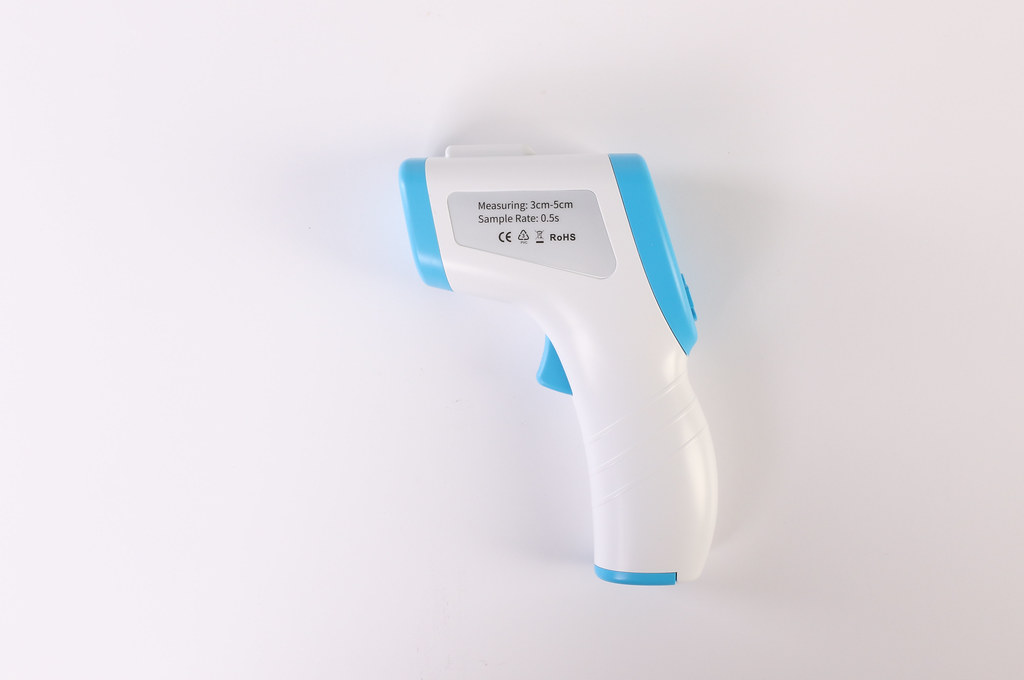
62: Handheld infrared thermometer of the kind used to measure surface temperature for a small area. Isometric Medical Digital Non-Contact Infrared Thermometer Temperature Measurement Device blue white by Jernej Furman, Flickr, CC BY 2.0.
Once you have a good set of validation data, the table that is the basis for accuracy assessment is one that compares numerical values, as in the below example of woody biomass per ha in a forest:
|
Mapped biomass, tons per ha (estimate) |
Observed biomass, tons per ha (reality) |
|
10.1 |
9.2 |
|
5.7 |
4.8 |
|
3.2 |
4.0 |
|
6.7 |
6.6 |
|
7.8 |
7.1 |
|
9.3 |
9.1 |
|
… |
… |
One of the first things we can quantify with this kind of data is whether the mapped estimates are typically underestimates or overestimates, when compared against the validation data. If this is the case, the workflow (algorithm) that produced the estimates is considered biased, and revising it may be in order. The bias can be calculated as the mean error, i.e. the mean value of the estimate minus the validation. We can calculate that by updating Table 10 to get to Table 11:
|
Mapped biomass, tons per ha (estimate) |
Observed biomass, tons per ha (reality) |
Error (estimate– reality) |
|
10.1 |
9.2 |
0.9 |
|
5.7 |
4.8 |
0.9 |
|
3.2 |
4.0 |
-0.8 |
|
6.7 |
6.6 |
0.1 |
|
7.8 |
7.1 |
0.7 |
|
9.3 |
9.1 |
0.2 |
|
… |
… |
|
|
Mean Error: |
0.33 |
|
In Table 11, we can see that the estimates have a mean error of 0.33. In other words, on average the biomass estimates in our map overestimate reality by 0.33 tons per ha. This may or may not warrant refining the algorithm used to produce the estimates, but at least it is something worth reporting to potential users of the biomass map that contains the overestimates.
Another crucial thing to quantify is how wrong the estimates typically are. This is important because you can imagine having an unbiased map that severely overestimates biomass in one part and severely underestimates it elsewhere. Such a map, unbiased, would still be wrong everywhere! The simplest way to report this is using the Mean Absolute Error, as shown in Table 12:
|
Mapped biomass, tons per ha (estimate) |
Observed biomass, tons per ha (reality) |
Error (estimate– reality) |
Absolute Error |
|
10.1 |
9.2 |
0.9 |
0.9 |
|
5.7 |
4.8 |
0.9 |
0.9 |
|
3.2 |
4.0 |
-0.8 |
0.8 |
|
6.7 |
6.6 |
0.1 |
0.1 |
|
7.8 |
7.1 |
0.7 |
0.7 |
|
9.3 |
9.1 |
0.2 |
0.2 |
|
… |
… |
||
|
Mean Absolute Error: |
0.6 |
||
The MAE tells you what difference you should expect between the estimate and reality, but not whether this difference takes the form of an overestimate or an underestimate. As most algorithms used to map continuous variables are very effective at minimizing bias, the MAE is often used to compare different approaches to mapping a continuous variable, considering the approach that leads to the lowest MAE as the ‘best’ one.
An alternative measure of ‘accuracy’ for continuous variables is the Root Mean Squared Error (RMSE), which is calculated as in Table 13:
|
Mapped biomass, tons per ha (estimate) |
Observed biomass, tons per ha (reality) |
Error (estimate– reality) |
Squared Error |
|
10.1 |
9.2 |
0.9 |
0.81 |
|
5.7 |
4.8 |
0.9 |
0.81 |
|
3.2 |
4.0 |
-0.8 |
0.64 |
|
6.7 |
6.6 |
0.1 |
0.01 |
|
7.8 |
7.1 |
0.7 |
0.49 |
|
9.3 |
9.1 |
0.2 |
0.04 |
|
… |
… |
||
|
Mean Squared Error: |
0.47 |
||
|
Root Mean Squared Error: |
0.68 |
||
The RMSE is larger than the MAE (or equal to it, in extremely rare cases) as it weighs large errors more heavily in its calculation. Algorithms that avoid large errors thus benefit when compared using the RMSE, while algorithms that often have very low errors but occasionally have very large errors do not.
Finally, another value that is typically reported when mapping continuous variable is the coefficient of determination, or R2, which indicates how much of the variance in the validation data values (‘reality’) is predictable from the estimates.
While it is important to understand why and how to report on the accuracy of any map you produce, in practical terms it is easier than what it might seem in the above sections. Most software used for image processing has built-in functions for accuracy assessment, and often even provides functionality to help you create the validation data. If the software you use doesn’t let you calculate a specific measure (e.g. the MAE, or the F1 score), it will probably help you export the necessary data to a file that is easily read in Excel, R, or whatever other software you are familiar with and can use to do the rest of the calculations manually.