
2.4: Visualizing Energy Use in the United States
- Page ID
- 15565

\( \newcommand{\vecs}[1]{\overset { \scriptstyle \rightharpoonup} {\mathbf{#1}} } \)
\( \newcommand{\vecd}[1]{\overset{-\!-\!\rightharpoonup}{\vphantom{a}\smash {#1}}} \)
\( \newcommand{\id}{\mathrm{id}}\) \( \newcommand{\Span}{\mathrm{span}}\)
( \newcommand{\kernel}{\mathrm{null}\,}\) \( \newcommand{\range}{\mathrm{range}\,}\)
\( \newcommand{\RealPart}{\mathrm{Re}}\) \( \newcommand{\ImaginaryPart}{\mathrm{Im}}\)
\( \newcommand{\Argument}{\mathrm{Arg}}\) \( \newcommand{\norm}[1]{\| #1 \|}\)
\( \newcommand{\inner}[2]{\langle #1, #2 \rangle}\)
\( \newcommand{\Span}{\mathrm{span}}\)
\( \newcommand{\id}{\mathrm{id}}\)
\( \newcommand{\Span}{\mathrm{span}}\)
\( \newcommand{\kernel}{\mathrm{null}\,}\)
\( \newcommand{\range}{\mathrm{range}\,}\)
\( \newcommand{\RealPart}{\mathrm{Re}}\)
\( \newcommand{\ImaginaryPart}{\mathrm{Im}}\)
\( \newcommand{\Argument}{\mathrm{Arg}}\)
\( \newcommand{\norm}[1]{\| #1 \|}\)
\( \newcommand{\inner}[2]{\langle #1, #2 \rangle}\)
\( \newcommand{\Span}{\mathrm{span}}\) \( \newcommand{\AA}{\unicode[.8,0]{x212B}}\)
\( \newcommand{\vectorA}[1]{\vec{#1}} % arrow\)
\( \newcommand{\vectorAt}[1]{\vec{\text{#1}}} % arrow\)
\( \newcommand{\vectorB}[1]{\overset { \scriptstyle \rightharpoonup} {\mathbf{#1}} } \)
\( \newcommand{\vectorC}[1]{\textbf{#1}} \)
\( \newcommand{\vectorD}[1]{\overrightarrow{#1}} \)
\( \newcommand{\vectorDt}[1]{\overrightarrow{\text{#1}}} \)
\( \newcommand{\vectE}[1]{\overset{-\!-\!\rightharpoonup}{\vphantom{a}\smash{\mathbf {#1}}}} \)
\( \newcommand{\vecs}[1]{\overset { \scriptstyle \rightharpoonup} {\mathbf{#1}} } \)
\( \newcommand{\vecd}[1]{\overset{-\!-\!\rightharpoonup}{\vphantom{a}\smash {#1}}} \)
\(\newcommand{\avec}{\mathbf a}\) \(\newcommand{\bvec}{\mathbf b}\) \(\newcommand{\cvec}{\mathbf c}\) \(\newcommand{\dvec}{\mathbf d}\) \(\newcommand{\dtil}{\widetilde{\mathbf d}}\) \(\newcommand{\evec}{\mathbf e}\) \(\newcommand{\fvec}{\mathbf f}\) \(\newcommand{\nvec}{\mathbf n}\) \(\newcommand{\pvec}{\mathbf p}\) \(\newcommand{\qvec}{\mathbf q}\) \(\newcommand{\svec}{\mathbf s}\) \(\newcommand{\tvec}{\mathbf t}\) \(\newcommand{\uvec}{\mathbf u}\) \(\newcommand{\vvec}{\mathbf v}\) \(\newcommand{\wvec}{\mathbf w}\) \(\newcommand{\xvec}{\mathbf x}\) \(\newcommand{\yvec}{\mathbf y}\) \(\newcommand{\zvec}{\mathbf z}\) \(\newcommand{\rvec}{\mathbf r}\) \(\newcommand{\mvec}{\mathbf m}\) \(\newcommand{\zerovec}{\mathbf 0}\) \(\newcommand{\onevec}{\mathbf 1}\) \(\newcommand{\real}{\mathbb R}\) \(\newcommand{\twovec}[2]{\left[\begin{array}{r}#1 \\ #2 \end{array}\right]}\) \(\newcommand{\ctwovec}[2]{\left[\begin{array}{c}#1 \\ #2 \end{array}\right]}\) \(\newcommand{\threevec}[3]{\left[\begin{array}{r}#1 \\ #2 \\ #3 \end{array}\right]}\) \(\newcommand{\cthreevec}[3]{\left[\begin{array}{c}#1 \\ #2 \\ #3 \end{array}\right]}\) \(\newcommand{\fourvec}[4]{\left[\begin{array}{r}#1 \\ #2 \\ #3 \\ #4 \end{array}\right]}\) \(\newcommand{\cfourvec}[4]{\left[\begin{array}{c}#1 \\ #2 \\ #3 \\ #4 \end{array}\right]}\) \(\newcommand{\fivevec}[5]{\left[\begin{array}{r}#1 \\ #2 \\ #3 \\ #4 \\ #5 \\ \end{array}\right]}\) \(\newcommand{\cfivevec}[5]{\left[\begin{array}{c}#1 \\ #2 \\ #3 \\ #4 \\ #5 \\ \end{array}\right]}\) \(\newcommand{\mattwo}[4]{\left[\begin{array}{rr}#1 \amp #2 \\ #3 \amp #4 \\ \end{array}\right]}\) \(\newcommand{\laspan}[1]{\text{Span}\{#1\}}\) \(\newcommand{\bcal}{\cal B}\) \(\newcommand{\ccal}{\cal C}\) \(\newcommand{\scal}{\cal S}\) \(\newcommand{\wcal}{\cal W}\) \(\newcommand{\ecal}{\cal E}\) \(\newcommand{\coords}[2]{\left\{#1\right\}_{#2}}\) \(\newcommand{\gray}[1]{\color{gray}{#1}}\) \(\newcommand{\lgray}[1]{\color{lightgray}{#1}}\) \(\newcommand{\rank}{\operatorname{rank}}\) \(\newcommand{\row}{\text{Row}}\) \(\newcommand{\col}{\text{Col}}\) \(\renewcommand{\row}{\text{Row}}\) \(\newcommand{\nul}{\text{Nul}}\) \(\newcommand{\var}{\text{Var}}\) \(\newcommand{\corr}{\text{corr}}\) \(\newcommand{\len}[1]{\left|#1\right|}\) \(\newcommand{\bbar}{\overline{\bvec}}\) \(\newcommand{\bhat}{\widehat{\bvec}}\) \(\newcommand{\bperp}{\bvec^\perp}\) \(\newcommand{\xhat}{\widehat{\xvec}}\) \(\newcommand{\vhat}{\widehat{\vvec}}\) \(\newcommand{\uhat}{\widehat{\uvec}}\) \(\newcommand{\what}{\widehat{\wvec}}\) \(\newcommand{\Sighat}{\widehat{\Sigma}}\) \(\newcommand{\lt}{<}\) \(\newcommand{\gt}{>}\) \(\newcommand{\amp}{&}\) \(\definecolor{fillinmathshade}{gray}{0.9}\)The economy of the United States needs roughly one hundred quadrillion Btu’s to function each year. One quadrillion – the number 10 followed by fifteen zeros (10,000,000,000,000,000) sounds like a huge number, and it is. 100 quadrillion Btu’s is enough energy for a few hundred million trips to the moon, or to light tens of billions of light bulbs for an entire year.
How different energy sources power different parts of the U.S. economy can be visualized using an energy flow diagram or “Sankey Diagram” like the one from the Lawrence Livermore National Laboratory shown in Figure 2. The diagram looks complicated, but once you get the hang of it you’ll see that it contains an incredible amount of information. Watch the video below to gain a better understanding of how to read the diagram.
How to read an LLNL energy flow chart (Sankey diagram) (3:02)
Sankey Diagram
Let’s start with the left-hand side of the diagram. Each of the colored boxes represents a specific fuel, like natural gas, coal or hydropower. (Electricity is not a “fuel” in and of itself but is generated using other fuels, which is why electricity does not appear alongside the other fuels on the left-hand side of the diagram.) The size of the boxes represents the amount of each fuel used in the U.S. economy each year, and the numbers in the boxes represent the number of quadrillion Btu’s of each fuel used. For example, in 2015 the U.S. used about twice as much natural gas as coal (15.7 quadrillion Btu of coal versus 28.3 quadrillion Btu of natural gas). Thus, the size of the natural gas box is larger than the size of the coal box.
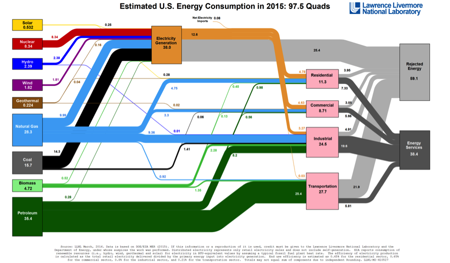
Moving from left to right in the Sankey diagram, the paths coming out of each fuel box illustrate how each fuel is used to power the U.S. economy in one of five ways:
- Generation of electric power (which is then used in buildings for heating, cooling, lighting and other uses)
- Residential: Use in homes, for example for heating and cooking
- Commercial: Use in businesses, for heating/cooling buildings
- Industrial: Use in factories and manufacturing facilities
- Transportation: Use for cars, buses, planes and so forth
The size of each of the paths describes how much of each fuel is used in each sector of the U.S. economy. The number next to each path shows the number of quadrillion Btu of each fuel is used in each economic sector. For example, if you follow the five paths out of the natural gas box you will see the following:
- 9.99 Quadrillion Btu of natural gas are used to generate electricity
- 4.75 Quadrillion Btu of natural gas are used in households
- 3.3 Quadrillion Btu of natural gas are used to in commercial buildings
- 9.36 Quadrillion Btu of natural gas are used in factories and manufacturing
- 0.92 Quadrillion Btu of natural gas are used in transportation
The Sankey diagram thus tells you that around two-thirds of the natural gas used in the U.S. every year goes to power plants and industry, while very little natural gas is used to fuel cars, buses and trucks.
As a point of comparison, look at the boxes for nuclear and petroleum. What differences do you spot in how these fuels are used in the U.S. economy, relative to natural gas? We can see that there is only one path coming out of the nuclear box, which goes directly to the electricity generation box. This means that all nuclear fuel used in the U.S. goes into power plants. (This should not come as a big surprise – we don’t see nuclear-powered cars on the road.) Looking at the paths coming out of the petroleum box, we can see that most of the oil used in the U.S. economy goes either to industrial boilers or for transportation fuel. Very little oil is used in buildings (some people and buildings still use furnaces that run on fuel oil) and even less is used to generate electricity.
Finally, the right-hand part of the Sankey diagram reveals an awful truth about the U.S. energy system: it is incredibly wasteful. Our power plants, cars and buildings just do not use energy very efficiently. You can see this in the two gray boxes on the right-hand side of the Sankey diagram. The darker gray box at the bottom labeled ‘Energy Services’ shows how much of the fuel from coal, oil, natural gas, wind, and so forth is actually put to useful work to move cars, light buildings and so forth. The lighter gray box labeled ‘Rejected Energy’ captures how much energy we waste because we use highly inefficient technologies in our power plants, cars and buildings. Looking at the amount of ‘Rejected Energy’ (59.1 quadrillion Btu) versus ‘Energy Services’ (38.4 quadrillion Btu), we can see that we waste about 60% of the fuel that we use to power the U.S. economy every year. The biggest waste comes from generating electricity (where we waste about two-thirds of all the fuel we put into power plants) and from transportation (where we waste around 80%).