4.7: Different Methods for Determining Recurrence Interval
- Page ID
- 9817
\( \newcommand{\vecs}[1]{\overset { \scriptstyle \rightharpoonup} {\mathbf{#1}} } \)
\( \newcommand{\vecd}[1]{\overset{-\!-\!\rightharpoonup}{\vphantom{a}\smash {#1}}} \)
\( \newcommand{\id}{\mathrm{id}}\) \( \newcommand{\Span}{\mathrm{span}}\)
( \newcommand{\kernel}{\mathrm{null}\,}\) \( \newcommand{\range}{\mathrm{range}\,}\)
\( \newcommand{\RealPart}{\mathrm{Re}}\) \( \newcommand{\ImaginaryPart}{\mathrm{Im}}\)
\( \newcommand{\Argument}{\mathrm{Arg}}\) \( \newcommand{\norm}[1]{\| #1 \|}\)
\( \newcommand{\inner}[2]{\langle #1, #2 \rangle}\)
\( \newcommand{\Span}{\mathrm{span}}\)
\( \newcommand{\id}{\mathrm{id}}\)
\( \newcommand{\Span}{\mathrm{span}}\)
\( \newcommand{\kernel}{\mathrm{null}\,}\)
\( \newcommand{\range}{\mathrm{range}\,}\)
\( \newcommand{\RealPart}{\mathrm{Re}}\)
\( \newcommand{\ImaginaryPart}{\mathrm{Im}}\)
\( \newcommand{\Argument}{\mathrm{Arg}}\)
\( \newcommand{\norm}[1]{\| #1 \|}\)
\( \newcommand{\inner}[2]{\langle #1, #2 \rangle}\)
\( \newcommand{\Span}{\mathrm{span}}\) \( \newcommand{\AA}{\unicode[.8,0]{x212B}}\)
\( \newcommand{\vectorA}[1]{\vec{#1}} % arrow\)
\( \newcommand{\vectorAt}[1]{\vec{\text{#1}}} % arrow\)
\( \newcommand{\vectorB}[1]{\overset { \scriptstyle \rightharpoonup} {\mathbf{#1}} } \)
\( \newcommand{\vectorC}[1]{\textbf{#1}} \)
\( \newcommand{\vectorD}[1]{\overrightarrow{#1}} \)
\( \newcommand{\vectorDt}[1]{\overrightarrow{\text{#1}}} \)
\( \newcommand{\vectE}[1]{\overset{-\!-\!\rightharpoonup}{\vphantom{a}\smash{\mathbf {#1}}}} \)
\( \newcommand{\vecs}[1]{\overset { \scriptstyle \rightharpoonup} {\mathbf{#1}} } \)
\( \newcommand{\vecd}[1]{\overset{-\!-\!\rightharpoonup}{\vphantom{a}\smash {#1}}} \)
\(\newcommand{\avec}{\mathbf a}\) \(\newcommand{\bvec}{\mathbf b}\) \(\newcommand{\cvec}{\mathbf c}\) \(\newcommand{\dvec}{\mathbf d}\) \(\newcommand{\dtil}{\widetilde{\mathbf d}}\) \(\newcommand{\evec}{\mathbf e}\) \(\newcommand{\fvec}{\mathbf f}\) \(\newcommand{\nvec}{\mathbf n}\) \(\newcommand{\pvec}{\mathbf p}\) \(\newcommand{\qvec}{\mathbf q}\) \(\newcommand{\svec}{\mathbf s}\) \(\newcommand{\tvec}{\mathbf t}\) \(\newcommand{\uvec}{\mathbf u}\) \(\newcommand{\vvec}{\mathbf v}\) \(\newcommand{\wvec}{\mathbf w}\) \(\newcommand{\xvec}{\mathbf x}\) \(\newcommand{\yvec}{\mathbf y}\) \(\newcommand{\zvec}{\mathbf z}\) \(\newcommand{\rvec}{\mathbf r}\) \(\newcommand{\mvec}{\mathbf m}\) \(\newcommand{\zerovec}{\mathbf 0}\) \(\newcommand{\onevec}{\mathbf 1}\) \(\newcommand{\real}{\mathbb R}\) \(\newcommand{\twovec}[2]{\left[\begin{array}{r}#1 \\ #2 \end{array}\right]}\) \(\newcommand{\ctwovec}[2]{\left[\begin{array}{c}#1 \\ #2 \end{array}\right]}\) \(\newcommand{\threevec}[3]{\left[\begin{array}{r}#1 \\ #2 \\ #3 \end{array}\right]}\) \(\newcommand{\cthreevec}[3]{\left[\begin{array}{c}#1 \\ #2 \\ #3 \end{array}\right]}\) \(\newcommand{\fourvec}[4]{\left[\begin{array}{r}#1 \\ #2 \\ #3 \\ #4 \end{array}\right]}\) \(\newcommand{\cfourvec}[4]{\left[\begin{array}{c}#1 \\ #2 \\ #3 \\ #4 \end{array}\right]}\) \(\newcommand{\fivevec}[5]{\left[\begin{array}{r}#1 \\ #2 \\ #3 \\ #4 \\ #5 \\ \end{array}\right]}\) \(\newcommand{\cfivevec}[5]{\left[\begin{array}{c}#1 \\ #2 \\ #3 \\ #4 \\ #5 \\ \end{array}\right]}\) \(\newcommand{\mattwo}[4]{\left[\begin{array}{rr}#1 \amp #2 \\ #3 \amp #4 \\ \end{array}\right]}\) \(\newcommand{\laspan}[1]{\text{Span}\{#1\}}\) \(\newcommand{\bcal}{\cal B}\) \(\newcommand{\ccal}{\cal C}\) \(\newcommand{\scal}{\cal S}\) \(\newcommand{\wcal}{\cal W}\) \(\newcommand{\ecal}{\cal E}\) \(\newcommand{\coords}[2]{\left\{#1\right\}_{#2}}\) \(\newcommand{\gray}[1]{\color{gray}{#1}}\) \(\newcommand{\lgray}[1]{\color{lightgray}{#1}}\) \(\newcommand{\rank}{\operatorname{rank}}\) \(\newcommand{\row}{\text{Row}}\) \(\newcommand{\col}{\text{Col}}\) \(\renewcommand{\row}{\text{Row}}\) \(\newcommand{\nul}{\text{Nul}}\) \(\newcommand{\var}{\text{Var}}\) \(\newcommand{\corr}{\text{corr}}\) \(\newcommand{\len}[1]{\left|#1\right|}\) \(\newcommand{\bbar}{\overline{\bvec}}\) \(\newcommand{\bhat}{\widehat{\bvec}}\) \(\newcommand{\bperp}{\bvec^\perp}\) \(\newcommand{\xhat}{\widehat{\xvec}}\) \(\newcommand{\vhat}{\widehat{\vvec}}\) \(\newcommand{\uhat}{\widehat{\uvec}}\) \(\newcommand{\what}{\widehat{\wvec}}\) \(\newcommand{\Sighat}{\widehat{\Sigma}}\) \(\newcommand{\lt}{<}\) \(\newcommand{\gt}{>}\) \(\newcommand{\amp}{&}\) \(\definecolor{fillinmathshade}{gray}{0.9}\)Why the disagreement about seismic risk at New Madrid?
The New Madrid Seismic Zone presents a difficult problem. We know that large earthquakes have happened in the past. If earthquakes of that magnitude happened today, the damage and recovery would be difficult. Here is the problem: how big were those historical earthquakes actually? How likely are they to happen again? How should the cost of retrofitting be weighed against the predicted cost of a large earthquake? Scientists and policymakers have different training. Scientists are trained to assess the recurrence interval and estimate the ground motion of hypothetical events, while policymakers are trained to assess normative problems (i.e. given a seismic risk at some level, what should we do about it?)
In the data analyses you just completed, you became familiar with earthquake catalogs, including their strengths and limitations. You practiced looking at frequency-magnitude diagrams and you used this data to estimate the recurrence interval for earthquakes of various sizes. In fact, seismological data is just one of the tools scientists use to estimate earthquake recurrence interval. In the reading activity on the next page, you will break up into groups to investigate other methods of studying the NMSZ.
Geodetic Surveys
Over the past ten or fifteen years, global positioning system satellite data has become an invaluable tool for measuring plate motion and strain accumulation across faults. This data is gathered by installing geodetic markers in the ground. Scientists then use GPS receivers at the sites of the markers to find out their exact locations from satellites. Over time, the position of some markers may shift relative to each other; for example, markers on opposite sides of a fault may move closer together or further apart or be offset laterally as the years go by. This motion can be used to infer the strain rate in the crust. In the case of the New Madrid Seismic Zone, the faults are buried, so GPS data can help to find out exactly where the faults are and to determine the direction and extent of motion along them.
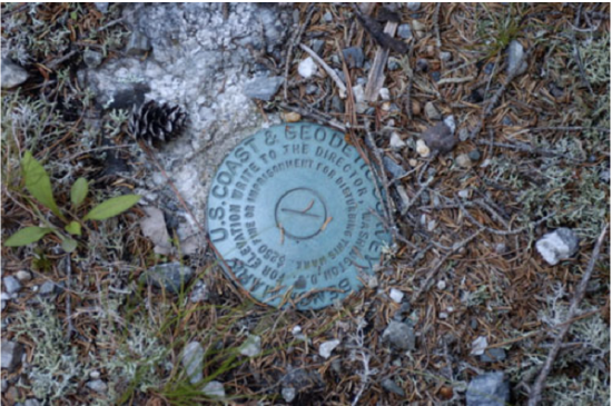
Credit: Jason Philbrook / Wikipedi
After several years of repeated measurements, the motion of the markers over the measurement time period is assessed. At active plate boundaries, such as along the San Andreas Fault on the West Coast of the United States, geodetic surveys have been used in concert with detailed records of seismicity to estimate stress buildup on faults and to predict seismic hazard. For example, a suite of geodetic markers may be placed around a fault of interest. After many measurements, the motion of the markers relative to each other can confirm the sense of motion on the fault, how fast the plates on either side of the fault are moving, and whether the fault itself is creeping or locked.
There have been several GPS campaigns over the last decade whose purpose has been to discover how much strain is building up at the New Madrid Seismic Zone. This work has been tricky because the faults involved are not well mapped, so the decision about where to place the markers hasn't been straightforward. The debate is still ongoing concerning whether the strain rates are high, thus posing a great seismic risk, or whether the strain rates are low, thus posing a lesser seismic risk to the area.
The map below shows current GPS stations operating in the USA.
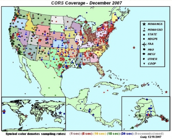
Credit: NGS
Paleoseismology
Some faults can be excavated and mapped geologically in order to find out about the recurrence interval for large earthquakes. This sort of work is often done by digging a big trench with a backhoe and then trying to date any large offsets that are found. This technique is useful because the largest possible earthquakes of even quite active faults usually happen several hundred years apart. (Recall the ballpark range of recurrence intervals you estimated in your data analysis exercise.) We simply don’t have seismicity records that go back that far in this country. Dates for prehistoric earthquakes can be estimated by using the dates of the sediments that have been interrupted by an earthquake or some bit of organic material, such as charcoal, in an adjacent layer that can be dated. In the New Madrid Seismic Zone, stream offsets and evidence of liquefaction (sand blows and dikes) caused by strong shaking are also clues to past earthquakes. Paleoseismologists use all these clues to try to put together a timeline of recurrence interval and the approximate earthquake magnitude for a particular fault. These data can be linked with seismicity catalogs and geodetic surveys to get a fuller picture of seismic hazard.
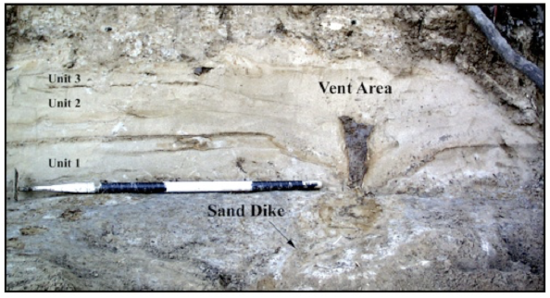
Credit: M. Tuttle and Associates
Watch this!
To see excavation and mapping in action, check out this short video from Teachers' Domain and NOVA Online about the work of Kerry Sieh, a paleoseismologist at The Earth Observatory of Singapore (He was a prof at Caltech when they made this video).
Video: NOVA: The Work of Kerry Sieh (3:19)
NOVA: The Work of Kerry Sieh
- Click here for a transcript of NOVA: The Work of Kerry Sieh.
-
PRESENTER: A young geologist named Kerry Sieh started work that would lead to a new approach to earthquake prediction based on the prehistoric record. The theory of plate tectonics told him that the buildup of strain along the fault was steady. Perhaps there was some regularity in the release.
Another 10-meter earthquake might take place when another 10 meters of strain had built up. Kerry needed to figure out the rate at which the strain was accumulating. A stream that had been moved off course by a series of earthquakes offered a tantalizing clue.
KERRY SIEH: We recognized that this channel at one time flowed across the fault in a straight line, but it has been offset now 130 meters. But it now has a dogleg in it along the fault and then continues to flow out into the valley.
PRESENTER: If Kerry could determine how long ago the creek ran straight across the fault, then by simply dividing the distance it had moved by the number of years it had taken, he would arrive at the rate of strain accumulation. The history of the now dry stream bed could be read in the way that sediments had been deposited over the centuries.
A trench 12 feet deep has been cut across the fault. A sedimentary record of the past 3,000 years is exposed. Each layer is identified and marked. Breaks in the layers are the result of earthquakes. Eventually, samples will be collected and earthquakes dated. Individual earthquakes can be identified with the help of a diagram, like this one made at a site called Pallett Creek.
KERRY SIEH: As the sediments have been accumulating over the past two millennia, they've recorded the story of the San Andreas Fault. The reason they've done that is that every hundred or a couple hundred years, the San Andreas fault breaks and disrupts these sediments, as you can see here.
Now let's look, for example, at this particular place. This layer was the ground surface in 1480 AD, about the time that Columbus was discovering America. So you can imagine a little Native American boy standing here about four feet high on this old marshy, boggy ground. If he'd been standing right here, what he would have seen, looking out this way, is the ground suddenly drop and shift this way during the great earthquake.
What formed was a scarp about a foot high, or about 30 centimeters high, here. You can see this layer has been broken off from its continuation over here. In the succeeding 100 or 200 or 300 years, these layers of sand and silt and peat accumulated and buried that fault scarp completely. So here we are here we have a beautiful example of a buried fault scarp produced by a paleo earthquake, or an ancient prehistoric earthquake, about the time that Columbus was setting foot in North America.Credit: NOVA
This video is shared under a PBS LearningMedia Educational license
PRESENTER: A young geologist named Kerry Sieh started work that would lead to a new approach to earthquake prediction based on the prehistoric record. The theory of plate tectonics told him that the buildup of strain along the fault was steady. Perhaps there was some regularity in the release.
Another 10-meter earthquake might take place when another 10 meters of strain had built up. Kerry needed to figure out the rate at which the strain was accumulating. A stream that had been moved off course by a series of earthquakes offered a tantalizing clue.
KERRY SIEH: We recognized that this channel at one time flowed across the fault in a straight line, but it has been offset now 130 meters. But it now has a dogleg in it along the fault and then continues to flow out into the valley.
PRESENTER: If Kerry could determine how long ago the creek ran straight across the fault, then by simply dividing the distance it had moved by the number of years it had taken, he would arrive at the rate of strain accumulation. The history of the now dry stream bed could be read in the way that sediments had been deposited over the centuries.
A trench 12 feet deep has been cut across the fault. A sedimentary record of the past 3,000 years is exposed. Each layer is identified and marked. Breaks in the layers are the result of earthquakes. Eventually, samples will be collected and earthquakes dated. Individual earthquakes can be identified with the help of a diagram, like this one made at a site called Pallett Creek.
KERRY SIEH: As the sediments have been accumulating over the past two millennia, they've recorded the story of the San Andreas Fault. The reason they've done that is that every hundred or a couple hundred years, the San Andreas fault breaks and disrupts these sediments, as you can see here.
Now let's look, for example, at this particular place. This layer was the ground surface in 1480 AD, about the time that Columbus was discovering America. So you can imagine a little Native American boy standing here about four feet high on this old marshy, boggy ground. If he'd been standing right here, what he would have seen, looking out this way, is the ground suddenly drop and shift this way during the great earthquake.
What formed was a scarp about a foot high, or about 30 centimeters high, here. You can see this layer has been broken off from its continuation over here. In the succeeding 100 or 200 or 300 years, these layers of sand and silt and peat accumulated and buried that fault scarp completely. So here we are here we have a beautiful example of a buried fault scarp produced by a paleo earthquake, or an ancient prehistoric earthquake, about the time that Columbus was setting foot in North America.
Credit: NOVA
Credit: University of Michigan
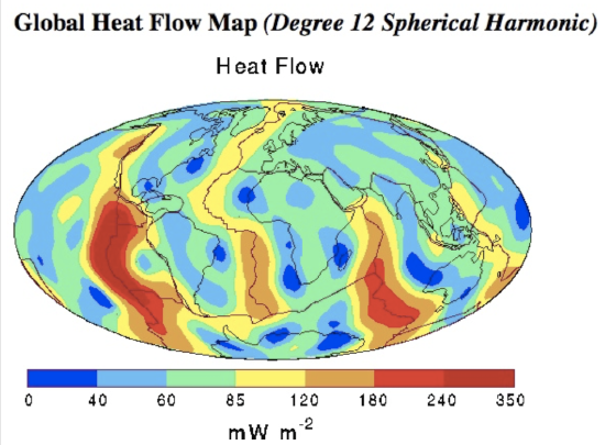
This map shows color-coded contours of the global distribution of heat flow at the surface of the Earth's crust. Major plate boundaries and continent outlines are also shown. The fundamental data embodied in this map are the more than 24,000 field measurements in both continental and oceanic terrains, supplemented by estimates of the heat flow in the unsurveyed regions. The estimates are based on empirically determined characteristic values for the heat flux in various geological and tectonic settings. Observations of the oceanic heat flux have been corrected for heat loss by hydrothermal circulation through the oceanic crust. The global data set so assembled was then subjected to a spherical harmonic analysis. The map is a representation of the heat flow to spherical harmonic degree and order 12.
What does this have to do with the New Madrid Seismic Zone? By looking at the map above, you can see that the amount of heat flowing out of the Earth is not uniform over the surface of the planet. Some areas have much higher heat flow than others and these areas are usually associated with tectonic activity such as volcanism and plate boundaries. For example, the boundaries of the North American plate, the Mid-Atlantic Ridge and the San Andreas fault system, both show up as "warm" places on this map. Heat flow measurements have been made in the New Madrid Seismic Zone to see whether this is a high heat flow area compared to what would be expected for the interior of a continent. (Conventional geophysical wisdom holds that the interior of continents should be old, cold, and stable.) If heat flow is higher than expected, this would be evidence for why earthquakes happen in this area. This remains a point of scientific contention. Past surveys concluded that heat flow was high in the NMSZ, but the most recent studies disagree with those earlier findings.
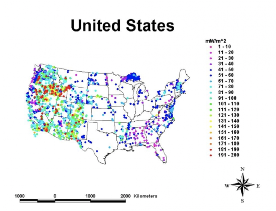
The map below comes from the Global Heat Flow Database, at the University of North Dakota. They have heat flow maps and data files for all different parts of the world. This particular map shows borehole data for the United States. Warm colors denote higher heat flow than cool colors (see the legend, which shows milliwatts per meter squared values color-coded). Notice that this map looks different than the global map above. It looks different because it shows exact borehole measurements as opposed to smoothed values that have been interpolated over the whole map. Where is the heat flow highest? Where is it lowest? Compare this map with the map above to see whether they are consistent for the US.
Credit: The International Heat Flow Commission


