
5.3: Explaining Patterns of Air Temperature
- Page ID
- 15184

\( \newcommand{\vecs}[1]{\overset { \scriptstyle \rightharpoonup} {\mathbf{#1}} } \)
\( \newcommand{\vecd}[1]{\overset{-\!-\!\rightharpoonup}{\vphantom{a}\smash {#1}}} \)
\( \newcommand{\id}{\mathrm{id}}\) \( \newcommand{\Span}{\mathrm{span}}\)
( \newcommand{\kernel}{\mathrm{null}\,}\) \( \newcommand{\range}{\mathrm{range}\,}\)
\( \newcommand{\RealPart}{\mathrm{Re}}\) \( \newcommand{\ImaginaryPart}{\mathrm{Im}}\)
\( \newcommand{\Argument}{\mathrm{Arg}}\) \( \newcommand{\norm}[1]{\| #1 \|}\)
\( \newcommand{\inner}[2]{\langle #1, #2 \rangle}\)
\( \newcommand{\Span}{\mathrm{span}}\)
\( \newcommand{\id}{\mathrm{id}}\)
\( \newcommand{\Span}{\mathrm{span}}\)
\( \newcommand{\kernel}{\mathrm{null}\,}\)
\( \newcommand{\range}{\mathrm{range}\,}\)
\( \newcommand{\RealPart}{\mathrm{Re}}\)
\( \newcommand{\ImaginaryPart}{\mathrm{Im}}\)
\( \newcommand{\Argument}{\mathrm{Arg}}\)
\( \newcommand{\norm}[1]{\| #1 \|}\)
\( \newcommand{\inner}[2]{\langle #1, #2 \rangle}\)
\( \newcommand{\Span}{\mathrm{span}}\) \( \newcommand{\AA}{\unicode[.8,0]{x212B}}\)
\( \newcommand{\vectorA}[1]{\vec{#1}} % arrow\)
\( \newcommand{\vectorAt}[1]{\vec{\text{#1}}} % arrow\)
\( \newcommand{\vectorB}[1]{\overset { \scriptstyle \rightharpoonup} {\mathbf{#1}} } \)
\( \newcommand{\vectorC}[1]{\textbf{#1}} \)
\( \newcommand{\vectorD}[1]{\overrightarrow{#1}} \)
\( \newcommand{\vectorDt}[1]{\overrightarrow{\text{#1}}} \)
\( \newcommand{\vectE}[1]{\overset{-\!-\!\rightharpoonup}{\vphantom{a}\smash{\mathbf {#1}}}} \)
\( \newcommand{\vecs}[1]{\overset { \scriptstyle \rightharpoonup} {\mathbf{#1}} } \)
\( \newcommand{\vecd}[1]{\overset{-\!-\!\rightharpoonup}{\vphantom{a}\smash {#1}}} \)
\(\newcommand{\avec}{\mathbf a}\) \(\newcommand{\bvec}{\mathbf b}\) \(\newcommand{\cvec}{\mathbf c}\) \(\newcommand{\dvec}{\mathbf d}\) \(\newcommand{\dtil}{\widetilde{\mathbf d}}\) \(\newcommand{\evec}{\mathbf e}\) \(\newcommand{\fvec}{\mathbf f}\) \(\newcommand{\nvec}{\mathbf n}\) \(\newcommand{\pvec}{\mathbf p}\) \(\newcommand{\qvec}{\mathbf q}\) \(\newcommand{\svec}{\mathbf s}\) \(\newcommand{\tvec}{\mathbf t}\) \(\newcommand{\uvec}{\mathbf u}\) \(\newcommand{\vvec}{\mathbf v}\) \(\newcommand{\wvec}{\mathbf w}\) \(\newcommand{\xvec}{\mathbf x}\) \(\newcommand{\yvec}{\mathbf y}\) \(\newcommand{\zvec}{\mathbf z}\) \(\newcommand{\rvec}{\mathbf r}\) \(\newcommand{\mvec}{\mathbf m}\) \(\newcommand{\zerovec}{\mathbf 0}\) \(\newcommand{\onevec}{\mathbf 1}\) \(\newcommand{\real}{\mathbb R}\) \(\newcommand{\twovec}[2]{\left[\begin{array}{r}#1 \\ #2 \end{array}\right]}\) \(\newcommand{\ctwovec}[2]{\left[\begin{array}{c}#1 \\ #2 \end{array}\right]}\) \(\newcommand{\threevec}[3]{\left[\begin{array}{r}#1 \\ #2 \\ #3 \end{array}\right]}\) \(\newcommand{\cthreevec}[3]{\left[\begin{array}{c}#1 \\ #2 \\ #3 \end{array}\right]}\) \(\newcommand{\fourvec}[4]{\left[\begin{array}{r}#1 \\ #2 \\ #3 \\ #4 \end{array}\right]}\) \(\newcommand{\cfourvec}[4]{\left[\begin{array}{c}#1 \\ #2 \\ #3 \\ #4 \end{array}\right]}\) \(\newcommand{\fivevec}[5]{\left[\begin{array}{r}#1 \\ #2 \\ #3 \\ #4 \\ #5 \\ \end{array}\right]}\) \(\newcommand{\cfivevec}[5]{\left[\begin{array}{c}#1 \\ #2 \\ #3 \\ #4 \\ #5 \\ \end{array}\right]}\) \(\newcommand{\mattwo}[4]{\left[\begin{array}{rr}#1 \amp #2 \\ #3 \amp #4 \\ \end{array}\right]}\) \(\newcommand{\laspan}[1]{\text{Span}\{#1\}}\) \(\newcommand{\bcal}{\cal B}\) \(\newcommand{\ccal}{\cal C}\) \(\newcommand{\scal}{\cal S}\) \(\newcommand{\wcal}{\cal W}\) \(\newcommand{\ecal}{\cal E}\) \(\newcommand{\coords}[2]{\left\{#1\right\}_{#2}}\) \(\newcommand{\gray}[1]{\color{gray}{#1}}\) \(\newcommand{\lgray}[1]{\color{lightgray}{#1}}\) \(\newcommand{\rank}{\operatorname{rank}}\) \(\newcommand{\row}{\text{Row}}\) \(\newcommand{\col}{\text{Col}}\) \(\renewcommand{\row}{\text{Row}}\) \(\newcommand{\nul}{\text{Nul}}\) \(\newcommand{\var}{\text{Var}}\) \(\newcommand{\corr}{\text{corr}}\) \(\newcommand{\len}[1]{\left|#1\right|}\) \(\newcommand{\bbar}{\overline{\bvec}}\) \(\newcommand{\bhat}{\widehat{\bvec}}\) \(\newcommand{\bperp}{\bvec^\perp}\) \(\newcommand{\xhat}{\widehat{\xvec}}\) \(\newcommand{\vhat}{\widehat{\vvec}}\) \(\newcommand{\uhat}{\widehat{\uvec}}\) \(\newcommand{\what}{\widehat{\wvec}}\) \(\newcommand{\Sighat}{\widehat{\Sigma}}\) \(\newcommand{\lt}{<}\) \(\newcommand{\gt}{>}\) \(\newcommand{\amp}{&}\) \(\definecolor{fillinmathshade}{gray}{0.9}\)Explaining Patterns of Air Temperature
Global patterns of air temperature are a reflection of the relative importance of sun angle and insolation intensity, day length, and location with respect to water bodies. We have found that low latitude locations experience less variation in sun angle and day length than do mid- and high latitude locations. Places located near large bodies of water tend to have more moderate temperatures than those further inland.
Mapping Patterns of Air Temperature
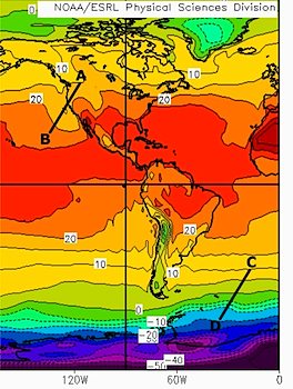
Isotherms, lines connecting points of equal air temperature are used to map the geographic pattern of temperature across the earth's surface. The spacing of isotherms depict the temperature gradient across a portion of the Earth's surface. Widely spaced isotherms (line A-B in Figure \(\PageIndex{1}\)) indicate a small change in temperature over distance and closely spaced isotherms (line C-D in Figure \(\PageIndex{1}\)) indicate large changes in temperature.
The shape of isotherms as they appear on a map are influenced by the distribution of large land masses and water bodies and the time of the year. Follow the 10C (50F) isotherm from left to right across the Figure \(\PageIndex{2}\). During January, the water stays warmer than the land causing the 10C isotherm to shift toward the south. In July (Figure \(\PageIndex{3}\)) the 10C isotherm swings to the north as we move from the cool water to the warmer land. This differential heating of land and water results in a small variation in the position of the 10C isotherm over water but a much larger variation over land.
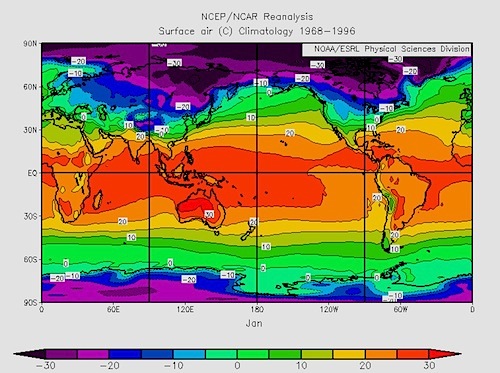
We can certainly see the effect of differential heating of oceans and continents in the average January and July temperature maps depicted in figures \(\PageIndex{2}\) and \(\PageIndex{3}\). The isotherms are more linear (straight across) in the Southern hemisphere. Isotherms bend much more between seasons in the Northern Hemisphere than in the Southern Hemisphere. The Southern hemisphere is more uniformly water than the Northern hemisphere. Large landmasses in the Northern hemisphere cause isotherms to bend toward the equator in winter and poles in summer as they change their temperature much more than the water. Air temperatures over land fluctuate more because land changes its temperature much more rapidly than ocean water does. Thus they shift north and south much more over land through the year than they do over water.
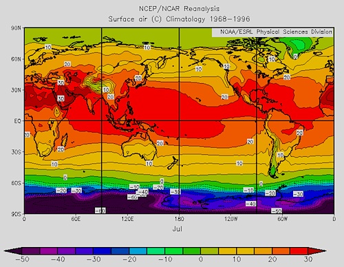
Comparing the difference in the values of the isotherms between seasons, the smallest temperature ranges are found near the equator while the largest are found over high latitude continental interiors, Siberia for example.
The difference in temperature across latitudes is the latitudinal temperature gradient. The winter hemisphere (January for the Northern hemisphere, July for the Southern Hemisphere) has the larger temperature gradients as shown by the closely spaced isotherms. Also note that the temperature gradient is steepest in the midlatitude to subarctic geographical zones. Here is where strongly contrasting tropical and polar type air masses clash along the polar front.
Latitudinal Patterns (north to south patterns)
The values of the isotherms validate our general conception of the distribution of world temperatures. Low latitudes that experience the highest sun angles throughout the year have the highest air temperatures. The highest temperatures occur in the tropical and subtropical deserts of North Africa, Australia, and the southwestern portion of the United States. Because the angle of the sun doesn't vary much during the year and day length is about the same, annual temperature ranges tend to be small, on the order of only a few degrees. However, daily temperature ranges can be quite large as pointed out earlier in this chapter.
High latitude locations have much lower annual temperatures as the sun never gets directly overhead and sun angles are quite a bit lower than those in low latitudes. However, the seasonal temperature range is large. Cold air masses penetrate south dropping air temperatures during the winter months. During the summer, warm tropical air masses stream toward higher latitudes raising temperatures. The movement of air masses and more varied sun angles results in larger temperature ranges than one experiences in the low latitudes.
Longitudinal Patterns (west to east patterns)
Longitudinal patterns of temperature reflect the influence of continentality and ocean circulation. Let's examine the longitudinal temperature patterns one sees in the midlatitudes of North America. In the mid-latitudes the prevailing wind direction is from west to east. Places located along the coast receive a constant influx of oceanic air throughout the year. Because oceans don't change their temperature much during the year, the air above them doesn't change much either. When the oceanic air streams on to land, temperatures tend to be rather mild.
The changes in air temperature one experiences as you travel from west to east across a midlatitude continent largely reflect the influence of continentality. The temperature range along the west coast of North America tends to be small due to the constant influx on oceanic air. Temperature extremes increase as distance from the coast increases. In the interior of the North American continent, warm air masses from the Gulf of Mexico work their way northward, especially during the summer. During the winter, cold continental polar air masses dominate. The great difference in the temperature of these two air masses results in a large temperature range. Air masses moving to the east from the interior tend to be warm, but the proximity to water keeps air temperatures mild giving east coast locations moderate ranges of temperatures.
|
City |
January Temperature |
July Temperature |
Temperature Range |
|
San Francisco, CA |
9.6oC (49.3oF) |
16.2oC (61.1oF) |
6.6oC (11.8oF) |
|
Dodge City, KS |
-.4oC (31.3oF) |
26.1oC (79oF) |
26.5oC (47.7oF) |
|
Atlantic City, NJ |
0oC (32oF) |
23.8oC (74.84oF) |
23.8oC (42.8oF) |
Temperature Trends
The fact that atmospheric gases contribute to the heating of the Earth is not new. A hundred years ago, Swedish scientist Svante Arrhenius ![]() became the first person to investigate the effect that doubling atmospheric carbon dioxide would have on global climate. Though all atmospheric scientists agree that there is a greenhouse effect, not all agree on the impact that human beings are having on it. In particular, many cannot agree that the present global warming that we are experiencing is a product of human activities. Analysis of ice cores has shown a significant variation in the carbon dioxide content of our atmosphere which has affected global air temperatures since the great ice sheets marched across the continents. Measurements of greenhouse gas concentrations over the last 150 years have shown a steady increase in carbon dioxide with an apparent increase in global temperatures as a result. Research has shown that there has been a 30% increase in the carbon dioxide content since the dawn of the industrial age. This increase is due to a number of activities such as fossil fuel burning, deforestation, and loss of other carbon dioxide "sinks" like wetlands and forests. The burning of fossil fuels releases stored carbon into the atmosphere raising the carbon dioxide content of the air. Forest removal leaves carbon dioxide in the air to enhance the natural greenhouse effect.
became the first person to investigate the effect that doubling atmospheric carbon dioxide would have on global climate. Though all atmospheric scientists agree that there is a greenhouse effect, not all agree on the impact that human beings are having on it. In particular, many cannot agree that the present global warming that we are experiencing is a product of human activities. Analysis of ice cores has shown a significant variation in the carbon dioxide content of our atmosphere which has affected global air temperatures since the great ice sheets marched across the continents. Measurements of greenhouse gas concentrations over the last 150 years have shown a steady increase in carbon dioxide with an apparent increase in global temperatures as a result. Research has shown that there has been a 30% increase in the carbon dioxide content since the dawn of the industrial age. This increase is due to a number of activities such as fossil fuel burning, deforestation, and loss of other carbon dioxide "sinks" like wetlands and forests. The burning of fossil fuels releases stored carbon into the atmosphere raising the carbon dioxide content of the air. Forest removal leaves carbon dioxide in the air to enhance the natural greenhouse effect.
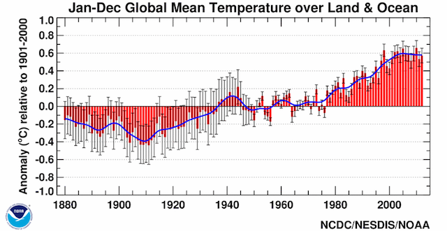
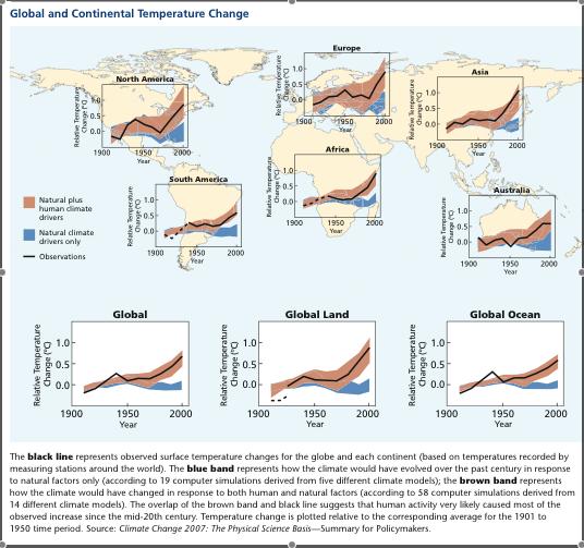
Increasing levels of greenhouse gases results in rising global air temperatures. Global mean surface temperatures have increased roughly 1.53°F (0.85ºC) from 1880 to 2012. The annual trend in average global air temperature through December 2012 is shown in Figure \(\PageIndex{5}\). The range of measurement uncertainty is indicated by the gray vertical bars. The temperature trends over the past 100-plus years in Figure \(\PageIndex{6}\) clearly indicate rising temperatures on all continents and over the oceans.
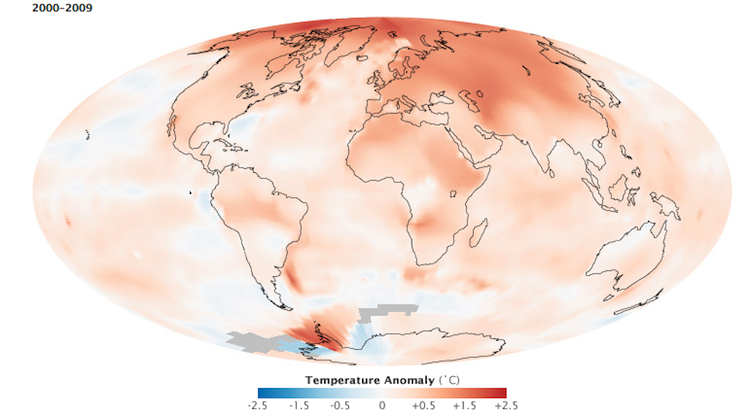
The last decade, 2000-2009, ended on the second warmest year on record. The temperature anomaly map (Figure \(\PageIndex{7}\)) shows the departure from "normal" for the reference period of 1951 through 1980. Very little of the earth showed cooling while most experienced warming. The greatest warming occurred in the Arctic, coinciding with changes in surface albedo as annual sea ice diminishes.
(Courtesy NOAA EOS)