
5.2: Building a Thermo-Diagram
- Page ID
- 9554

5.1.1. Components
In the Water Vapor chapter you learned how to compute isohumes and moist adiabats, and in the Thermodynamics chapter you learned to plot dry adiabats. You plotted these isopleths on a background graph having temperature along the horizontal axis and log of pressure along the vertical axis. Figs. 5.1a-d show these diagram components.
When these isopleths are combined on a single graph, the result is called a thermodynamic diagram or thermo diagram (Figure 5.1e). At first glance, Figure 5.1e looks like a confusing nest of lines; however, you can use the pattern-recognition capability of your mind to focus on the components as shown in Figure 5.1a-d. Your efforts to master thermo diagrams now will save you time in the future.
Several types of thermo diagrams are used in meteorology. They all can show the same information, and are used the same way. The thermo diagram we learned so far is called an Emagram. We learned this one first because it was easy to create using a computer spreadsheet.
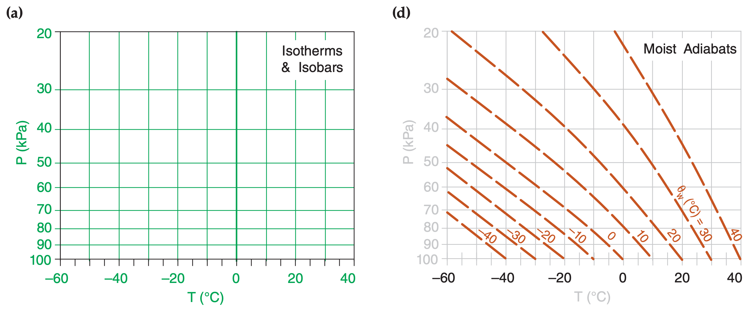
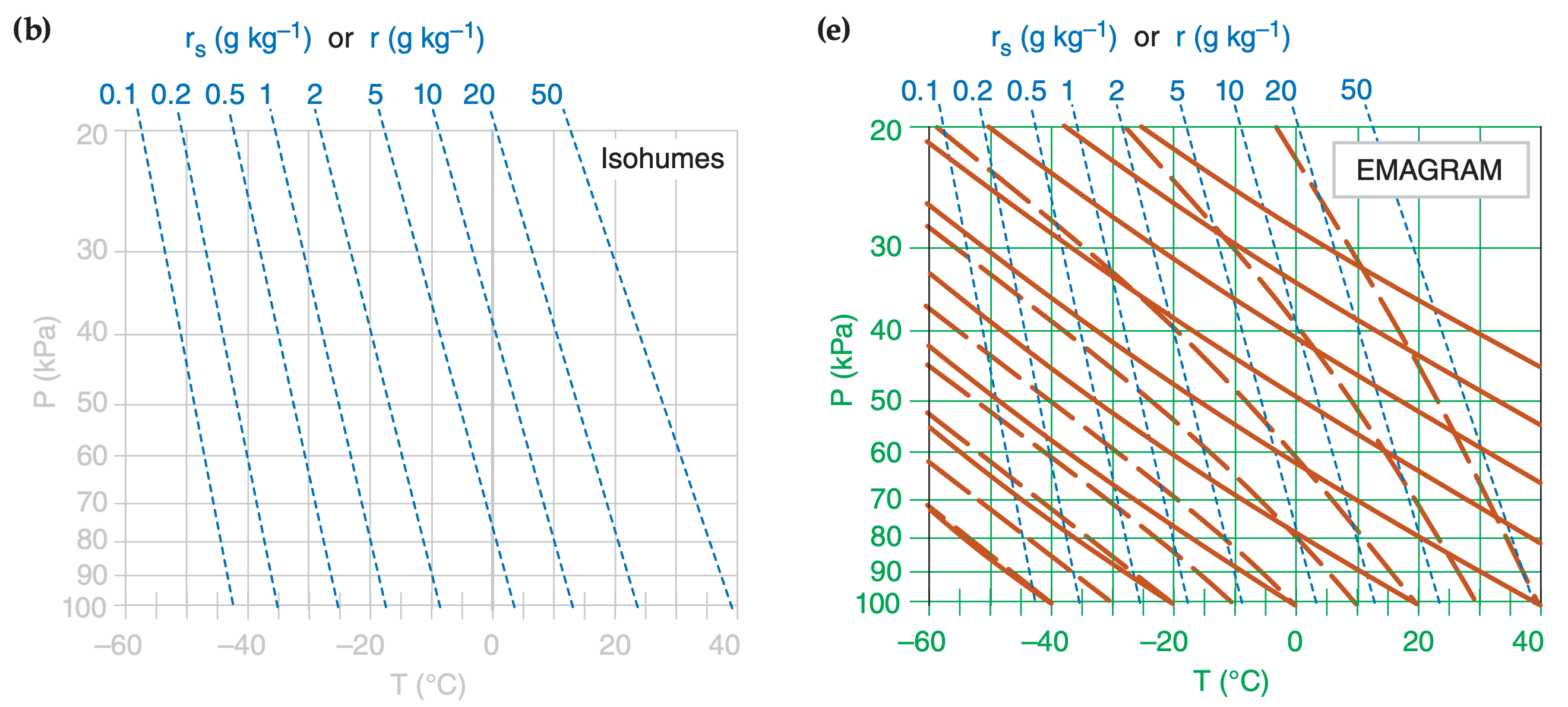
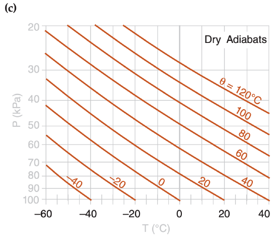
Five or more sets of lines are plotted on every thermo diagram, including the Emagram (Figure 5.1e). Three sets give the state of the air (isotherms, isobars, isohumes). Two sets (dry adiabats and moist adiabats) describe processes that change the state. Height contours are omitted from introductory thermo diagrams, but are included in full thermo diagrams at the end of this chapter.
5.1.2. Pseudoadiabatic Assumption
In the Water Vapor chapter, we assumed an adiabatic process (no heat transfer or mixing to or from the air parcel) when computing the moist adiabats. However, for any of the thermo diagrams, the moist adiabats can be computed assuming either:
- adiabatic processes (i.e., reversible, where all liquid water is carried with the air parcels), or
- pseudoadiabatic processes (i.e., irreversible, where all condensed water is assumed to fall out immediately).
Air parcels in the real atmosphere behave between these two extremes, because small droplets and ice crystals are carried with the air parcel while larger ones precipitate out.
When liquid or solid water falls out, it removes from the system some of the sensible heat associated with the temperature of the droplets, and also changes the heat capacity of the remaining air because of the change in relative amounts of the different constituents. The net result is that an air parcel lifted pseudoadiabatically from 100 kPa to 20 kPa will be about 3°C colder than one lifted adiabatically. This small difference between adiabatic and pseudoadiabatic can usually be neglected compared to other errors in measuring soundings.
5.1.3. Complete Thermo Diagrams
Color thermo diagrams printed on large-format paper were traditionally used by weather services for hand plotting of soundings, but have become obsolete and expensive compared to modern plots by computer. The simplified, small-format diagrams presented so far in this chapter are the opposite extreme – useful for education, but not for plotting real soundings. Also, some weather stations have surface pressure greater than 100 kPa, which is off the scale for the simple diagrams presented so far.
As a useful compromise, full-page thermo diagrams in several formats are included at the end of this chapter. They are optimized for you to print on a color printer.
[Hint: Keep the original thermo diagrams in this book clean and unmarked, to serve as master copies. Or download fresh copies from the Practical Meteor. website.]
Meteorological thermo diagrams were originally created as optimized versions of the P vs. α diagrams of classical physics (thermodynamics), where α is the specific volume (i.e., α = volume per unit mass = 1/ρ, where ρ is air density). A desirable attribute of the P vs. α diagram is that when a cyclic process is traced on this diagram, the area enclosed by the resulting curve is proportional to the specific work done by or to the atmosphere. The disadvantage of P vs. α diagram is that the angle between any isotherm and adiabat is relatively small, making it difficult to interpret atmospheric soundings.
Three meteorological thermo diagrams have been devised that satisfy the “area = work” attribute, and are optimized for meteorology to have greater angles between the isotherms and adiabats:
- Emagram,
- Skew-T Log-P Diagram,
- Tephigram.
Meteorologists rarely need to utilize the “area = work” attribute, so they also can use any of three additional diagrams:
- Stüve Diagram,
- Pseudoadiabatic (Stüve) Diagram,
- Theta-Height (θ-z) Diagram.
Why are there so many diagrams that show the same things? Historically, different diagrams were devised somewhat independently in different countries. Nations would adopt one as the “official” diagram for their national weather service, and teach only that one to their meteorologists. For example, the tephigram is used in British Commonwealth countries (UK, Canada, Australia, New Zealand). To this day, many meteorologists feel most comfortable with the diagram they learned first.
For many readers, this myriad of diagrams might make an already-difficult subject seem even more daunting. Luckily, all the diagrams show the same thermodynamic state (T, P, r) and process lines (θ, θw), but in different orientations. So once you have learned how to read one diagram, it is fairly easy to read the others.
The skill to read diverse thermo diagrams will serve you well when acquiring weather data via the internet, because they can come in any format. The internet is the main reason I cataloged the different thermo diagrams in this book.
Of all these diagrams, the Skew-T and Tephigram have the greatest angle between isotherms and adiabats, and are therefore preferred when studying soundings and stability. These two diagrams look similar, but the Skew-T is growing in popularity because it is easier to create on a computer.