
1.5: Reading Plots
- Page ID
- 15914
Below is a plot showing two datasets at once. The bars show the price of natural gas (right y axis) in the United States as a function of time from January 2007 until November 2011. The circles connected by a line shows the number of Marcellus well permits issued in Clearfield County, PA, (left y axis) from January 2007 until January 2012. Take a look at the plot, and see what conclusions you can draw from it. Then let’s discuss it together.
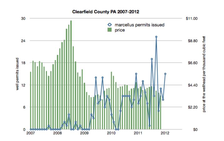
Clearfield County PA 2007-2012
Credit: PA Department of Environmental Protection, Oil and Gas Reports
When I look at a plot I have never seen before, I have a mental checklist in my head that helps me read its information. Here it is:
Where did this data come from?
The data for well permits issued came from Pennsylvania’s Department of Environmental Protection website.
Here’s a screenshot of what you get when you go through the web form entering times for which you’d like to view numbers of permits issued for Marcellus wells:
Above is a plot showing two datasets at once. The bars show the price of natural gas (right y axis) in the United States as a function of time from January 2007 until November 2011. The circles connected by a line shows the number of Marcellus well permits issued in Clearfield County, PA, (left y axis) from January 2007 until January 2012. Take a look at the plot, and see what conclusions you can draw from it. Then let’s discuss it together.
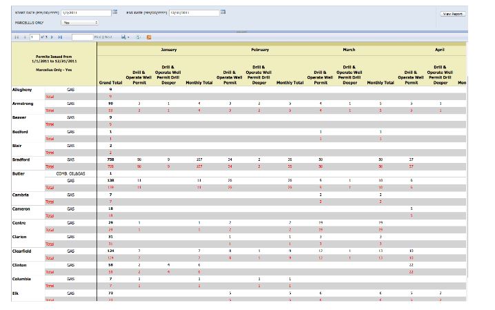
Screen Shot: Numbers of Permits Issued for Marcellus Wells
Credit: Pennsylvania Department of Environmental Protection, Oil and Gas Reports
Which one is easier to make sense of, the line on my plot or this data table? I hope you agree that my plot is clearer. This is why scientists often make plots from their data. It is often easier to spot a trend, see a relationship, or make sense of all your observations with a plot that conveys information in a visually logical way.
The data concerning price of gas at the well head came from the United States Energy Information Administration website. Here is a screenshot from their page.
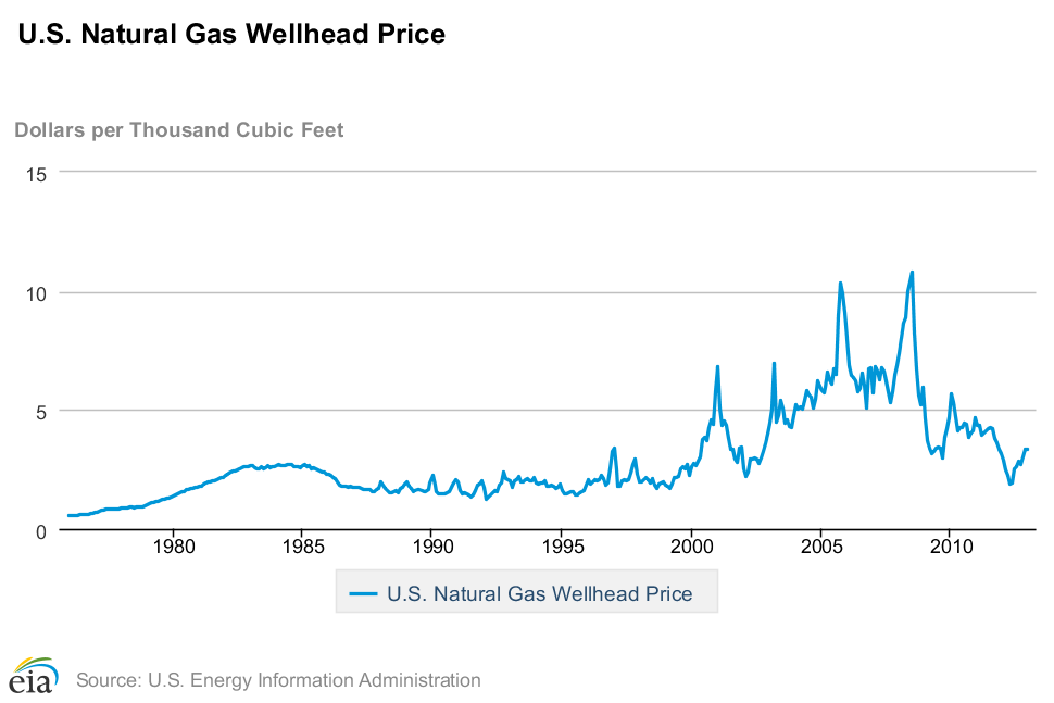
Price of Gas at the Well Head
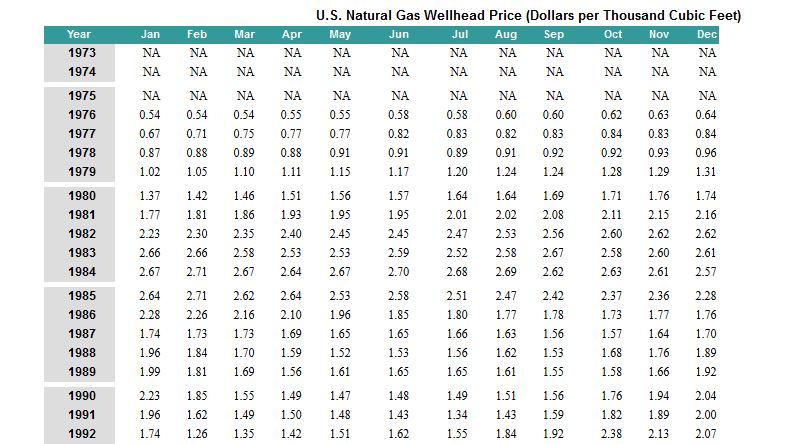
Screenshot: U.S. Natural Gas Wellhead Price (Dollars per Thousand Cubic Feet)
I like the organization of this web site a lot better than the one produced by the DEP because it has both the plot as well as the data table used to make the plot. In general, I do not dispute data that is posted on government websites (have a .gov address) nor do I dispute data that comes from a peer-reviewed publication, especially if I do not have the expertise to evaluate the data itself. Even scientists trust each other and rely on each other to publish truthful data to the best of their ability. We have to. Nobody can be an expert in all fields.
Okay, back to the plot.
What are the plot axes?
In this plot the x axis is calendar years and I can see from the number of bars and data points that this is monthly data. There are two y axes with different numbers and labels. It is important to make sure I know which data goes with which one. On the left it says “well permits issued” and the range goes from zero to 30. On the right it says “price at the well head per thousand cubic feet” and the range goes from $0 to $11.
What does the data show?
When I look at the legend, I see that the circles connected by a line belongs to the left y axis and concerns permits issued. I see that the bars belong to the right y axis and correspond to gas price. From about 2007 to early 2009 there were a handful of permits issued and from early 2009 until the end of the plot, number of permits issued fluctuates quite wildly month by month going as high as 25 and sometimes dropping to 0. The price of gas reached a high of nearly $11 in mid 2008 but since then has been around the neighborhood of $4.00 - $4.50.
What is the person who made this plot trying to tell me?
You will hear people say things like “the data speaks for itself,” but in my experience that is never true. People make plots to visualize data but also to tell a story. In this case, why did I put those two datasets together on one plot? I did it because I wanted to see if there was a similar trend followed by both the price of gas as well as by number of permits issued. What do you think? Having just completed an exercise about correlation, what are some questions you could ask about this data if you wanted to try to convince somebody else that these two observations are or are not related to each other? If you were going to collect more data to try to confirm or disprove the idea that gas price and permits issued are related, how would you go about it? What would you look for?