
1.3.1: Maps
- Page ID
- 15317

A map is the fundamental tool of the geographer. With a map, one can illustrate the spatial distribution (i.e., geographic pattern) of almost any kind of phenomena. Maps provide a wealth of information. The information collected to create a map is called spatial data. Any object or characteristic that has a location can be considered spatial data. Maps can depict two kinds of data. Qualitative map data is in the form of a quality and expresses the presence or absence of the subject on a map, like the kind of vegetation present occupying a region. Quantitative map data is expressed as a numerical value, like elevation in meters, or temperature is degrees celsius. There are many different kinds of maps that serve quite different purposes.
Types of Maps
Reference Maps
Reference or navigational maps are created to help you navigate over the earth surface. These kinds of maps show you where particular places are located and can be used to navigate your way to them. A street map or the common highway road map falls into this category.
Thematic Maps
Thematic maps are used to communicate geographic concepts like the distribution of densities, spatial relationships, magnitudes, movements etc. World climate or soils maps are notable examples of thematic maps. There are five common techniques for depicting geography data on a thematic map. The most common is a choropleth map that uses color to show variations in quantity, density, percent, etc. within a defined geographic area. Each color usually depicts a range of values.
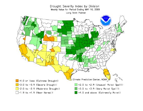
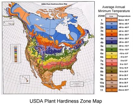
Defined areal units are colored on the Palmer Drought Index map in Figure 1.12 to show the pattern of dryness across the United States. Using administrative units presents a less realistic picture of the pattern of the distribution of natural phenomena. To overcome this, a variant of the choropleth map, the dasymetric map was created. This type of map employs special statistical methods and extra information to combine areas of similar values to depict geographic patterns on the map. The USDA's Plant Hardiness Zone Map is a dasymetric map.
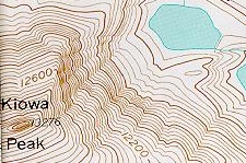
An isarithmic map uses isolines, lines that connect equal values, to illustrate continuous data such as elevation, air pressure, and precipitation. Topographic maps use contour lines to show elevation (height above sea level). Contour lines connect points of equal elevation above a specified reference, usually as sea level. The heavy brown contour lines with the elevation printed on them are called index contours. Intermediate contours are the lighter brown lines between index contours. Sometimes dashed lines called supplemental contours are used in areas of very low relief. Benchmarks are locations where the elevation has been surveyed. Benchmarks are denoted on a map with the letters "BM", "X" or a triangle with the elevation printed beside.
Not only are natural features like mountains, valleys, streams and glaciers portrayed, but cultural features as well, like houses, schools, streets, and urbanized areas. Examine a topographic symbol sheet (pdf file) from the USGS to see how a variety of features are symbolized on a topographic map.
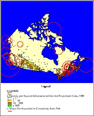
Proportional or graduated circle maps are another way of depicting geographic information on a map. Figure \(\PageIndex{4}\) is a map that shows population density of Canada as colored polygons and the distribution of major earthquakes felt throughout the country. Graduated circles indicate the area over which the earthquakes were felt. This map was created using a geographic information system which has the capability of overlying different kinds of spatial data to show the relationships between them.
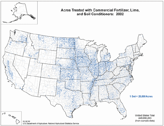
Dot maps use dots to illustrate the presence of the phenomenon on a map. A dot may equate to one or several units of measurement. Dot maps are especially useful in visualizing the frequency of occurrence or density of a mapped variable.
Isolines
Isarithmic maps use isolines to depict the geographic pattern of earth phenomena. An isoline is a line that connects points of equal value. For instance, the brown contour lines on a topographic map connect points of equal elevation. Isobars are used to show the distribution of air pressure . Some common isolines encountered in physical geography are:
- isotherm: a line connecting points of equal temperature.
- isohyet: a line that connects points of equal precipitation
- isophene: a line representing points where biological events occur at the same time, such as cops flowering.
- isopleth: a line connecting points of equal numerical value, like population
- isotach: a line of equal wind speed.
- isobath: a line representing points of equal water depth.
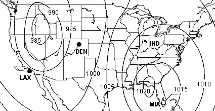
A few "rules" apply to isolines. First, there is a set interval between consecutive isolines called the isoline interval. For example, the map in Figure \(\PageIndex{6}\) uses isobars to depict the disribution of air pressure. A 5 millibar interval was used to drawn them. Second, two different isolines cannot cross each other. If they did, it would mean two different values are at the same location. Third, values inside a closed isoline are either higher or smaller than those outside.
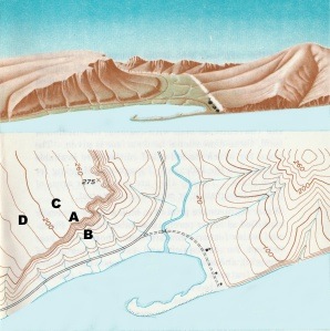
Because the interval between isolines is constant, their spacing gives an visual indication of the change that occurs over a given distance, called a gradient. The more closely spaced the isolines, the larger is the gradient. For example, the spacing of contour lines between A-B on the topographic map shows a much steeper hillslope gradient than does the spacing of the contour lines between points C-D.
Map Scale
Map scale is the relationship between distance on a map and distance in the real world. There are several ways to specify map scale. Often we find the scale of a map expressed in words like, "one inch equals one mile". You’ve most likely seen map scale depicted with a graphic, like a bar divided up into segments. The length of a segment represents some distance on the earth. We can specify scale as a representative fraction as well. These fractions often appear as follows:
1:24000
The fraction means that one unit of measurement on a map represents 24000 units in the real world. It’s important to remember that the same units of measurement are on either side of the colon. That is, 1 inch represents 24000 inches, or 1 centimeter represents 24000 centimeters. To calculate the distance between two points, one simply measures the map distance and multiplies it by the number of "real world" units. For example, if the measured distance between two points on a map with a scale of 1:62500 is 2.4 inches, then the real world distance is 2.4 times 62500 or 150000 inches. It’s hard to think how far that really is so convert it to miles. To do so simply take 150000 and divide by the number of inches in a mile which is 63360. So, the distance between the two points is about 2.37 miles.
Scale Categories
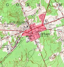
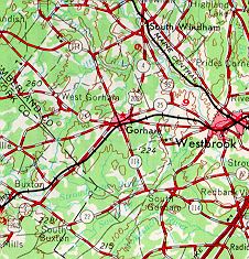
Map scales are grouped into small, medium and large categories. Large scale maps, such as 1:24000 scale maps show a smaller area in great detail. They are useful for showing the locations of buildings and other features important to engineers and planners. Medium scale maps, (1:62500) are good for agricultural planning where less detail is required. Small scale maps have the least detail but show large areas. These are useful for extensive projects at regional levels of analysis. You can easily see the impact of map scale on the information in figures \(\PageIndex{8a}\) through \(\PageIndex{8c}\) below.
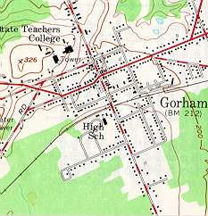
Scale 1:24000
1 inch = 2000feet
Area Shown: 1 square mile
(Source: U.S.G.S.
Topographic Maps, 1969)
Scale 1:62500
1 inch = nearly 1 mile
Area Shown: 6 3/4 square miles
(Source: U.S.G.S
Topographic Maps, 1969.)
Scale 1:250,000
1 inch = nearly 4 miles
Area Shown: 107 square miles
(Source: U.S.G.S.
Topographic Maps, 1969)
Concept Check \(\PageIndex{1}\)
Notice in Figure \(\PageIndex{8a}\)(above) that black squares have been used to depict individual buildings in the downtown of Gorham. Why hasn't this been done in Figure \(\PageIndex{8c}\)?
- Answer
-
At the reduced scale of 1:62500, it is impossible to show the same level of detail as that of a map of a larger scale (1:24000). Small features like individual buildings in the downtown are too small at this scale to show each of them. If a cartographer tried, the downtown area would be covered in black. Instead, a pinkish color is used to depict urban area.
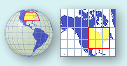
Map projections
A map projection is a method of portraying the curved surface of the Earth on a flat planar surface of a map. Projections are created to preserve one or several measurements of the following qualities:
Each projection handles the conversion of these metric properties from the curved surface of a globe to the flat surface of map differently.
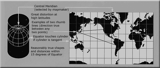
The purpose of the map is of primary importance in choosing a projection to illustrate spatial patterns of Earth phenomena. For instance, the Mercator projection was long used for navigation or maps of equatorial regions. The cylindrical Mercator projection mathematically projects the globe onto a cylinder tangent to the Equator. Large areas become distorted which increases toward away from the Equator. Distances are true only along the Equator, special scales are provided for other latitudes for measurement.
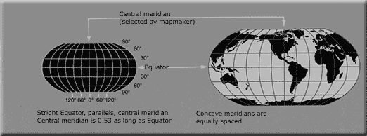
The Robinson projection uses tabular coordinates rather than mathematical formulas to make earth features look the "right" size and shape. A better balance of size and shape result is a more accurate picture of high-latitude lands like Russia, Soviet and Canada. Greenland is truer to size but compressed.
For more on projections see: Map Projections from the United States Geological Survey.