
6.1: Descriptions and Summaries
- Page ID
- 6336
- The objective of this section is to review the most frequently used measures of distribution, central tendency, and dispersion.
No discussion of geospatial analysis would be complete without a brief overview of basic statistical concepts. The basic statistics outlined here represent a starting point for any attempt to describe, summarize, and analyze geospatial datasets. An example of a common geospatial statistical endeavor is the analysis of point data obtained by a series of rainfall gauges patterned throughout a particular region. Given these rain gauges, one could determine the typical amount and variability of rainfall at each station, as well as typical rainfall throughout the region as a whole. In addition, you could interpolate the amount of rainfall that falls between each station or the location where the most (or least) rainfall occurs. Furthermore, you could predict the expected amount of rainfall into the future at each station, between each station, or within the region as a whole.
The increase of computational power over the past few decades has given rise to vast datasets that cannot be summarized easily. Descriptive statistics provide simple numeric descriptions of these large datasets. Descriptive statistics tend to be univariate analyses, meaning they examine one variable at a time. There are three families of descriptive statistics that we will discuss here: measures of distribution, measures of central tendency, and measures of dispersion. However, before we delve too deeply into various statistical techniques, we must first define a few terms.
- Variable: a symbol used to represent any given value or set of values
- Value: an individual observation of a variable (in a geographic information system [GIS] this is also called a record)
- Population: the universe of all possible values for a variable
- Sample: a subset of the population
- n: the number of observations for a variable
- Array: a sequence of observed measures (in a GIS this is also called a field and is represented in an attribute table as a column)
- Sorted Array: an ordered, quantitative array
Measures of Distribution
The measure of distribution of a variable is merely a summary of the frequency of values over the range of the dataset (hence, this is often called a frequency distribution). Typically, the values for the given variable will be grouped into a predetermined series of classes (also called intervals, bins, or categories), and the number of data values that fall into each class will be summarized. A graph showing the number of data values within each class range is called a histogram. For example, the percentage grades received by a class on an exam may result in the following array (n = 30):
Array of Exam Scores: {87, 76, 89, 90, 64, 67, 59, 79, 88, 74, 72, 99, 81, 77, 75, 86, 94, 66, 75, 74, 83, 100, 92, 75, 73, 70, 60, 80, 85, 57}
When placing this array into a frequency distribution, the following general guidelines should be observed. First, between five and fifteen different classes should be employed, although the exact number of classes depends on the number of observations. Second, each observation goes into one and only one class. Third, when possible, use classes that cover an equal range of values (Freund and Perles 2006).Freund, J., and B. Perles. 2006. Modern Elementary Statistics. Englewood Cliffs, NJ: Prentice Hall. With these guidelines in mind, the exam score array shown earlier can be visualized with the following histogram (Figure 6.1).
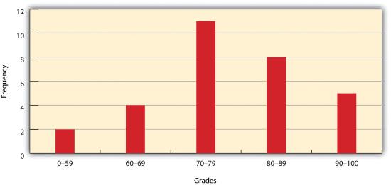
As you can see from the histogram, certain descriptive observations can be readily made. Most students received a C on the exam (70–79). Two students failed the exam (50–59). Five students received an A (90–99). Note that this histogram does violate the third basic rule that each class cover an equal range because an F grade ranges from 0–59, whereas the other grades have ranges of equal size. Regardless, in this case we are most concerned with describing the distribution of grades received during the exam. Therefore, it makes perfect sense to create class ranges that best suit our individual needs.
Measures of Central Tendency
We can further explore the exam score array by applying measures of central tendency. There are three primary measures of central tendency: the mean, mode, and median. The mean, more commonly referred to as the average, is the most often used measure of central tendency. To calculate the mean, simply add all the values in the array and divide that sum by the number of observations. To return to the exam score example from earlier, the sum of that array is 2,340, and there are 30 observations (n = 30). So, the mean is 2,340 / 30 = 78.
The mode is the measure of central tendency that represents the most frequently occurring value in the array. In the case of the exam scores, the mode of the array is 75 as this was received by the most number of students (three, in total). Finally, the median is the observation that, when the array is ordered from lowest to highest, falls exactly in the center of the sorted array. More specifically, the median is the value in the middle of the sorted array when there are an odd number of observations. Alternatively, when there is an even number of observations, the median is calculated by finding the mean of the two central values. If the array of exam scores were reordered into a sorted array, the scores would be listed thusly:
Sorted Array of Exam Scores: {57, 59, 60, 64, 66, 67, 70, 72, 73, 74, 74, 75, 75, 75, 76, 77, 79, 80, 81, 83, 85, 86, 87, 88, 89, 90, 92, 93, 94, 99}
Since n = 30 in this example, there are an even number of observations. Therefore, the mean of the two central values (15th = 76 and 16th = 77) is used to calculate the median as described earlier, resulting in (76 + 77) / 2 = 76.5. Taken together, the mean, mode, and median represent the most basic ways to examine trends in a dataset.
Measures of Dispersion
The third type of descriptive statistics is measures of dispersion (also referred to as measures of variability). These measures describe the spread of data around the mean. The simplest measure of dispersion is the range. The range equals the largest value minus in the dataset the smallest. In our case, the range is 99 − 57 = 42.
The interquartile range represents a slightly more sophisticated measure of dispersion. This method divides the data into quartiles. To accomplish this, the median is used to divide the sorted array into two halves. These halves are again divided into halves by their own median. The first quartile (Q1) is the median of the lower half of the sorted array and is also referred to as the lower quartile. Q2 represents the median. Q3 is the median of the upper half of the sorted array and is referred to as the upper quartile. The difference between the upper and lower quartile is the interquartile range. In the exam score example, Q1 = 72.25 and Q3 = 86.75. Therefore, the interquartile range for this dataset is 86.75 − 72.25 = 14.50.
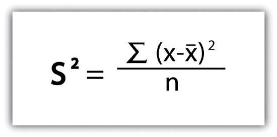
A third measure of dispersion is the variance (s2). To calculate the variance, subtract the raw value of each exam score from the mean of the exam scores. As you may guess, some of the differences will be positive, and some will be negative, resulting in the sum of differences equaling zero. As we are more interested in the magnitude of differences (or deviations) from the mean, one method to overcome this “zeroing” property is to square each deviation, thus removing the negative values from the output (Figure 6.2). This results in the following:
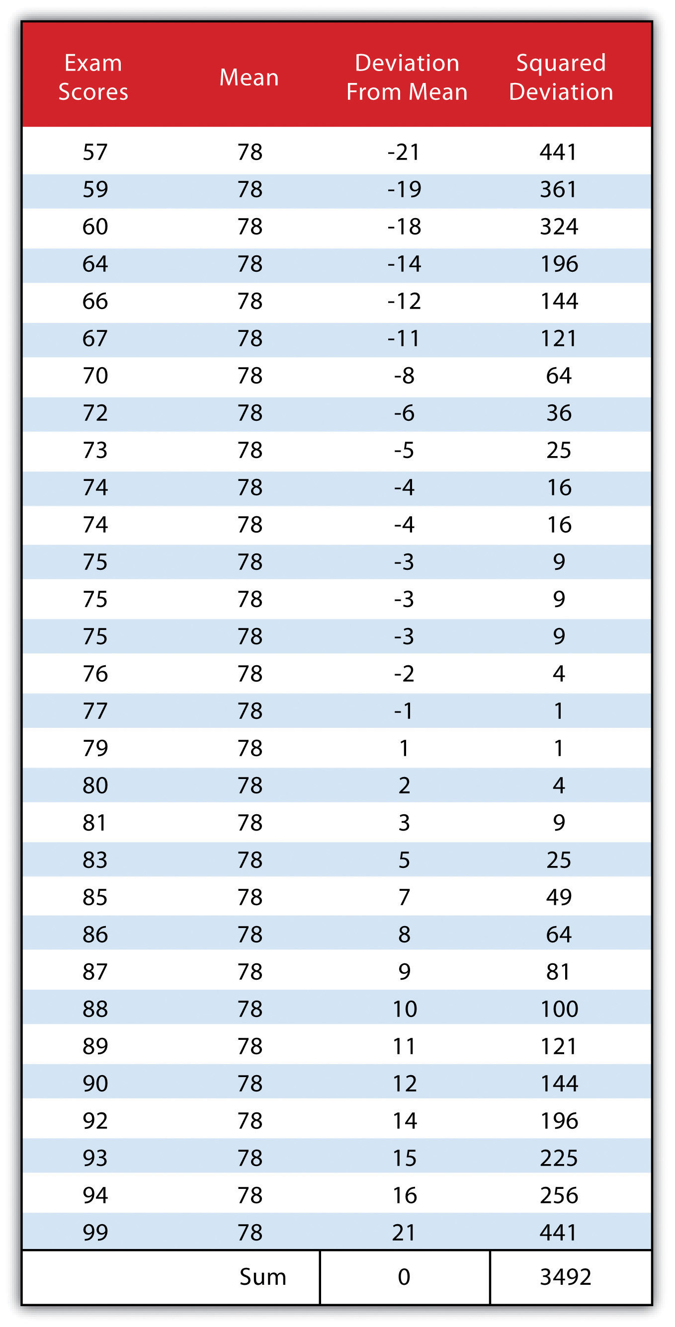
We then divide the sum of squares by either n − 1 (in the case of working with a sample) or n (in the case of working with a population). As the exam scores given here represent the entire population of the class, we will employ Figure 6.3, which results in a variance of s2 = 116.4. If we wanted to use these exam scores to extrapolate information about the larger student body, we would be working with a sample of the population. In that case, we would divide the sum of squares by n − 1.
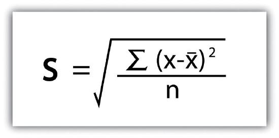
Standard deviation, the final measure of dispersion discussed here, is the most commonly used measure of dispersion. To compensate for the squaring of each difference from the mean performed during the variance calculation, standard deviation takes the square root of the variance. As determined from Figure 6.4, our exam score example results in a standard deviation of s = SQRT(116.4) = 10.8.
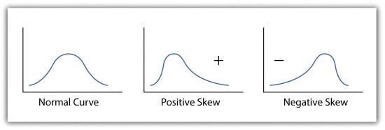
Calculating the standard deviation allows us to make some notable inferences about the dispersion of our dataset. A small standard deviation suggests the values in the dataset are clustered around the mean, while a large standard deviation suggests the values are scattered widely around the mean. Additional inferences may be made about the standard deviation if the dataset conforms to a normal distribution. A normal distribution implies that the data, when placed into a frequency distribution (histogram), looks symmetrical or “bell-shaped.” When not “normal,” the frequency distribution of dataset is said to be positively or negatively “skewed” (Figure 6.5). Skewed data are those that maintain values that are not symmetrical around the mean. Regardless, normally distributed data maintains the property of having approximately 68 percent of the data values fall within ± 1 standard deviation of the mean, and 95 percent of the data value fall within ± 2 standard deviations of the mean. In our example, the mean is 78, and the standard deviation is 10.8. It can therefore be stated that 68 percent of the scores fall between 67.2 and 88.8 (i.e., 78 ± 10.8), while 95 percent of the scores fall between 56.4 and 99.6 (i.e., 78 ± [10.8 * 2]). For datasets that do not conform to the normal curve, it can be assumed that 75 percent of the data values fall within ± 2 standard deviations of the mean.
Key Takeaways
- The measure of distribution for a given variable is a summary of the frequency of values over the range of the dataset and is commonly shown using a histogram.
- Measures of central tendency attempt to provide insights into “typical” value for a dataset.
- Measures of dispersion (or variability) describe the spread of data around the mean or median.
Exercises
- Create a table containing at least thirty data values.
- For the table you created, calculate the mean, mode, median, range, interquartile range, variance, and standard deviation.