
8: Remotely Sensed Image Data
- Page ID
- 8174

Remotely Sensed Image Data
David DiBiase
8.1. Overview
Chapter 7 concluded with the statement that the raster approach is well suited not only to terrain surfaces, but to other continuous phenomena as well. This chapter considers the characteristics and uses of raster data produced with satellite remote sensing systems. Remote sensing is a key source of data for land use and land cover mapping, agricultural and environmental resource management, mineral exploration, weather forecasting, and global change research.
Objectives
The overall goal of the lesson is to acquaint you with the properties of data produced by satellite-based sensors. Specifically, in the lesson you will learn to:
- Compare and contrast the characteristics of image data produced by photography and digital remote sensing systems;
- Use the Web to find Landsat data for a particular place and time;
- Explain why and how remotely sensed image data are processed; and
- Perform a simulated unsupervised classification of raster image data.
Comments and Questions
Registered students are welcome to post comments, questions, and replies to questions about the text. Particularly welcome are anecdotes that relate the chapter text to your personal or professional experience. In addition, there are discussion forums available in the ANGEL course management system for comments and questions about topics that you may not wish to share with the whole world.
To post a comment, scroll down to the text box under “Post new comment” and begin typing in the text box, or you can choose to reply to an existing thread. When you are finished typing, click on either the “Preview” or “Save” button (Save will actually submit your comment). Once your comment is posted, you will be able to edit or delete it as needed. In addition, you will be able to reply to other posts at any time.
Note: the first few words of each comment become its “title” in the thread.
8.2. Checklist
The following checklist is for Penn State students who are registered for classes in which this text, and associated quizzes and projects in the ANGEL course management system, have been assigned. You may find it useful to print this page out first so that you can follow along with the directions.
| Step | Activity | Access/Directions |
|---|---|---|
| 1 | Read Chapter 8 | This is the second page of the Chapter. Click on the links at the bottom of the page to continue or to return to the previous page, or to go to the top of the chapter. You can also navigate the text via the links in the GEOG 482 menu on the left. |
| 2 | Submit four practice quizzesincluding:
Practice quizzes are not graded and may be submitted more than once. | Go to ANGEL > [your course section] > Lessons tab > Chapter 8 folder > [quiz] |
| 3 | Perform “Try this” activitiesincluding:
“Try this” activities are not graded. | Instructions are provided for each activity. |
| 4 | Submit theChapter 8 Graded Quiz | ANGEL > [your course section] > Lessons tab > Chapter 8 folder > Chapter 8 Graded Quiz. See the Calendar tab in ANGEL for due dates. |
| 5 | Read comments and questionsposted by fellow students. Add comments and questions of your own, if any. | Comments and questions may be posted on any page of the text, or in a Chapter-specific discussion forum in ANGEL. |
8.3. Nature of Remotely Sensed Image Data
Data, as you know, consist of measurements. Here we consider the nature of the phenomenon that many, though not all, remote sensing systems measure: electromagnetic energy. Many of the objects that make up the Earth’s surface reflect and emit electromagnetic energy in unique ways. The appeal of multispectral remote sensing is that objects that are indistinguishable at one energy wavelength may be easy to tell apart at other wavelengths. You will see that digital remote sensing is a little like scanning a paper document with a desktop scanner, only a lot more complicated.
8.4. Electromagnetic Spectrum
Most remote sensing instruments measure the same thing: electromagnetic radiation. Electromagnetic radiation is a form of energy emitted by all matter above absolute zero temperature (0 Kelvin or -273° Celsius). X-rays, ultraviolet rays, visible light, infrared light, heat, microwaves, and radio and television waves are all examples of electromagnetic energy.
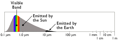
A portion of the electromagnetic spectrum, ranging from wavelengths of 0.1 micrometer (a micrometer is one millionth of a meter) to one meter, within which most remote sensing systems operate. (Adapted from Lillesand & Kiefer, 1994).
The graph above shows the relative amounts of electromagnetic energy emitted by the Sun and the Earth across the range of wavelengths called the electromagnetic spectrum. Values along the horizontal axis of the graph range from very short wavelengths (ten millionths of a meter) to long wavelengths (meters). Note that the horizontal axis is logarithmically scaled, so that each increment represents a ten-fold increase in wavelength. The axis has been interrupted three times at the long wave end of the scale to make the diagram compact enough to fit on your screen. The vertical axis of the graph represents the magnitude of radiation emitted at each wavelength.
Hotter objects radiate more electromagnetic energy than cooler objects. Hotter objects also radiate energy at shorter wavelengths than cooler objects. Thus, as the graph shows, the Sun emits more energy than the Earth, and the Sun’s radiation peaks at shorter wavelengths. The portion of the electromagnetic spectrum at the peak of the Sun’s radiation is called the visible band because the human visual perception system is sensitive to those wavelengths. Human vision is a powerful means of sensing electromagnetic energy within the visual band. Remote sensing technologies extend our ability to sense electromagnetic energy beyond the visible band, allowing us to see the Earth’s surface in new ways, which in turn reveals patterns that are normally invisible.
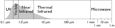
The electromagnetic spectrum divided into five wavelength bands. (Adapted from Lillesand & Kiefer, 1994).
The graph above names several regions of the electromagnetic spectrum. Remote sensing systems have been developed to measure reflected or emitted energy at various wavelengths for different purposes. This chapter highlights systems designed to record radiation in the bands commonly used for land use and land cover mapping: the visible, infrared, and microwave bands.
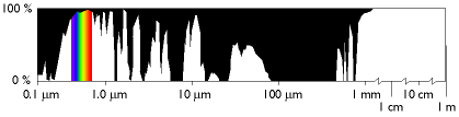
The transmissivity of the atmosphere across a range of wavelengths. Black areas indicate wavelengths at which the atmosphere is partially or wholly opaque. (Adapted from Lillesand & Kiefer, 1994).
At certain wavelengths, the atmosphere poses an obstacle to satellite remote sensing by absorbing electromagnetic energy. Sensing systems are therefore designed to measure wavelengths within the windows where the transmissivity of the atmosphere is greatest.
8.5. Spectral Response Patterns
The Earth’s land surface reflects about three percent of all incoming solar radiation back to space. The rest is either reflected by the atmosphere, or absorbed and re-radiated as infrared energy. The various objects that make up the surface absorb and reflect different amounts of energy at different wavelengths. The magnitude of energy that an object reflects or emits across a range of wavelengths is called its spectral response pattern.
The graph below illustrates the spectral response patterns of water, brownish gray soil, and grass between about 0.3 and 6.0 micrometers. The graph shows that grass, for instance, reflects relatively little energy in the visible band (although the spike in the middle of the visible band explains why grass looks green). Like most vegetation, the chlorophyll in grass absorbs visible energy (particularly in the blue and red wavelengths) for use during photosynthesis. About half of the incoming near-infrared radiation is reflected, however, which is characteristic of healthy, hydrated vegetation. Brownish gray soil reflects more energy at longer wavelengths than grass. Water absorbs most incoming radiation across the entire range of wavelengths. Knowing their typical spectral response characteristics, it is possible to identify forests, crops, soils, and geological formations in remotely sensed imagery, and to evaluate their condition.
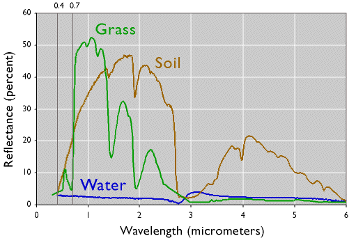
The spectral response patterns of brownish-gray soil (mollisol), grass, and water. To explore the spectral response characteristics of thousands of natural and man made materials, visit the ASTER Spectral Library at http://speclib.jpl.nasa.gov/. (California Institute of Technology, 2002).
The next graph demonstrates one of the advantages of being able to see beyond the visible spectrum. The two lines represent the spectral response patterns of conifer and deciduous trees. Notice that the reflectances within the visual band are nearly identical. At longer, near- and mid-infrared wavelengths, however, the two types are much easier to differentiate. As you’ll see later, land use and land cover mapping were previously accomplished by visual inspection of photographic imagery. Multispectral data and digital image processing make it possible to partially automate land cover mapping, which in turn makes it cost effective to identify some land use and land cover categories automatically, all of which makes it possible to map larger land areas more frequently.
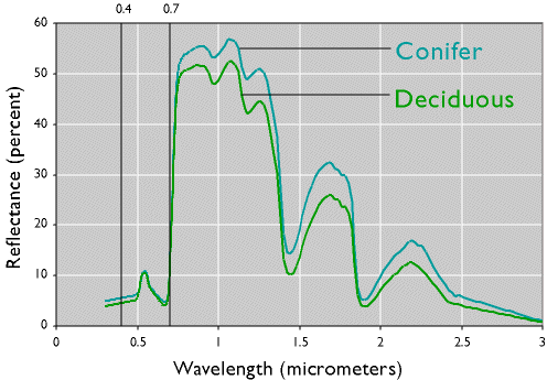
The spectral response patterns of conifer trees and deciduous trees (California Institute of Technology, 1999).
Spectral response patterns are sometimes called spectral signatures. This term is misleading, however, because the reflectance of an entity varies with its condition, the time of year, and even the time of day. Instead of thin lines, the spectral responses of water, soil, grass, and trees might better be depicted as wide swaths to account for these variations.
8.6. Raster Scanning
Remote sensing systems work in much the same way as the digital flatbed scanner you may have attached to your personal computer. A desktop scanner creates a digital image of a document by recording, pixel by pixel, the intensity of light reflected from the document. The component that measures reflectance is called the scan head, which consists of a row of tiny sensors that convert light to electrical charges. Color scanners may have three light sources and three sets of sensors, one each for the blue, green, and red wavelengths of visible light. When you push a button to scan a document, the scan head is propelled rapidly across the image, one small step at a time, recording new rows of electrical signals as it goes. Remotely sensed data, like the images produced by your desktop scanner, consist of reflectance values arrayed in rows and columns that make up raster grids.
Desktop scanner, circa 2000.
After the scan head converts reflectances to electrical signals, another component, called the analog-to-digital converter, converts the electrical charges into digital values. Although reflectances may vary from 0 percent to 100 percent, digital values typically range from 0 to 255. This is because digital values are stored as units of memory called bits. One bit represents a single binary integer, 1 or 0. The more bits of data that are stored for each pixel, the more precisely reflectances can be represented in a scanned image. The number of bits stored for each pixel is called the bit depth of an image. An 8-bit image is able to represent 28 (256) unique reflectance values. A color desktop scanner may produce 24-bit images in which 8 bits of data are stored for each of the blue, green, and red wavelengths of visible light.
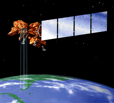
Artist’s rendition of the Landsat 7 remote sensing satellite. The satellite does not really cast a four-sided beam of light upon the Earth’s surface, of course. Instead, it merely records electromagnetic energy reflected or emitted by the Earth. (NASA, 2001).
As you might imagine, scanning the surface of the Earth is considerably more complicated than scanning a paper document with a desktop scanner. Unlike the document, the Earth’s surface is too large to be scanned all at once, and so must be scanned piece by piece, and mosaicked together later. Documents are flat, but the Earth’s shape is curved and complex. Documents lay still while they are being scanned, but the Earth rotates continuously around its axis at a rate of over 1,600 kilometers per hour. In the desktop scanner, the scan head and the document are separated only by a plate of glass; satellite-based sensing systems may be hundreds or thousands of kilometers distant from their targets, separated by an atmosphere that is nowhere near as transparent as glass. And while a document in a desktop scanner is illuminated uniformly and consistently, the amount of solar energy reflected or emitted from the Earth’s surface varies with latitude, the time of year, and even the time of day. All of these complexities combine to yield data with geometric and radiometric distortions that must be corrected before the data are useful for analysis. Later in this chapter you’ll learn about some of the image processing techniques used to correct remotely sensed image data.
8.7. Resolution
So far you’ve read that remote sensing systems measure electromagnetic radiation, and that they record measurements in the form of raster image data. The resolution of remotely sensed image data varies in several ways. As you recall, resolution is the least detectable difference in a measurement. In this context, three of the most important kinds are spatial resolution, radiometric resolution and spectral resolution.
Spatial resolution refers to the coarseness or fineness of a raster grid. The grid cells in high resolution data, such as those produced by digital aerial imaging, or by the Ikonos satellite, correspond to ground areas as small or smaller than one square meter. Remotely sensed data whose grid cells range from 15 to 80 meters on a side, such as the Landsat ETM+ and MSS sensors, are considered medium resolution. The cells in low resolution data, such as those produced by NOAA’s AVHRR sensor, are measured in kilometers. (You’ll learn more about all these sensors later in this chapter.)
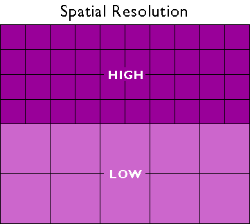
Spatial resolution is a measure of the coarseness or fineness of a raster grid.
The higher the spatial resolution of a digital image, the more detail it contains. Detail is valuable for some applications, but it is also costly. Consider, for example, that an 8-bit image of the entire Earth whose spatial resolution is one meter could fill 78,400 CD-ROM disks, a stack over 250 feet high (assuming that the data were not compressed). Although data compression techniques reduce storage requirements greatly, the storage and processing costs associated with high resolution satellite data often make medium and low resolution data preferable for analyses of extensive areas.
A second aspect of resolution is radiometric resolution, the measure of a sensor’s ability to discriminate small differences in the magnitude of radiation within the ground area that corresponds to a single raster cell. The greater the bit depth (number of data bits per pixel) of the images that a sensor records, the higher its radiometric resolution. The AVHRR sensor, for example, stores 210 bits per pixel, as opposed to the 28 bits that the Landsat sensors record. Thus although its spatial resolution is very coarse (~4 km), the Advanced Very High Resolution Radiometer takes its name from its high radiometric resolution.
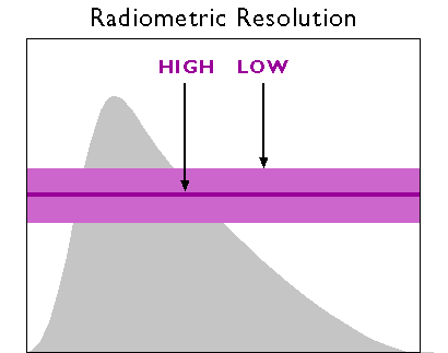
Radiometric resolution. The area under the curve represents the magnitude of electromagnetic energy emitted by the Sun at various wavelengths. Sensors with low radiometric resolution are able to detect only relatively large differences in energy magnitude (as represented by the lighter and thicker purple band). Sensors with high radiometric resolution are able to detect relatively small differences (represented by the darker and thinner band).
Finally, there is spectral resolution, the ability of a sensor to detect small differences in wavelength. For example, panchromatic film is sensitive to a broad range of wavelengths. An object that reflects a lot of energy in the green portion of the visible band would be indistinguishable in a panchromatic photo from an object that reflected the same amount of energy in the red band, for instance. A sensing system with higher spectral resolution would make it easier to tell the two objects apart.
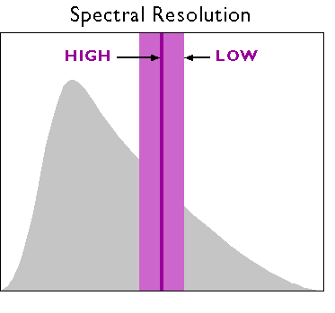
Spectral resolution. The area under the curve represents the magnitude of electromagnetic energy emitted by the Sun at various wavelengths. Low resolution sensors record energy within relatively wide wavelength bands (represented by the lighter and thicker purple band). High-resolution sensors record energy within narrow bands (represented by the darker and thinner band)
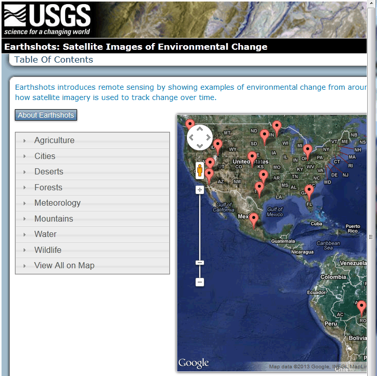
8.8. Site visit to USGS Earthshots
TRY THIS!
The following exercise involves a site visit to Earthshots, a World Wide Web site created by the USGS to publicize the many contributions of remote sensing to the field of environmental science. There you will view and compare examples of images produced from Landsat data.
The USGS has recently revised the Earthshots website and made it more layman friendly. Unfortunately the new site is much less valuable to our education mission. Fortunately, though, the older web pages are still available. So, after taking you briefly to the new Earthshots homepage, in step 1, I will direct you to the older pages that are more informative for us.
1. To begin, point your browser to the newer Earthshots site. Go ahead and explore this site. Note the information found by following theAbout Earthshots button.
2. Next go to the USGS Earthshots site.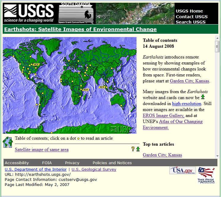
3. View images produced from Landsat data Follow the link to the Garden City, Kansas example. You’ll be presented with an image created from Landsat data of Garden City, Kansas in 1972. By clicking the date link below the lower left corner of the image, you can compare images produced from Landsat data collected in 1972 and 1988.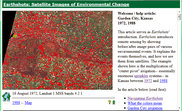
4. Zoom in to a portion of the image Four yellow corner ticks outline a portion of the image that is linked to a magnified view. Click within the ticks to view the magnified image.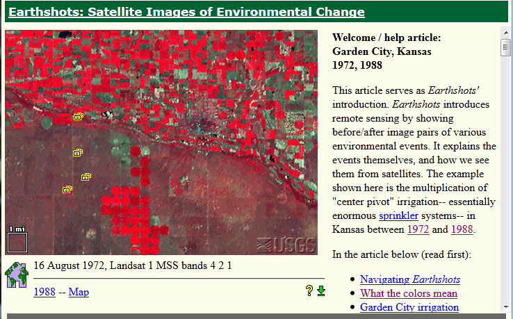
5. View a photograph taken on the ground Click on one of the little camera icons arranged one above the other in the western quarter of the image. A photograph taken on the ground will appear.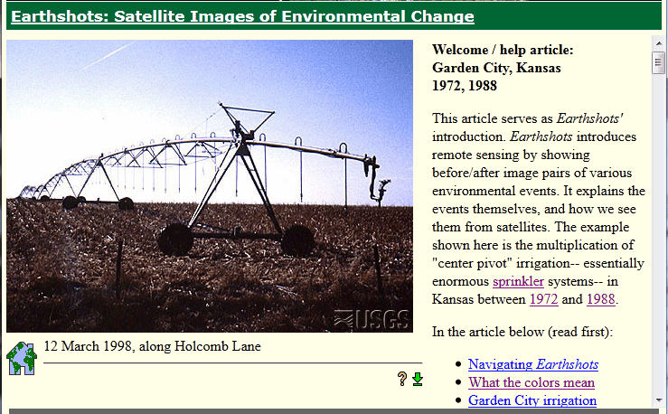
6. Explore articles linked to the example Find answers to the following questions in the related articles entitled What the colors mean, How images represent Landsat data, MSS and TM bands, andBeyond looking at pictures.
- What is the spectral sensitivity of the Landsat MSS sensor used to captured the image data?
- Which wavelength bands are represented in the image?
- What does the red color signify?
- How was “contrast stretching” used to enhance the images?
- What is the spatial resolution of the MSS data from which the images were produced?
PRACTICE QUIZ
Registered Penn State students should return now to the Chapter 8 folder in ANGEL (via the Resources menu to the left) to take a self-assessment quiz about the Nature of Image Data.
You may take practice quizzes as many times as you wish. They are not scored and do not affect your grade in any way.
8.9. Visible and Infrared Image Data
Next we explore examples of remotely sensed image data produced by measuring electromagnetic energy in the visible, near-infrared, and thermal infrared bands. Aerial photography is reconsidered as an analog to digital image data. Characteristics of panchromatic data produced by satellite-based cameras and sensors like KVR 1000, IKONOS, and DMSP are compared, as well as multispectral data produced by AVHRR, Landsat, and SPOT. We conclude with an opportunity to shop for satellite image data online.
8.10. Aerial Imaging
Not counting human vision, aerial photography is the earliest remote sensing technology. A Parisian photographer allegedly took the first air photo from a balloon in 1858. If you are (or were) a photographer who uses film cameras, you probably know that photographic films are made up of layers. One or more layers consist of emulsions of light-sensitive silver halide crystals. The black and white film used most often for aerial photography consists of a single layer of silver crystals that are sensitive to the entire visible band of the electromagnetic spectrum. Data produced from photographic film and digital sensors that are sensitive to the entire visible band are called panchromatic.
When exposed to light, silver halide crystals are reduced to black metallic silver. The more light a crystal absorbs, the darker it becomes when the film is developed. A black and white panchromatic photo thus represents the intensities of visible electromagnetic energy recorded across the surface of the film at the moment of exposure. You can think of a silver halide crystal as a physical analog for a pixel in a digital image.
A vertical aerial photograph produced from panchromatic film.
Experienced film photographers know to use high-speed film to capture an image in a low-light setting. They also know that faster films tend to produce grainier images. This is because fast films contain larger silver halide grains, which are more sensitive to light than smaller grains. Films used for aerial photography must be fast enough to capture sharp images from aircraft moving at hundreds of feet per second, but not so fast as to produce images so grainy that they mask important details. Thus, the grain size of a photographic film is a physical analog for the spatial resolution of a digital image. Cowen and Jensen (1998) estimated the spatial resolution of a high resolution aerial photograph to be about 0.3-0.5 meters (30-50 cm). Since then, the resolution that can be achieved by digital aerial imaging has increased to as great as 0.05 meters (5 cm). For applications in which maximum spatial and temporal resolutions are needed, aerial (as opposed to satellite) imaging still has its advantages.
Earlier in the course you learned (or perhaps you already knew) that the U.S. National Agricultural Imagery Program (NAIP) flies much of the lower 48 states every year. Organizations that need more timely imagery typically hire private aerial survey firms to fly custom photography missions. Most organizations would prefer to have image data in digital form, if possible, since digital image processing (including geometric and radiometric correction) is more efficient than comparable darkroom methods, and because most users want to combine imagery with other data layers in GIS databases. Digital image data are becoming a cost-effective alternative for many applications as the spatial and radiometric resolution of digital sensors increases.
8.11. High Resolution Panchromatic Image Data
Just as digital cameras have replaced film cameras for many of us on the ground, digital sensors are replacing cameras for aerial surveys. This section describes two sources of digital panchromatic imagery with sufficient geometric resolution for some, though certainly not all, large-scale mapping tasks. Also considered is a panchromatic sensing system with sufficient radiometric resolution to detect from space the light emitted by human settlements at night.
KVR-1000 / SPIN-2
High-resolution panchromatic image data first became available to civilians in 1994, when the Russian space agency SOVINFORMSPUTNIK began selling surveillance photos to raise cash in the aftermath of the breakup of the Soviet Union. The photos are taken with an extraordinary camera system called KVR 1000. KVR 1000 cameras are mounted in unmanned space capsules very much like the one in which Russian cosmonaut Yuri Gagarin first traveled into space in 1961. After orbiting the Earth at altitudes of 220 kilometers for about 40 days, the capsules separate from the Cosmos rockets that propelled them into space, and spiral slowly back to Earth. After the capsules parachute to the surface, ground personnel retrieve the cameras and transport them to Moscow, where the film is developed. Photographs are then shipped to the U.S., where they are scanned and processed by Kodak Corporation. The final product is two-meter resolution, georeferenced, and orthorectified digital data called SPIN-2 (Space Information 2-Meter). A firm called Aerial Images Inc. was licensed in 1998 to distribute SPIN-2 data in the U.S (SPIN-2, 1999).
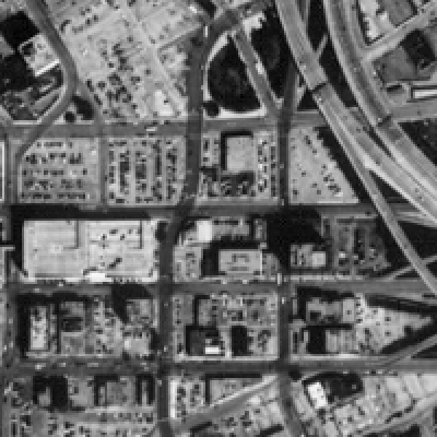
Portion of a SPIN-2 image of Dallas, Texas.
© 2006 Aerial Images, Inc. All rights reserved. Used by Permission.
IKONOS
Also in 1994, when the Russian space agency first began selling its space surveillance imagery, a new company called Space Imaging, Inc. was chartered in the U.S. Recognizing that high-resolution images were then available commercially from competing foreign sources, the U.S. government authorized private firms under its jurisdiction to produce and market remotely sensed data at spatial resolutions as high as one meter. By 1999, after a failed first attempt, Space Imaging successfully launched its Ikonos I satellite into an orbital path that circles the Earth 640 km above the surface, from pole to pole, crossing the equator at the same time of day every day. Such an orbit is called asun synchronous polar orbit, in contrast with the geosynchronousorbits of communications and some weather satellites that remain over the same point on the Earth’s surface at all times.
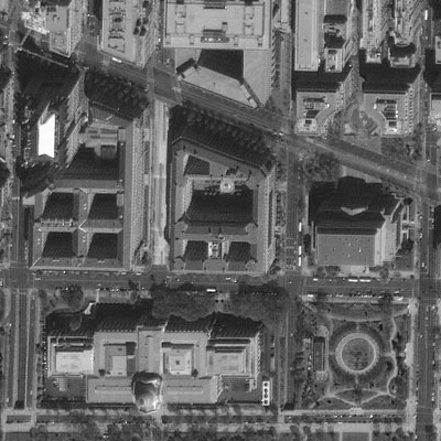
Portion of a 1-meter resolution panchromatic image of Washington, DC produced by the
Ikonos I sensor. © 2001 Space Imaging, inc. All Rights Reserved. Used by permission.
Ikonos’ panchromatic sensor records reflectances in the visible band at a spatial resolution of one meter, and a bit depth of eleven bits per pixel. The expanded bit depth enables the sensor to record reflectances more precisely, and allows technicians to filter out atmospheric haze more effectively than is possible with 8-bit imagery. Archived, unrectified, panchromatic Ikonos imagery within the U.S. is available for as little as $7 per square kilometer, but new orthorectified imagery costs $28 per square kilometer and up.
A competing firm called ORBIMAGE acquired Space Imaging in early 2006, after ORBIMAGE secured a half-billion dollar contract with the National Geospatial-Intelligence Agency. The merged companies were called GeoEye, Inc. In early 2013 GeoEye was merged into theDigitalGlobe corporation. A satellite named GeoEye-1 was launched in 2008 and provides sub-meter (0.41 meter) panchromatic resolution (GeoEye, 2007). In 2013 a new satellite named GeoEye-2 is due to become operational. It will have a panchromatic resolution of 0.34 meters.
DMSP
The U.S. Air Force initiated its Defense Meteorology Satellite Program (DMSP) in the mid-1960s. By 2001, they had launched fifteen DMSP satellites. The satellites follow polar orbits at altitudes of about 830 km, circling the Earth every 101 minutes.
The program’s original goal was to provide imagery that would aid high-altitude navigation by Air Force pilots. DMSP satellites carry several sensors, one of which is sensitive to a band of wavelengths encompassing the visible and near-infrared wavelengths (0.40-1.10 µm). The spatial resolution of this panchromatic sensor is low (2.7 km), but its radiometric resolution is high enough to record moonlight reflected from cloud tops at night. During cloudless new moons, the sensor is able to detect lights emitted by cities and towns. Image analysts have successfully correlated patterns of night lights with population density estimates produced by the U.S. Census Bureau, enabling analysts to use DMSP imagery (in combination with other data layers, such as transportation networks) to monitor changes in global population distribution.
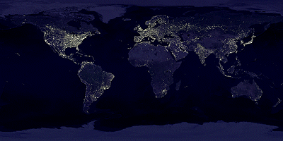
Composite image of the Earth at night showing lights from cities and towns throughout the world. This image was recorded by DMSP satellite sensors. (Geophysical Data Center, 2005).
8.12. Multispectral Image Data
The previous section highlighted the one-meter panchromatic data produced by the IKONOS satellite sensor. Pan data is not all that IKONOS produces, however. It is a multispectral sensor that records reflectances within four other (narrower) bands, including the blue, green, and red wavelengths of the visible spectrum, and the near-infrared band. The range(s) of wavelengths that a sensor is able to detect is called its spectral sensitivity.
| Spectral Sensitivity | Spatial Resolution |
|---|---|
| 0.45 – 0.90 μm (panchromatic) | 1m |
| 0.45 – 0.52 μm (visible blue) | 4m |
| 0.51 – 0.60 μm (visible green) | 4m |
| 0.63 – 0.70 μm (visible red) | 4m |
| 0.76 – 0.85 μm (near IR) | 4m |
Spectral sensitivities and spatial resolution of the IKONOS I sensor. Wavelengths are expressed in micrometers (millionths of a meter). Spatial resolution is expressed in meters.
This section profiles two families of multispectral sensors that play important roles in land use and land cover characterization: AVHRR and Landsat.
AVHRR
AVHRR stands for “Advanced Very High Resolution Radiometer.” AVHRR sensors have been onboard sixteen satellites maintained by the National Oceanic and Atmospheric Administration (NOAA) since 1979 (TIROS-N, NOAA-6 through NOAA-15). The data the sensors produce are widely used for large-area studies of vegetation, soil moisture, snow cover, fire susceptibility, and floods, among other things.
AVHRR sensors measure electromagnetic energy within five spectral bands, including visible red, near infrared, and three thermal infrared. The visible red and near-infrared bands are particularly useful for large-area vegetation monitoring. The Normalized Difference Vegetation Index (NDVI), a widely used measure of photosynthetic activity that is calculated from reflectance values in these two bands, is discussed later.
| Spectral Sensitivity | Spatial Resolution |
|---|---|
| 0.58 – 0.68 μm (visible red) | 1-4 km* |
| 0.725 – 1.10 μm (near IR) | 1-4 km* |
| 3.55 – 3.93 μm (thermal IR) | 1-4 km* |
| 10.3 – 11.3 μm (thermal IR) | 1-4 km* |
| 11.5 – 12.5 μm (thermal IR) | 1-4 km* |
Spectral sensitivities and spatial resolution of the AVHRR sensor. Wavelengths are expressed in micrometers (millionths of a meter). Spatial resolution is expressed in kilometers (thousands of meters). *Spatial resolution of AVHRR data varies from 1 km to 16 km. Processed data consist of uniform 1 km or 4 km grids.
The NOAA satellites that carry AVHRR sensors trace sun-synchronous polar orbits at altitudes of about 833 km. Traveling at ground velocities of over 6.5 kilometers per second, the satellites orbit the Earth 14 times daily (every 102 minutes), crossing over the same locations along the equator at the same times every day. As it orbits, the AVHRR sensor sweeps a scan head along a 110°-wide arc beneath the satellite, taking many measurements every second. (The back and forth sweeping motion of the scan head is said to resemble a whisk-broom.) The arc corresponds to a ground swath of about 2400 km. Because the scan head traverses so wide an arc, its instantaneous field of view (IFOV: the ground area covered by a single pixel) varies greatly. Directly beneath the satellite, the IFOV is about 1 km square. Near the edge of the swath, however, the IFOV expands to over 16 square kilometers. To achieve uniform resolution, the distorted IFOVs near the edges of the swath must be resampled to a 1 km grid (Resampling is discussed later in this chapter). The AVHRR sensor is capable of producing daily global coverage in the visible band, and twice daily coverage in the thermal IR band.
For more information, visit the USGS’ AVHRR home page.
LANDSAT MSS
Television images of the Earth taken from early weather satellites (such as TIROS-1, launched in 1960), and photographs taken by astronauts during the U.S. manned space programs in the 1960s, made scientists wonder about how such images could be used for environmental resource management. In the mid 1960s, U.S. National Aeronautics and Space Administration (NASA) and the Department of Interior began work on a plan to launch a series of satellite-based orbiting sensors. The Earth Resource Technology Satellite program launched its first satellite, ERTS-1, in 1972. When the second satellite was launched in 1975, NASA renamed the program Landsat. Since then, there have been six successful Landsat launches (Landsat 6 failed shortly after takeoff in 1993; Landsat 7 successfully launched in 1999).
Two sensing systems were on board Landsat 1 (formerly ERTS-1): a Return Beam Videcon (RBV) and a Multispectral Scanner (MSS). The RBV system is analogous to today’s digital cameras. It sensed radiation in the visible band for an entire 185 km square scene at once, producing images comparable to color photographs. The RBV sensor was discontinued after Landsat 3, due to erratic performance and a general lack of interest in the data it produced.
The MSS sensor, however, enjoyed much more success. From 1972 through 1992 it was used to produce an archive of over 630,000 scenes. MSS measures radiation within four narrow bands: one that spans visible green wavelengths, another that spans visible red wavelengths, and two more spanning slightly longer, near-infrared wavelengths.
| Spectral Sensitivity | Spatial Resolution |
|---|---|
| 0.5 – 0.6 μm (visible green) | 79 / 82 m* |
| 0.6 – 0.7 μm (visible red) | 79 / 82 m* |
| 0.7 – 0.8 μm (near IR) | 79 / 82 m* |
| 0.8 – 1.1 μm (near IR) | 79 / 82 m* |
Spectral sensitivities and spatial resolution of the Landsat MSS sensor. Wavelengths are expressed in micrometers (millionths of a meter). Spatial resolution is expressed in meters. *MSS sensors aboard Landsats 4 and 5 had nominal resolution of 82 m, which includes 15 meters of overlap with previous scene.
Landsats 1 through 3 traced near-polar orbits at altitudes of about 920 km, orbiting the Earth 14 times per day (every 103 minutes). Landsats 4 and 5 orbit at 705 km altitude. The MSS sensor sweeps an array of six energy detectors through an arc of less than 12°, producing six rows of data simultaneously across a 185 km ground swath. Landsat satellites orbit the Earth at similar altitudes and velocities as the satellites that carry AVHRR, but because the MSS scan swath is so much narrower than AVHRR, it takes much longer (18 days for Landsat 1-3, 16 days for Landsats 4 and 5) to scan the entire Earth’s surface.
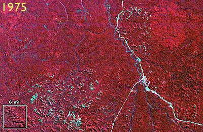
Three scenes produced by a Landsat Multispectral Scanner. Images reveal Amazonian rainforest cleared in the Brazilian state of Rondonia between 1975 and 1992. Red areas represent healthy vegetation (USGS, 2001).
The sequence of three images shown above cover the same portion of the state of Rondonia, Brazil. Reflectances in the near-infrared band are coded red in these images; reflectances measured in the visible green and red bands are coded blue and green. Since vegetation absorbs visible light, but reflects infrared energy, the blue-green areas indicate cleared land. Land use change detection is one of the most valuable uses of multispectral imaging.
For more information, visit USGS’ Landsat home page
LANDSAT TM AND ETM+
As NASA prepared to launch Landsat 4 in 1982, it replaced the unsuccessful RBV sensor with a new sensing system called Thematic Mapper (TM). TM was a new and improved version of MSS that featured higher spatial resolution (30 meters in most channels) and expanded spectral sensitivity (seven bands, including visible blue, visible green, visible red, near-infrared, two mid-infrared, and thermal infrared wavelengths). An Enhanced Thematic Mapper Plus (ETM+) sensor, which includes an eighth (panchromatic) band with a spatial resolution of 15 meters, was onboard Landsat 7 when it successfully launched in 1999.
| Spectral Sensitivity | Spatial Resolution |
|---|---|
| 0.522 -0.90 μm (panchromatic)* | 15 m* |
| 0.45 – 0.52 μm (visible blue) | 30 m |
| 0.52 – 0.60 μm (visible green) | 30 m |
| 0.63 – 0.69 μm (visible red) | 30 m |
| 0.76 – 0.90 μm (near IR) | 30 m |
| 1.55 – 1.75 μm (mid IR) | 30 m |
| 10.40 – 12.50 μm (thermal IR) | 120 m (Landsat 4-5) 60 m (Landsat 7) |
| 2.08 – 2.35 μm (mid IR) | 30 m |
Spectral sensitivities and spatial resolution of the Landsat TM and ETM sensors. Wavelengths are expressed in micrometers (millionths of a meter). Spatial resolution is expressed in meters. Note the lower spatial resolution in thermal IR band, which allows for increased radiometric resolution. *ETM+/Landsat 7 only.
The spectral sensitivities of the TM and ETM+ sensors are attuned to both the spectral response characteristics of the phenomena that the sensors are designed to monitor, as well as to the windows within which electromagnetic energy are able to penetrate the atmosphere. The following table outlines some of the phenomena that are revealed by each of the wavelengths bands, phenomena that are much less evident in panchromatic image data alone.
| Band | Phenomena Revealed |
|---|---|
| 0.45 – 0.52 μm (visible blue) | Shorelines and water depths (these wavelenths penetrate water) |
| 0.52 – 0.60 μm (visible green) | Plant types and vigor (peak vegitation reflects these wavelengths strongly) |
| 0.63 – 0.69 μm (visible red) | Photosynthetic activity (plants absorb these wavelengths during photosynthesis) |
| 0.76 – 0.90 μm (near IR) | Plant vigor (healthy plant tissue reflects these wavelengths strongly) |
| 1.55 – 1.75 μm (mid IR) | Plant water stress, soil moisture, rock types, cloud cover vs. snow |
| 10.40 – 12.50 μm (themal IR) | Relative amounts of heat, soil moisture |
| 2.08 – 2.35 μm (mid IR) | Plant water stress, mineral and rock types |
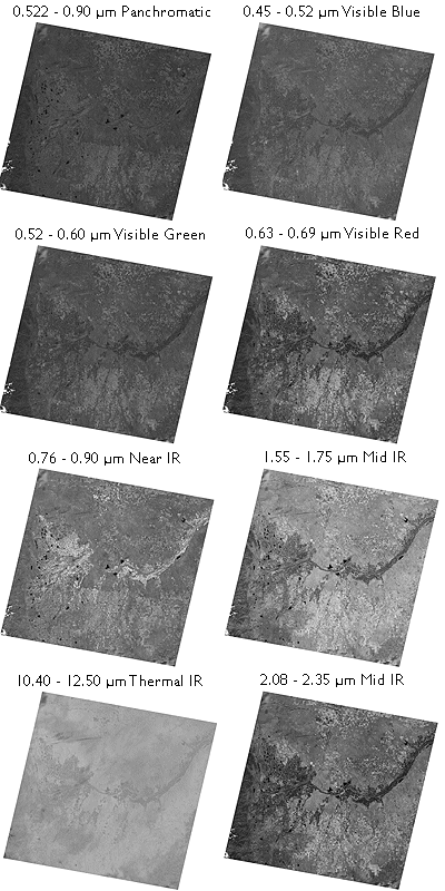
Images produced from 8 bands of Landsat 7 ETM data of Denver, CO. Each image in the illustration represents reflectance values recorded in each wavelength band. False color images are produced by coloring three bands (for example, the visible green, visible red, and near-infrared bands) using blue, green, and red, like the layers in color photographic film.
Until 1984, Landsat data were distributed by the U.S. federal government (originally by the USGS’s EROS Data Center, later by NOAA). Data produced by Landsat missions 1 through 4 are still available for sale from EROS. With the Land Remote Sensing Commercialization Act of 1984, however, the U.S. Congress privatized the Landsat program, transferring responsibility for construction and launch of Landsat 5, and for distribution of the data it produced, to a firm called EOSAT.
Dissatisfied with the prohibitive costs of unsubsidized data (as much as $4,400 for a single 185 km by 170 km scene), users prompted Congress to pass the Land Remote Sensing Policy Act of 1992. The new legislation returned responsibility for the Landsat program to the U.S. government. Data produced by Landsat 7 is distributed by USGS at a cost to users of $600 per scene (about 2 cents per square kilometer). Scenes that include data gaps caused by a “scan line corrector” failure are sold for $250; $275 for scenes in which gaps are filled with earlier data.
TRY THIS!
You may choose to visit the USGS’ EarthNow! Landsat Image Viewer, which allows you to view live acquisition of Landsat 5 and Landsat 7 images. This site has a link to the USGS Global Visualization Viewer where you can search for images based on percent cloud cover.

A snapshot of the live EarthNow! Landsat Image Viewer (USGS, 2011).
8.13. Using EarthExplorer to Find Landsat Data
TRY THIS!
This activity involves using the USGS EarthExplorer system to find Landsat data that corresponds with the scene of the Denver, Colorado area illustrated earlier. At the end of the experiment you can search for data in your own area of interest.
EarthExplorer is a Web application that enables users to find, preview, and download or order digital data published by the U.S. Geological Survey. In addition to Landsat MSS, TM, and ETM+ data, AVHRR, DOQ, aerial photography, and other data are also available from the site.
Begin by pointing your browser to EarthExplorer. (Clicking on this link opens a separate window featuring the EarthExplorer Web site. You may enlarge the window and work within it, or if you prefer, open a separate browser and type in the EarthExplorer Web address.)
- You don’t have to register to use EarthExplorer, unless you want to download data.
- In order to uncompress the data files that you might choose to download you will need an application that is capable of uncompressing a .tar.gz file. One such application is 7-Zip. You can download 7-Zip here
1. Enter your search criteria
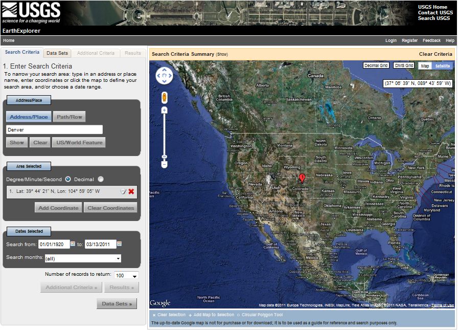
- Enter Address/Place name: Denver on the first tab Search Criteria
- Click the Address/Place name Show button
- “Denver, CO, USA” is returned (as are several other matches on the “Denver” string), along with latitude and longitude coordinates needed to perform a spatial search of EarthExplorer’s database. Click on the Denver, CO, USA choice from the list. It may take several seconds, but the display on the left will change to show only the location coordinates for Denver, CO, and a location marker will appear on the map. See below.
EarthExplorer home page, March 2011.
2. Select your Data Set(s) Our objective is to find the Landsat ETM+ data that is illustrated, band by band, in the previous page.
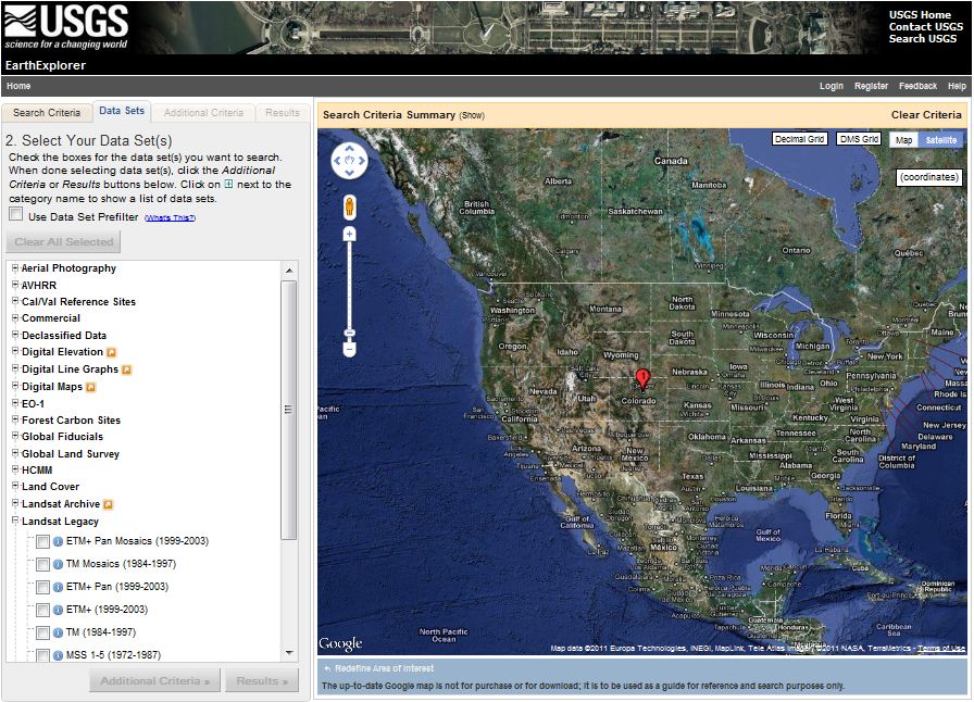
- In the frame in the left side of the window click on the second tabData Sets
- Mark the checkbox to select ETM+ (1999-2003) under Landsat Legacy.
3. View your Results
- The list of Results will show up on the fourth tab.
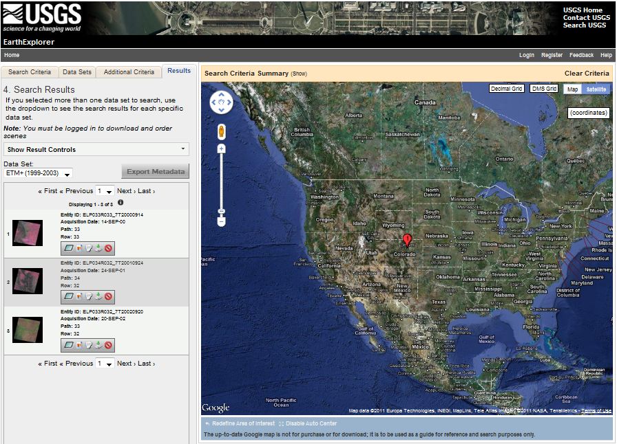
- Click the image icon for one of the results to show a full display of that result, including attribute information.
- Click the “Show Browse Overlay” icon or the “Show Footprint” icon to bring up and overlay or footprint over the Google map.
- Click “Download” to dowload a specific result. (NOTE: You will need to login or register and then login to the USGS to download data.)
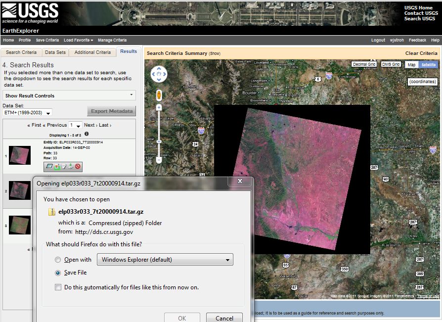
Overlay and footprint image of Landsat scene and download dialog box, EarthExplorer, March 2011.
Downloaded data arrives on your desktop in a double-compressed archive format. For instance, the archive I downloaded is named “elp033r033_7t20000914.tar.gz” To open and view the data in Global Mapper / dlgv32 Pro, I had to first extract the .tar archive from the .gz archive, then extract .tif files from the .tar archive. I used the 7-Zip application, that I mentioned above, to extract the files: right-click on an archive, then choose 7-Zip > Extract files…. The screen capture below shows one of the eight Landsat images (corresponding to the eight ETM+ bands) in Global Mapper.
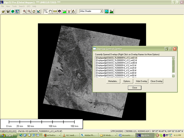
Landsat scene viewed in Global Mapper software.
Use EarthExplorer to find Landsat data for your own area of interest
- Use the Redefine Criteria link at the bottom of the Results page to begin a new search. Try searching for your hometown or a place you’ve always wanted to visit.
PRACTICE QUIZ
Registered Penn State students should return now to the Chapter 8 folder in ANGEL (via the Resources menu to the left) to take a self-assessment quiz about Visible and Infrared Data.
You may take practice quizzes as many times as you wish. They are not scored and do not affect your grade in any way.
8.14. Multispectral Image Processing
One of the main advantages of digital data is that they can be readily processed using digital computers. Over the next few pages we focus on digital image processing techniques used to correct, enhance, and classify remotely sensed image data.
8.15. Image Correction
As suggested earlier, scanning the Earth’s surface from space is like scanning a paper document with a desktop scanner, only a lot more complicated. Raw remotely sensed image data are full of geometric and radiometric flaws caused by the curved shape of the Earth, the imperfectly transparent atmosphere, daily and seasonal variations in the amount of solar radiation received at the surface, and imperfections in scanning instruments, among other things. Understandably, most users of remotely sensed image data are not satisfied with the raw data transmitted from satellites to ground stations. Most prefer preprocessed data from which these flaws have been removed.
GEOMETRIC CORRECTION
You read in Chapter 6 that scale varies in unrectified aerial imagery due to the relief displacement caused by variations in terrain elevation. Relief displacement is one source of geometric distortion in digital image data, although it is less of a factor in satellite remote sensing than it is in aerial imaging because satellites fly at much higher altitudes than airplanes. Another source of geometric distortions is the Earth itself, whose curvature and eastward spinning motion are more evident from space than at lower altitudes.
The Earth rotates on its axis from west to east. At the same time, remote sensing satellites like IKONOS, Landsat, and the NOAA satellites that carry the AVHRR sensor, orbit the Earth from pole to pole. If you were to plot on a cylindrical projection the flight path that a polar orbiting satellite traces over a 24-hour period, you would see a series of S-shaped waves. As a remote sensing satellite follows its orbital path over the spinning globe, each scan row begins at a position slightly west of the row that preceded it. In the raw scanned data, however, the first pixel in each row appears to be aligned with the other initial pixels. To properly georeference the pixels in a remotely sensed image, pixels must be shifted slightly to the west in each successive row. This is why processed scenes are shaped like skewed parallelograms when plotted in geographic or plane projections, as shown in the illustration you saw earlier that showed eight bands of a Landsat 7 ETM+ scene.
In addition to the systematic error caused by the Earth’s rotation, random geometric distortions result from relief displacement, variations in the satellite altitude and attitude, instrument misbehaviors, and other anomalies. Random geometric errors are corrected through a process known as rubber sheeting. As the name implies, rubber sheeting involves stretching and warping an image to georegister control points shown in the image to known control point locations on the ground. First, a pair of plane coordinate transformation equations is derived by analyzing the differences between control point locations in the image and on the ground. The equations enable image analysts to generate a rectified raster grid. Next, reflectance values in the original scanned grid are assigned to the cells in the rectified grid. Since the cells in the rectified grid don’t align perfectly with the cells in the original grid, reflectance values in the rectified grid cells have to be interpolated from values in the original grid. This process is calledresampling. Resampling is also used to increase or decrease the spatial resolution of an image so that its pixels can be georegistered with those of another image.
RADIOMETRIC CORRECTION
The reflectance at a given wavelength of an object measured by a remote sensing instrument varies in response to several factors, including the illumination of the object, its reflectivity, and the transmissivity of the atmosphere. Furthermore, the response of a given sensor may degrade over time. With these factors in mind, it should not be surprising that an object scanned at different times of the day or year will exhibit different radiometric characteristics. Such differences can be advantageous at times, but they can also pose problems for image analysts who want to mosaic adjoining images together, or to detect meaningful changes in land use and land cover over time. To cope with such problems, analysts have developed numerous radiometric correction techniques, including Earth-sun distance corrections, sun elevation corrections, and corrections for atmospheric haze.
To compensate for the different amounts of illumination of scenes captured at different times of day, or at different latitudes or seasons, image analysts may divide values measured in one band by values in another band, or they may apply mathematical functions that normalize reflectance values. Such functions are determined by the distance between the Earth and the sun and the altitude of the sun above the horizon at a given location, time of day, and time of year. Analysts depend on metadata that includes the location, date, and time at which a particular scene was captured.
Image analysts may also correct for the contrast-diminishing effects of atmospheric haze. Haze compensation resembles the differential correction technique used to improve the accuracy of GPS data in the sense that it involves measuring error (or, in this case, spurious reflectance) at a known location, then subtracting that error from another measurement. Analysts begin by measuring the reflectance of an object known to exhibit near-zero reflectance under non-hazy conditions, such as deep, clear water in the near-infrared band. Any reflectance values in those pixels can be attributed to the path radiance of atmospheric haze. Assuming that atmospheric conditions are uniform throughout the scene, the haze factor may be subtracted from all pixel reflectance values. Some new sensors allow “self calibration” by measuring atmospheric water and dust content directly.
Geometric and radiometric correction services are commonly offered by government agencies and private firms that sell remotely sensed data. For example, although the USGS offers raw (Level Zero R) Landsat 7 data for just $475 per 185 km by 170 km scene, many users find the $600 radiometrically corrected, orthorectified, and custom projected Level One G data well worth the added expense. GeoEye (formerly Space Imaging) routinely delivers preprocessed IKONOS data that has been radiometrically corrected, orthorectified, projected and mosaicked to user specifications. Four levels of geometric accuracy are available, from 12 meters (which satisfies National Map Accuracy Standards at 1:50,000 scale) to 1 meter (1:2,400 NMAS).
8.16. Image Enhancement
Correction techniques are routinely used to resolve geometric, radiometric, and other problems found in raw remotely sensed data. Another family of image processing techniques is used to make image data easier to interpret. These so-called image enhancement techniques include contrast stretching, edge enhancement, and deriving new data by calculating differences, ratios, or other quantities from reflectance values in two or more bands, among many others. This section considers briefly two common enhancement techniques, contrast stretching and derived data. Later you’ll learn how vegetation indices derived from two bands of AVHRR imagery are used to monitor vegetation growth at a global scale.
CONTRAST STRETCHING
Consider the pair of images shown side by side below. Although both were produced from the same Landsat MSS data, you will notice that the image on the left is considerably dimmer than the one on the right. The difference is a result of contrast stretching. As you recall, MSS data have a precision of 8 bits, that is, reflectance values are encoded as 256 (28) intensity levels. As is often the case, reflectances in the near-infrared band of the scene partially shown below ranged from only 30 and 80 in the raw image data. This limited range results in an image that lacks contrast and, consequently, appears dim. The image on the right shows the effect of stretching the range of reflectance values in the near-infrared band from 30-80 to 0-255, and then similarly stretching the visible green and visible red bands. As you can see, the contrast-stretched image is brighter and clearer.
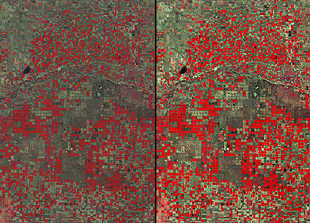
Pair of images produced from Landsat MSS data captured in 1988. The near-infrared band is shown in red, the visible red is shown in green, and the visible green band is shown in blue. The right and left images show the before and after effects of contrast stretching. The images show agricultural patterns characteristic of center-pivot irrigation in a portion of a county in southwestern Kansas. (USGS, 2001a).
DERIVED DATA: NDVI
One advantage of multispectral data is the ability to derive new data by calculating differences, ratios, or other quantities from reflectance values in two or more wavelength bands. For instance, detecting stressed vegetation amongst healthy vegetation may be difficult in any one band, particularly if differences in terrain elevation or slope cause some parts of a scene to be illuminated differently than others. The ratio of reflectance values in the visible red band and the near-infrared band compensates for variations in scene illumination, however. Since the ratio of the two reflectance values is considerably lower for stressed vegetation regardless of illumination conditions, detection is easier and more reliable.
Besides simple ratios, remote sensing scientists have derived other mathematical formulae for deriving useful new data from multispectral imagery. One of the most widely used examples is the Normalized Difference Vegetation Index (NDVI). As you may recall, the AVHRR sensor measures electromagnetic radiation in five wavelengths bands. NDVI scores are calculated pixel-by-pixel using the following algorithm:
NDVI = (NIR – R) / (NIR + R)
R stands for the visible red band (AVHRR channel 1), while NIR represents the near-infrared band (AVHRR channel 2). The chlorophyll in green plants strongly absorbs radiation in AVHRR’s visible red band (0.58-0.68 µm) during photosynthesis. In contrast, leaf structures cause plants to strongly reflect radiation in the near-infrared band (0.725-1.10 µm). NDVI scores range from -1.0 to 1.0. A pixel associated with low reflectance values in the visible band and high reflectance in the near-infrared band would produce an NDVI score near 1.0, indicating the presence of healthy vegetation. Conversely, the NDVI scores of pixels associated with high reflectance in the visible band and low reflectance in the near-infrared band approach -1.0, indicating clouds, snow, or water. NDVI scores near 0 indicate rock and non-vegetated soil.
Applications of the NDVI range from local to global. At the local scale, the Mondavi Vineyards in Napa Valley California can attest to the utility of NDVI data in monitoring plant health. In the 1993, the vineyards suffered an infestation of phylloxera, a species of plant lice that attacks roots and is impervious to pesticides. The pest could only be overcome by removing infested vines and replacing them with more resistant root stock. The vineyard commissioned a consulting firm to acquire high-resolution (2-3 meter) visible and near-infrared imagery during consecutive growing seasons using an airborne sensor. Once the data from the two seasons were georegistered, comparison of NDVI scores revealed areas in which vine canopy density had declined. NDVI change detection proved to be such a fruitful approach that the vineyards adopted it for routine use as part of their overall precision farming strategy (Colucci, 1998).
The example that follows outlines the image processing steps involved in producing a global NDVI data set.
8.17. Processing the 1Km Global Land Dataset
The Advanced Very High Resolution Radiometer (AVHRR) sensors aboard NOAA satellites scan the entire Earth daily at visible red, near-infrared, and thermal infrared wavelengths. In the late 1980s and early 1990s, several international agencies identified the need to compile a baseline, cloud-free, global NDVI data set in support of efforts to monitor global vegetation cover. For example, the United Nations mandated its Food and Agriculture Organization to perform a global forest inventory as part of its Forest Resources Assessment project. Scientists participating in NASA’s Earth Observing System program also needed a global AVHRR data set of uniform quality to calibrate computer models intended to monitor and predict global environmental change. In 1992, under contract with the USGS, and in cooperation with the International Geosphere Biosphere Programme, scientists at the EROS Data Center in Sioux Falls, South Dakota, started work. Their goals were to create not only a single 10-day composite image, but also a 30-month time series of composites that would help Earth system scientists to understand seasonal changes in vegetation cover at a global scale. This example highlights the image processing procedures used to produce the data set. Further information is available in Eidenshink & Faundeen (1994) and at the project home page.
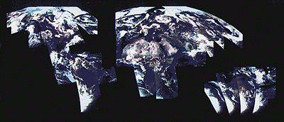
From 1992 through 1996, a network of 30 ground receiving stations acquired and archived tens of thousands of scenes from an AVHRR sensor aboard one of NOAA’s polar orbiting satellites. Individual scenes were stitched together into daily orbital passes like the ones illustrated below. Creating orbital passes allowed the project team to discard the redundant data in overlapping scenes acquired by different receiving stations.
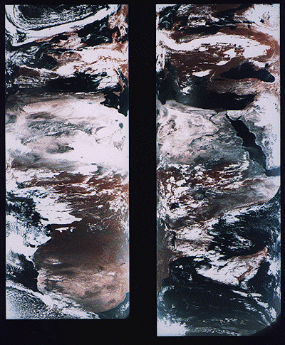
False color images produced from AVHRR data acquired on June 24, 1992 for the 1-Km AVHRR Global Land Dataset project. The images represent orbital passes created by splicing consecutive scenes. The 2400-km wide swaths cover Europe, Africa, and the Near East. Note the cloud cover and geometric distortion. (Eidenshink & Faundeen, 1994).
Once the daily orbital scenes were stitched together, the project team set to work preparing cloud-free, 10-day composite data sets that included Normalized Difference Vegetation Index (NDVI) scores. The image processing steps involved included radiometric calibration, atmospheric correction, NDVI calculation, geometric correction, regional compositing, and projection of composited scenes. Each step is described briefly below.
RADIOMETRIC CALIBRATION
Radiometric calibration means defining the relationship between reflectance values recorded by a sensor from space and actual radiances measured with spectrometers on the ground. The accuracy of the AVHRR visible red and near-IR sensors degrade over time. Image analysts would not be able to produce useful time series of composite data sets unless reflectances were reliably calibrated. The project team relied on research that showed how AVHRR data acquired at different times could be normalized using a correction factor derived by analyzing reflectance values associated with homogeneous desert areas.
ATMOSPHERIC CORRECTION
Several atmospheric phenomena, including Rayleigh scatter, ozone, water vapor, and aerosols, were known to affect reflectances measured by sensors like AVHRR. Research yielded corrections to compensate for some of these.
One proven correction was for Rayleigh scatter. Named for an English physicist who worked in the early 20th century, Rayleigh scatter is the phenomenon that accounts for the fact that the sky appears blue. Short wavelengths of incoming solar radiation tend to be diffused by tiny particles in the atmosphere. Since blue wavelengths are the shortest in the visible band, they tend to be scattered more than green, red, and other colors of light. Rayleigh scatter is also the primary cause of atmospheric haze.
Because the AVHRR sensor scans such a wide swath, image analysts couldn’t be satisfied with applying a constant haze compensation factor throughout entire scenes. To scan its 2400-km wide swath, the AVHRR sensor sweeps a scan head through an arc of 110°. Consequently, the viewing angle between the scan head and the Earth’s surface varies from 0° in the middle of the swath to about 55° at the edges. Obviously the lengths of the paths traveled by reflected radiation toward the sensor vary considerably depending on the viewing angle. Project scientists had to take this into account when compensating for atmospheric haze. The farther a pixel was located from the center of a swath, the greater its path length, and the more haze needed to be compensated for. While they were at it, image analysts also factored in terrain elevation, since that too affects path length. ETOPO5, the most detailed global digital elevation model available at the time, was used to calculate path lengths adjusted for elevation. (You learned about the more detailed ETOPO1 in Chapter 7.)
NDVI CALCULATION
The Normalized Difference Vegetation Index (NDVI) is the difference of near-IR and visible red reflectance values normalized over the sum of the two values. The result, calculated for every pixel in every daily orbital pass, is a value between -1.0 and 1.0, where 1.0 represents maximum photosynthetic activity, and thus maximum density and vigor of green vegetation.
GEOMETRIC CORRECTION AND PROJECTION
As you can see in the stitched orbital passes illustrated above, the widerange of view angles produced by the AVHRR sensor results in a great deal of geometric distortion. Relief displacement makes matters worse, distorting images even more towards the edges of each swath. The project team performed both orthorectification and rubber sheeting to rectify the data. The ETOPO5 global digital elevation model was again used to calculate corrections for scale distortions caused by relief displacement. To correct for distortions caused by the wide range of sensor view angles, analysts identified well-defined features like coastlines, lakeshores, and rivers in the imagery that could be matched to known locations on the ground. They derived coordinate transformation equations by analyzing differences between positions of control points in the imagery and known locations on the ground. The accuracy of control locations in the rectified imagery was shown to be no worse than 1,000 meters from actual locations. Equally important, the georegistration error between rectified daily orbital passes was shown to be less than one pixel.
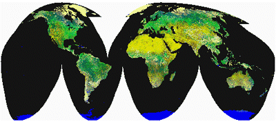
After the daily orbital passes were rectified, they were transformed into a map projection called Goode’s Homolosine. This is an equal-area projection that minimizes shape distortion of land masses by interrupting the graticule over the oceans. The project team selected Goode’s projection in part because they knew that equivalence of area would be a useful quality for spatial analysis. More importantly, the interrupted projection allowed the team to process the data set as twelve separate regions that could be spliced back together later. The illustration below shows the orbital passes for June 24, 1992 projected together in a single global image based on Goode’s projection.
AVHRR orbital passes acquired on June 24, 1992, projected together in a Goode’s Homolosine projection of the world. (Eidenshink & Faundeen, 1994).
COMPOSITING
Once the daily orbital passes for a ten-day period were rectified, every one-kilometer square pixel could be associated with corresponding pixels at the same location in other orbital passes. At this stage, with the orbital passes assembled into twelve regions derived from the interrupted Goode’s projection, image analysts identified the highest NDVI value for each pixel in a given ten-day period. They then produced ten-day composite regions by combining all the maximum-value pixels into a single regional data set. This procedure minimized the chances that cloud-contaminated pixels would be included in the final composite data set. Finally, the composite regions were assembled into a single data set, illustrated below. This same procedure has been repeated to create 93 ten-day composites from April 1-10, 1992 to May 21-30, 1996.
Ten-day composite AVHRR image. The greenest pixels represent the highest NDVI values. (Eidenshink & Faundeen, 1994).
8.18. Image Classification
Along with military surveillance and weather forecasting, a common use of remotely sensed image data is to monitor land cover and to inform land use planning. The term land cover refers to the kinds of vegetation that blanket the Earth’s surface, or the kinds of materials that form the surface where vegetation is absent. Land use, by contrast, refers to the functional roles that the land plays in human economic activities (Campbell, 1983).
Both land use and land cover are specified in terms of generalized categories. For instance, an early classification system adopted by a World Land Use Commission in 1949 consisted of nine primary categories, including settlements and associated non-agricultural lands, horticulture, tree and other perennial crops, cropland, improved permanent pasture, unimproved grazing land, woodlands, swamps and marshes, and unproductive land. Prior to the era of digital image processing, specially trained personnel drew land use maps by visually interpreting the shape, size, pattern, tone, texture, and shadows cast by features shown in aerial photographs. As you might imagine, this was an expensive, time-consuming process. It’s not surprising then that the Commission appointed in 1949 failed in its attempt to produce a detailed global land use map.
Part of the appeal of digital image processing is the potential to automate land use and land cover mapping. To realize this potential, image analysts have developed a family of image classification techniques that automatically sort pixels with similar multispectral reflectance values into clusters that, ideally, correspond to functional land use and land cover categories. Two general types of image classification techniques have been developed: supervised and unsupervised techniques.
SUPERVISED CLASSIFICATION
Human image analysts play crucial roles in both supervised and unsupervised image classification procedures. In supervised classification, the analyst’s role is to specify in advance the multispectral reflectance or (in the case of the thermal infrared band) emittance values typical of each land use or land cover class.
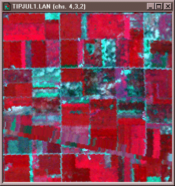
Portion of Landsat TM scene acquired July 17, 1986 showing agricultural fields in Tippecanoe County, Indiana. Reflectances recorded in TM bands 2 (visible green), 3 (visible red), and 4 (near-infrared) are shown in blue, green, and red respectively. Multispec image processing software © 2001 Purdue Research Foundation, Inc.
For instance, to perform a supervised classification of the Landsat Thematic Mapper (TM) data shown above into two land cover categories, Vegetation and Other, you would first delineate several training fields that are representative of each land cover class. The illustration below shows two training fields for each class, however, to achieve the most reliable classification possible, you would define as many as 100 or more training fields per class.
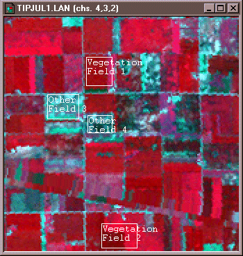
Training fields defined for two classes of land cover, vegetation and other. Multispec image processing software © 2001 Purdue Research Foundation, Inc.
The training fields you defined consist of clusters of pixels with similar reflectance or emittance values. If you did a good job in supervising the training stage of the classification, each cluster would represent the range of spectral characteristics exhibited by its corresponding land cover class. Once the clusters are defined, you would apply a classification algorithm to sort the remaining pixels in the scene into the class with the most similar spectral characteristics. One of the most commonly used algorithms computes the statistical probability that each pixel belongs to each class. Pixels are then assigned to the class associated with the highest probability. Algorithms of this kind are known as maximum likelihood classifiers. The result is an image like the one shown below, in which every pixel has been assigned to one of two land cover classes.
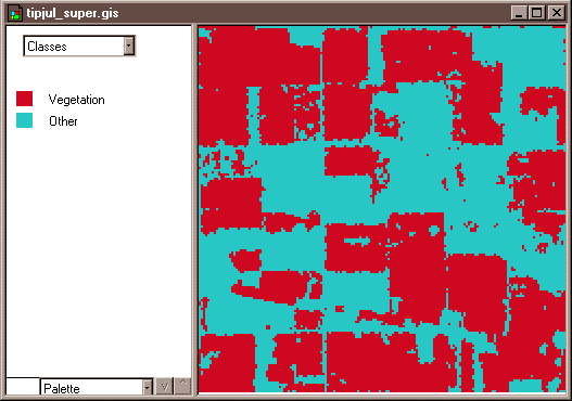
Two-class land cover map produced by supervised classification of Landsat TM data. Multispec image processing software © 2001 Purdue Research Foundation, Inc.
UNSUPERVISED CLASSIFICATION
The image analyst plays a different role in unsupervised classification. They do not define training fields for each land cover class in advance. Instead, they rely on one of a family of statistical clustering algorithms to sort pixels into distinct spectral classes. Analysts may or may not even specify the number of classes in advance. Their responsibility is to determine the correspondences between the spectral classes that the algorithm defines and the functional land use and land cover categories established by agencies like the U.S. Geological Survey. The example that follows outlines how unsupervised classification contributes to the creation of a high-resolution national land cover data set.
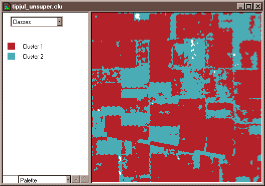
Two-class land cover map produced by unsupervised classification of Landsat TM data. Multispec image processing software © 2001 Purdue Research Foundation, Inc.
8.19. Classifying Landsat Data for the National Land Cover Dataset
The USGS developed one of the first land use/land cover classifications systems designed specifically for use with remotely sensed imagery. The Anderson Land Use/Land Cover Classificationsystem, named for the former Chief Geographer of the USGS who led the team that developed the system, consists of nine land cover categories (urban or built-up; agricultural; range; forest; water; wetland; barren; tundra; and perennial snow and ice), and 37 subcategories (for example, varieties of agricultural land include cropland and pasture; orchards, groves, vineyards, nurseries, and ornamental horticulture; confined feeding operations; and other agricultural land). Image analysts at the U. S. Geological Survey created the USGS Land Use and Land Cover (LULC) data by manually outlining and coding areas on air photos that appeared to have homogeneous land cover that corresponded to one of the Anderson classes.
The LULC data were compiled for use at 1:250,000 and 1:100,000 scales. Analysts drew outlines of land cover polygons onto vertical aerial photographs. Later, the outlines were transferred to transparent film georegistered with small-scale topographic base maps. The small map scales kept the task from taking too long and costing too much, but also forced analysts to generalize the land cover polygons quite a lot. The smallest man-made features encoded in the LULC data are four hectares (ten acres) in size, and at least 200 meters (660 feet) wide at their narrowest point. The smallest non-man-made features are sixteen hectares (40 acres) in size, with a minimum width of 400 meters (1320 feet). Smaller features were aggregated into larger ones. After the land cover polygons were drawn onto paper and georegistered with topographic base maps, they were digitized as vector features, and attributed with land cover codes. A rasterized version of the LULC data was produced later.
For more information, visit the USGS’ LULC home page.
The successor to LULC is the USGS’s National Land Cover Data (NLCD). Unlike LULC, which originated as a vector data set in which the smallest features are about ten acres in size, NLCD is a raster data set with a spatial resolution of 30 meters (i.e., pixels represent about 900 square meters on the ground) derived from Landsat TM imagery. The steps involved in producing the NLCD include preprocessing, classification, and accuracy assessment, each of which is described briefly below.
PREPROCESSING
The first version of NLCD–NLCD 92–was produced for subsets of ten federal regions that make up the conterminous United States. The primary source data were bands 3, 4, 5, and 7 (visible red, near-infrared, mid-infrared, and thermal infrared) of cloud-free Landsat TM scenes acquired during the spring and fall (when trees are mostly bare of leaves) of 1992. Selected scenes were geometrically and radiometrically corrected, then combined into sub-regional mosaics comprised of no more than 18 scenes. Mosaics were then projected to the same Albers Conic Equal Area projection (with standard parallels at 29.5° and 45.5° North Latitude, and central meridian at 96° West Longitude) based upon the NAD83 horizontal datum.
IMAGE CLASSIFICATION
An unsupervised classification algorithm was applied to the preprocessed mosaics to generate 100 spectrally distinct pixel clusters. Using aerial photographs and other references, image analysts at USGS then assigned each cluster to one of the classes in a modified version of the Anderson classification scheme. Considerable interpretation was required, since not all functional classes have unique spectral response patterns.
| Level I Classes | Level II Classes | |
|---|---|---|
| Water | 11 | Open Water |
| 12 | Perennial Ice/Snow | |
| Developed | 21 | Low Intensity Residential |
| 22 | High Intensity Residential | |
| 23 | Commercial/Industrial/Transportation | |
| Barren | 31 | Bare Rock/Sand/Clay |
| 32 | Quarries/Strip Mines/Gravel Pits | |
| 33 | Transitional | |
| Forrested Upland | 41 | Deciduous Forest |
| 42 | Evergreen Forest | |
| 43 | Mixed Forest | |
| Shrubland | 51 | Shrubland |
| Non-Natural Woody | 61 | Orchards/Vineyards/Other |
| Herbaceous Upland Natural/Semi-natural Vegitation | 71 | Grasslands/Herbaceous |
| Herbaceous Planted/Cultivated | 81 | Pasture/Hay |
| 82 | Row Crops | |
| 83 | Small Grains | |
| 84 | Fallow | |
| 85 | Urban/Recreational Grasses | |
| Wetlands | 91 | Woody Wetlands |
| 92 | Emergent Herbaceous Wetlands | |
Modified Anderson Land Use/Land Cover Classification used for the USGS National Land Cover Dataset.
ACCURACY ASSESSMENT
The USGS hired private sector vendors to assess the classification accuracy of the NLCD 92 by checking randomly sampled pixels against manually interpreted aerial photographs. Results from the first four completed regions suggested that the likelihood that a given pixel is correctly classified ranges from only 38 to 62 percent. Much of the classification error was found to occur among the Level II classes that make up the various Level I classes, and some classes were much more error-prone than others. USGS encourages users to aggregate the data into 3 x 3 or 5 x 5 pixel blocks (in other words, to decrease spatial resolution from 30 meters to 90 or 150 meters), or to aggregate the 21 Level II classes into the nine Level I classes. Even in the current era of high-resolution satellite imaging and sophisticated image processing techniques, there is still no cheap and easy way to produce detailed, accurate geographic data.
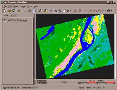
An extract from NLCD 92 that corresponds to the same portion of the Bushkill, PA quadrangle mapped in other USGS data files provided with earlier chapters. The data viewer is ESRI’s ArcExplorer version 2.
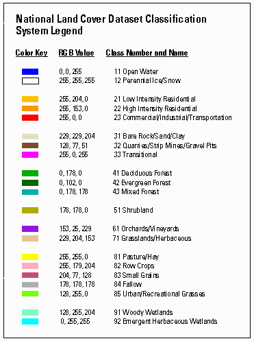
Map legend for the National Land Cover Dataset.
For more information about NLCD 92 and its successor, NLCD 2001, visit the Multi-Resolution Land Characteristics Consortium.
GLOBAL LAND COVER DATA
Meanwhile, the U.S. National Geospatial-Intelligence Agency (formerly the National Imagery and Mapping Agency) hired a company called Earthsat (Now MDA Federal) to produce a 120-meter resolution, 13-class land use / land cover data set for the rest of the world. This product, called Geocover LC, is derived from 30-meter Landsat TM imagery from the 1990s and 2000. A team of image analysts assigned 240 clusters produced by unsupervised classification into the thirteen land use/ land cover classes (Barrios, 2001). For more information about Geocover LC, visit MDA Information Systems and GeoCover LC.
8.20. Unsupervised Classification By Hand
TRY THIS!
This activity guides you through a simulated unsupervised classification of remotely sensed image data to create a land cover map. Begin by viewing and printing the Image Classification Activity PDF file.
1. Plot the reflectance values.
The two grids on the top of the second page of the PDF file represent reflectance values in the visible red and near infrared wavelength bands measured by a remote sensing instrument for a parcel of land. Using the graph (like the one below) on the first page of the PDF file you printed, plot the reflectance values for each pixel and write the number of each pixel (1 to 36) next to its location in the graph. Pixel 1 has been plotted for you (Visible Red band = 22, Near Infrared band = 6).
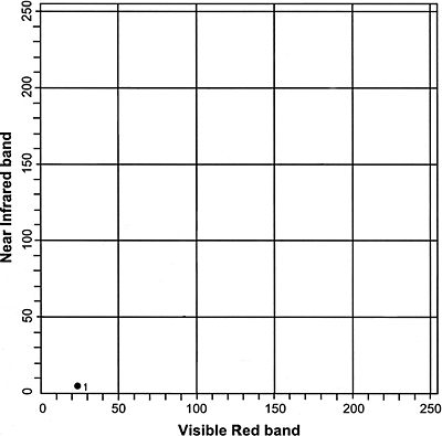
- After you have completed filling in the graph you can check your progress by following this link to a completed graph.
2. Identify four land cover classes.
Looking at the completed plot from step one, identify and circle four clusters (classes) of pixels. Label these four classes A, B, C, and D.
- After you have circled the four clusters of pixels in the graph you can check your progress by following this link to view the identified clusters.
- Note: You may have labeled the clusters differently but the four clusters should contain the same points, more or less, as the example.
3. Complete the land cover map grid.
Using the clusters you identified in the previous step, fill in the land cover map grid with the letter that represents the land use class in which each pixel belongs. The result is a classified image.
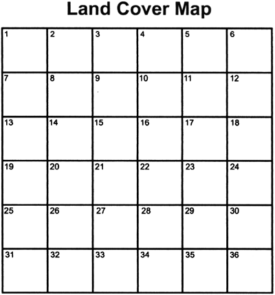
- If you would like to check your land cover map you can follow this link to view a completed land cover map.
- Note: If you labeled the clusters in step two differently than the example, your land cover map may look different but the patterns should look similar.
4. Complete a legend that explains the association.
Using the spectral response data provided on the second page of the PDF file, associate each of the four classes with a land use class.
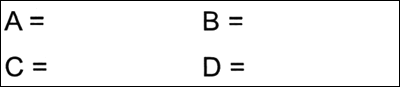
- You can check your results by following this link to view a completed legend.
- Note: Depending on how you labeled your clusters, your legend may differ from the example legend, however, when you apply your legend to your Land Cover Map the land use classes on your map should match the example map.
You have now completed the unsupervised classification activity in which you used remotely sensed image data to create a land cover map.
PRACTICE QUIZ
Registered Penn State students should return now to the Chapter 8 folder in ANGEL (via the Resources menu to the left) to take a self-assessment quiz about Image Processing.
You may take practice quizzes as many times as you wish. They are not scored and do not affect your grade in any way.
8.21. Microwave Data
The remote sensing systems you’ve studied so far are sensitive to the visible, near-infrared, and thermal infrared bands of the electromagnetic spectrum, wavelengths at which the magnitude of solar radiation is greatest. IKONOS, AVHRR, and the Landsat MSS, TM, and ETM+ instruments are all passive sensors that only measure radiation emitted by other objects.
There are two main shortcomings to passive sensing of the visible and infrared bands. First, clouds interfere with both incoming and outgoing radiation at these wavelengths. Secondly, reflected visible and near-infrared radiation can only be measured during daylight hours. This is why the AVHRR sensor only produces visible and near-infrared imagery of the entire Earth once a day, although it is capable of two daily scans.
The electromagnetic spectrum divided into five wavelength bands. (Adapted from Lillesand & Kiefer, 1994).
Longwave radiation, or microwaves, are made up of wavelengths between about one millimeter and one meter. Microwaves can penetrate clouds, but the Sun and Earth emit so little longwave radiation that it can’t be measured easily from space. Active remote sensing systems solve this problem. Active sensors like those aboard the European Space Agency’s ERS satellites, the Japanese JERS satellites, and the Canadian Radarsat, among others, transmit pulses of longwave radiation, then measure the intensity and travel time of those pulses after they are reflected back to space from the Earth’s surface. Microwave sensing is unaffected by cloud cover, and can operate day or night. Both image data and elevation data can be produced by microwave sensing, as you will discover in the sections on imaging radar and radar altimetry that follow.
8.22. Imaging Radar
One example of active remote sensing that everyone has heard of is radar, which stands for RAdio Detection And Ranging. Radar was developed as an air defense system during World War II and is now the primary remote sensing system air traffic controllers use to track the 40,000 daily aircraft takeoffs and landings in the U.S. Radar antennas alternately transmit and receive pulses of microwave energy. Since both the magnitude of energy transmitted and its velocity (the speed of light) are known, radar systems are able to record either the intensity or the round-trip distance traveled of pulses reflected back to the sensor. Systems that record pulse intensity are called imaging radars.
In addition to its indispensable role in navigation, radar is also an important source of raster image data about the Earth’s surface. Radar images look the way they do because of the different ways that objects reflect microwave energy. In general, rough-textured objects reflect more energy back to the sensor than smooth objects. Smooth objects, such as water bodies, are highly reflective, but unless they are perpendicular to the direction of the incoming pulse, the reflected energy all bounces off at an angle and never returns to the sensor. Rough surfaces, such as vegetated agricultural fields, tend to scatter the pulse in many directions, increasing the chance that some back scatter will return to the sensor.
Radar image showing areas inundated by a flood of the Mississippi River in 1993. © 2001 Space Imaging, Inc. All Rights Reserved. Used by permission.
The imaging radar aboard the European Resource Satellite (ERS-1) produced the data used to create the image shown above. The smooth surface of the flooded Mississippi River deflected the radio signal away from the sensor, while the surrounding rougher-textured land cover reflected larger portions of the radar pulse. The lighter an object appears in the image, the more energy it reflected. Imaging radar can be used to monitor flood extents regardless of weather conditions. Passive instruments like Landsat MSS and TM that are sensitive only to shorter wavelengths are useless as long as cloud-covered skies prevail.
8.23. Radar Altimetry
Altimetry is the measurement of elevation. Earlier chapters discussed land survey methods used to calculate terrain elevations in the field (leveling and GPS), and photogrammetric methods used to measure terrain elevations from stereoscopic images produced from pairs of aerial photographs. Land surveys and photogrammetric surveys yield high quality elevation data, but they are also time-consuming and expensive to conduct.
Radar (and laser) altimetry provides more efficient solutions when elevation data are needed for larger areas. For example, you have heard about the Shuttle Radar Topography Mission (SRTM), which used dual radar altimeters to produce 30-meter elevation data as well as stereoscopic terrain imagery for the Earth’s land surface between 60° North and South latitude. Next we’ll consider how radar altimetry has been used to produce a global seafloor elevation data set.
PREDICTING SEAFLOOR DEPTHS
Detailed maps of the Earth’s bathymetry (the topography of the ocean floor) are needed to study plate tectonics, to locate potential offshore oil and mineral deposits, and to route undersea telecommunications cables, among other things. Coarse global data sets (such as ETOPO2, with its 2-minute grid resolution) are inadequate for such purposes. Slow-moving surface vessels equipped with sonar instruments have mapped only a small fraction of the Earth’s bathymetry.
Data produced by radar sensors like ERS-1 have been used to produce global seafloor elevation data. Radar pulses cannot penetrate the deep ocean, but they can be used to accurately measure the height of the sea surface relative to a global ellipsoid such as WGS 84. As you know, the geoid is defined as mean sea level adjusted to account for the effects of gravity. Geodesists invent reference ellipsoids like WGS 84 to approximate the geoid’s shape with a figure that is easier to define mathematically. Because gravity varies with mass, the geoid bulges slightly above the ellipsoid over seamounts and undersea volcanoes, which often rise 2000 meters or more above the ocean floor. Sea surface elevation data produced by satellite altimeters can thus be used to predict fairly detailed bathymetry, as shown in the map below.
Global bathymetry predicted from sea surface elevations measured by the ERS-1 radar sensing system. The predicted bathymetry reveals seamounts and undersea volcanoes greater than 1000 meters in elevation, more than half of which had not previously been charted. (Sandwell & Smith, 1998).
8.24. Using Radar Altimetry to Monitor El Nino
Remotely sensed data play crucial roles in global change research. One example is data produced by radar altimetry, which are used to monitor the global climatological phenomenon called El Niño. El Niño is the colloquial name for a periodic weakening of the trade winds and warming of the surface layers of the eastern and central equatorial Pacific Ocean. El Niño events occur irregularly at intervals of 2-7 years, and typically last 12-18 months. Poorly understood teleconnections between the ocean and the atmosphere result in altered regional precipitation patterns that sometimes include severe floods. The animation below illustrates the changes in sea surface temperatures that accompanied the 1997-98 El Niño event.
Sea surface temperature anomalies from January 1997 through March 1998, estimated from on-site measurements and sea surface elevation data produced by the TOPEX-POSEIDON satellite altimeter. NOTE: To replay the animation, hold down the Shift key and reload the page.(NOAA-CRIES Climate Diagnostics Center, 2006).
Active remote sensing provides an alternative to the expensive and tedious business of measuring sea surface temperatures directly at many locations throughout the Pacific Ocean.
Researchers collect data from one of the 70 buoys in the Tropical Atmosphere Ocean (TAO) array. TAO buoys are equipped with sea surface temperature monitoring instruments. Hourly observations are stored in instrument memory and must be retrieved by operators. (Tropical Atmosphere Ocean Project, n. d.).
From 1992 through 2005, the TOPEX/POSEIDON radar altimeter measured heights of the ocean surface with centimeter accuracy. The sensor transmitted and received longwave energy at 6 km intervals along ground tracks spaced 315 km apart. The satellite that carried the sensor completed a polar orbit every 112 minutes at an altitude of 1,335 km, passing over the same point every 10 days. Sea level deviations (differences between the geoid and measured sea level) were determined from measurements of the height of the ocean surface relative to the sensor, which is calculated from the time difference between the transmission and return of signals reflected from the ocean surface. Sea surface temperature can be inferred from deviations of sea surface heights relative to long-term mean values.
Deviations of sea surface elevations from long-term averages, measured by the TOPEX-POSEIDON radar altimeter. Sea level deviations are used as a surrogate measure of the warming of the eastern equatorial Pacific Ocean that indicates an El Niño event. The S-shaped curves trace the path of the satellite’s polar orbit as the Earth rotates beneath it. (NASA, Jet Propulsion Laboratory, 2006).
PRACTICE QUIZ
Registered Penn State students should return now to the Chapter 8 folder in ANGEL (via the Resources menu to the left) to take a self-assessment quiz about Microwave Data.
You may take practice quizzes as many times as you wish. They are not scored and do not affect your grade in any way.
8.25. Summary
Most remotely sensed data are derived from measurements of electromagnetic radiation. Aerial photographs are analog forms of data that record intensities of electromagnetic radiation within the visible or near-infrared wavelength bands. Digital sensing systems extend the spectral sensitivity of photographic film far beyond the visible band, enabling users to map phenomena that are otherwise invisible. Because many objects exhibit unique spectral response characteristics across a range of wavelengths, multispectral sensing offers the potential to identify features of interest automatically. Recognizing this potential, analysts in many fields have adopted land remote sensing data for such diverse applications as land use and land cover mapping, geological resource exploration, precision farming, archeological investigations, and even validating the computational models used to predict global environmental change. Once the exclusive domain of government agencies, an industry survey suggests that the gross revenue earned by private land remote sensing firms exceeded $2.4 billion (U.S.) in 2001 (ASPRS, 2004).
The fact that remote sensing is first and foremost a surveillance technology deployed by government agencies cannot be overlooked. State-of-the-art spy satellites are rumored to be able to detect objects as small as six inches wide. Meanwhile, GeoEye and other private firms have been licensed to build and launch half-meter panchromatic sensors. As the resolution of remotely sensed imagery increases, and its price decreases, privacy concerns are bound to proliferate. For example, remotely sensed data were pivotal in the case of an Arizona farmer who was fined for growing cotton illegally (Kerber, 1998). Was the farmer right to claim that remote sensing constituted unreasonable search? More serious, perhaps, is the potential impact of the remote sensing industry on defense policy of the United States and other countries. In light of an expected $500 billion investment in commercial satellites (including communications satellites as well as land remote sensing systems) by 2010, some analysts believe that “the military will be called upon to defend American interests in space much as navies were formed to protect sea commerce in the 1700s” (Newman, 1999).
While the ethical implications of remote sensing technologies must not be ignored, neither should their potential to help us to become more knowledgeable, and thus more effective stewards of our home planet. Several challenges must be addressed before remote sensing can fulfill this potential. One is the need to produce cost-effective, high-resolution data suitable for local scale mapping–the scale at which most land use decisions are made. Another is the need to develop more sophisticated image processing algorithms that will enable analysts to extract vector features from raster source data with minimal intervention. Yet another challenge is to develop automated classification techniques to help derive meaningful patterns from the data produced by a new generation of hyperspectral scanners–sensing systems that measure reflected and emitted radiation across 200 or more narrow wavelength bands simultaneously.
QUIZ
Registered Penn State students should return now to the Chapter 8 folder in ANGEL (via the Resources menu to the left) to take a graded quiz for this chapter.
This one counts. You may take graded quizzes only once.
The purpose of the quiz is to ensure that you have studied the text closely, that you have mastered the practice activities, and that you have fulfilled the chapter’s learning objectives. You are free to review the chapter during the quiz.
Once you have submitted the quiz and posted any questions you may have to our Chapter 8 Discussion Forum, you will have completed Chapter 8.
COMMENTS AND QUESTIONS
Registered students are welcome to post comments, questions, and replies to questions about the text. Particularly welcome are anecdotes that relate the chapter text to your personal or professional experience. In addition, there are discussion forums available in the ANGEL course management system for comments and questions about topics that you may not wish to share with the whole world.
To post a comment, scroll down to the text box under “Post new comment” and begin typing in the text box, or you can choose to reply to an existing thread. When you are finished typing, click on either the “Preview” or “Save” button (Save will actually submit your comment). Once your comment is posted, you will be able to edit or delete it as needed. In addition, you will be able to reply to other posts at any time.
Note: the first few words of each comment become its “title” in the thread.
8.26. Bibliography
American Society for Photogrammetry and Remote Sensing (2004). ASPRS/NASA ten-year industry forecast. Photogrammetric Engineering and Remote Sensing, 70:1 Originally retrieved March 2, 2008 from www.asprs.org/news/forecast/ (expired). Retrieved November 30, 2011 from http://www.asprs.org/a/news/forecast/10-year-ind-forecast-exec-summary.pdf
California Institute of Technology. (2002). ASTER spectral library. Retrieved June 3, 2001 from http://speclib.jpl.nasa.gov
Campbell, J. B. (1983). Mapping the land: Aerial imagery for land use information. Washington, D.C.: Association of American Geographers.
Colucci, J. A. (1998). Uncorking technology: Better wine through remote sensing. EOM, May, pp. 32-35.
Cowen, D. J. & Jensen, J. R. (1998). Extraction and Modeling of Urban Attributes Using Remote Sensing Technology. In D. Liverman, E. F. Moran, R. R. Rindfuss & P. C. Stern (Eds.), People and Pixels: Linking Remote Sensing and Social Science (pp. 164-188). Washington, D. C.: National Academy Press, National Research Council.
Eidenshink, J. C., & Faundeen, J. L. (1994). The 1-km AVHRR global land data set: First stages in implementation. International Journal of Remote Sensing, 15, pp. 3443-3462.
GeoEye (2007). GeoEye imagery products: GeoEye 1. Retrieved March 1, 2008, fromwww.geoeye.com/products/imagery/geoeye1/default.htm(expired, or moved to launch.geoeye.com/LaunchSite/about/ )
Geophysical Data Center, National Oceanic and Atmospheric Administration (2005). EOG Defense Meteorological Satellite Program (DMSPP). Retrieved June 3, 2001, fromwww.ngdc.noaa.gov/dmsp/dmsp.html
Jensen, J. R. (1996). Introductory digital image processing: A remote sensing perspective. Upper Saddle River, N.J.: Prentice Hall.
Jet Propulsion Laboratory. (2006). Ocean surface topography from space. National Aeronautics and Space Administration. Retrieved June 20, 2006, from http://sealevel.jpl.nasa.gov/
Kerber, R. (1998). When is a satellite photo an unreasonable search?Wall Street Journal, January 27, 1998.
Lillesand, T. & Kiefer, R. (1994). Remote sensing and image interpretation (3rd ed.). New York, NY: John Wiley and Sons.
Newman, R. J. (1999). The new space race. U.S. News and World Report, November 8, pp. 30-38.
National Aeronautics & Space Administration (2001). The Landsat Program. Retrieved June 3, 2001, from http://landsat.gsfc.nasa.gov
NOAA-CIRES Climate Diagnostics Center. (2006). Retrieved June 20, 2006, from http://www.cdc.noaa.gov/map/clim/sst_olr/sst_anim.shtml
Sandwell, D. T. & Smith, W. H. F. (1998). Exploring the ocean basins with satellite altimeter data. Retrieved December 18, 1998, fromwww.ngdc.noaa.gov/mgg/bathymetry/predicted/explore.HTML
Steinwand, D.R. (1994). Mapping raster imagery to the interrupted goode homolosine projection. International Journal of Remote Sensing, 15:17, pp. 3463-3471.
Tropical Atmosphere Ocean Project. (n. d.). TAO buoy photo gallery. Retrieved June 20, 2006, fromhttp://www.pmel.noaa.gov/tao/proj_over/diagrams/buoy.html
United States Geological Survey (2001). Earthshots: satellite images of environmental change. Retrieved March 6, 2001, fromhttp://earthshots.usgs.gov/
United States Geological Survey. (2005). Global Land 1-Km AVHRR Project. Retrieved May 31, 2006, fromedcsns17.cr.usgs.gov/1KM/
United States Geological Survey (2011). EarthNow! Landsat Image Viewer. Retrieved November 30, 2011 from http://earthnow.usgs.gov/