
20.7: Forecast Quality and Verfication
- Page ID
- 10862

NWP forecasts can have both systematic error and random error (see Appendix A). By making ensemble forecasts you can reduce random errors caused by the chaotic nature of the atmosphere. By post-processing each ensemble member using Model Output Statistics, you can reduce systematic errors (biases) before computing the ensemble average. After making these corrections, the forecast is still not perfect. But how good is the forecast?
Verification is the process of determining the quality of a forecast. Quality can be measured in different ways, using various statistical definitions.
One of the least useful measures of quality is forecast accuracy. For example, in Vancouver, Canada, clouds are observed 327 days per year, on average. If I forecast clouds every day of the year, then my accuracy (= number of correct forecasts / total number of forecasts) will be 327/365 = 90% on the average. Although this accuracy is quite high, it shows no skill. To be skillful, I must beat climatology in successfully forecasting the cloudless days.
Skill measures forecast improvement above some reference such as the climatic average, persistence, or a random guess. On some days the forecast is better than others, so these measures of skill are usually averaged over a long time (months to years) and over a large area (such as all the grid points in the USA, Canada, Europe, or the world).
Methods to calculate verification scores and skills for various types of forecasts are presented next.
20.7.1. Continuous Variables
An example of a continuous variable is temperature, which varies over a wide range of values. Other variables are bounded continuous. For example, precipitation is bounded on one side — it cannot be less than zero. Relative humidity is bounded on two sides — it cannot be below 0% nor greater than 100%, but otherwise can vary smoothly in between.
First, define the terms. Let:
- A = initial analysis (based on observations)
- V = verifying analysis (based on later obs.)
- F = deterministic forecast
- C = climatological conditions
- n = number of grid points being averaged
An anomaly is defined as the difference from climatology at any instant in time. For example
- F – C = predicted anomaly
- A – C = persistence anomaly
- V – C = verifying anomaly
A tendency is the change with time:
- F – A = predicted tendency
- V – A = verifying tendency
An error is the difference from the observations (i.e., from the verifying analysis):
- F – V = forecast error
- A – V = persistence error
The first error is used to measure forecast accuracy
Note that the persistence error is the negative of the verifying tendency.
As defined earlier in this book, the overbar represents an average. In this case, the average can be over n times, over n grid points, or both:
\begin{align*}\bar{X}=\frac{1}{n} \sum_{k=1}^{n} X_{k}\tag{20.24}\end{align*}
where k is an arbitrary grid-point or time index, and X represents any variable.
20.7.1.1. Mean Error
The simplest quality statistic is the mean error (ME):
\begin{align}M E=\overline{(F-V)}=\bar{F}-\bar{V}\tag{20.25}\end{align}
This statistic gives the mean bias (i.e., a mean difference) between the forecast and verification data. [CAUTION: For precipitation, sometimes the bias is given as a ratio \(\ \bar{F} / \bar{V}\).]
A persistence forecast is a forecast where we say the future weather will be the same as the current or initial weather (A) — namely, the initial weather will persist. Persistence forecasts are excellent for very short range forecasts (minutes), because the actual weather is unlikely to have changed very much during a short time interval. The quality of persistence forecasts decreases exponentially with increasing lead time, and eventually becomes worse than climatology. Analogous to mean forecast error, we can define a mean persistence error:
\begin{align}\overline{(A-V)}=\bar{A}-\bar{V}=\text { mean persistence error }\tag{20.26}\end{align}
Other persistence statistics can be defined analogously to the forecast statistics defined below, by replacing F with A.
For forecast ME, positive errors at some grid points or times can cancel out negative errors at other grid points or times, causing ME to give a false impression of overall error.
20.7.1.2. Mean Absolute Error
A better alternative is the mean absolute error (MAE):
\begin{align}M A E=\overline{|F-V|}\tag{20.27}\end{align}
Thus, both positive and negative errors contribute positively to this error measure.
20.7.1.3. Mean Squared Error and RMSE
Another way to quantify error that is independent of the sign of the error is by the mean squared error (MSE)
\begin{align}M S E=\overline{(F-V)^{2}}\tag{20.28}\end{align}
A similar mean squared error for climatology (MSEC) can be defined by replacing F with C in the equation above. This allows a mean squared error skill score (MSESS) to be defined as
\begin{align}M S E S S=1-\frac{M S E}{M S E C}\tag{20.29}\end{align}
which equals 1 for a perfect forecast, and equals 0 for a forecast that is no better than climatology. Negative skill score means the forecast is worse than climatology
The MSE is easily converted into a root mean square error (RMSE):
R M S E=\sqrt{\overline{(F-V)^{2}}}
\begin{align}R M S E=\sqrt{\overline{(F-V)^{2}}}\tag{20.30}\end{align}
This statistic not only includes contributions from each individual grid point or time, but it also includes any mean bias error.
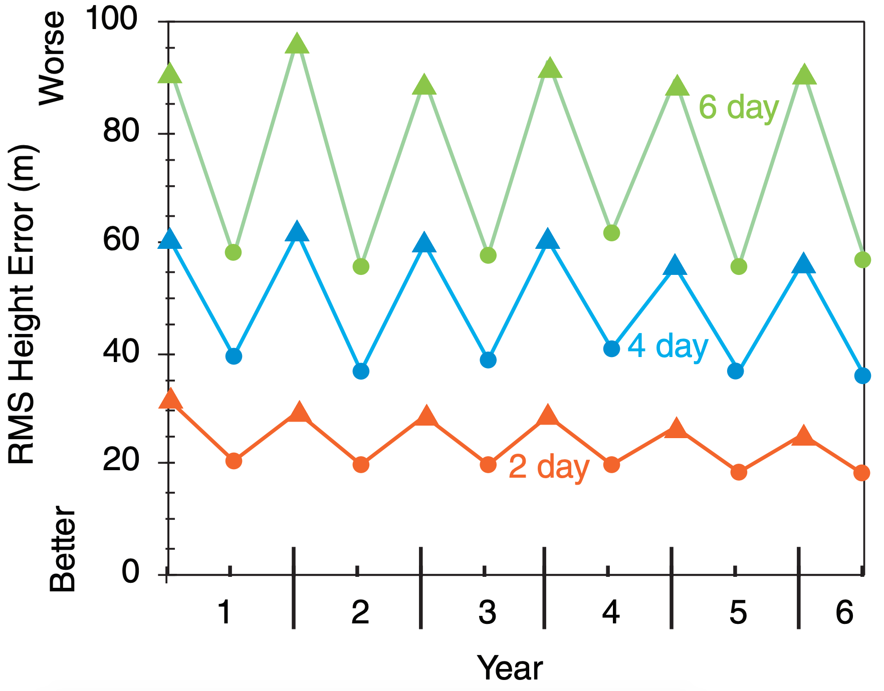
RMSE increases with forecast duration (i.e., lead time, or forecast range). It is also greater in winter than summer, because summer usually has more quiescent weather. Fig. 20.21 shows the maximum (winter) and minimum (summer) RMS errors of the 50 kPa heights in the Northern Hemisphere, for hypothetical forecasts.
Also, RMSE is very sensitive to the subset of data points with large errors, because the errors are squared in this equation before they are summed. This is one reason why you might prefer to use MAE instead of RMSE.
20.7.1.4. Correlation Coefficient
To discover how well the forecast and verification vary together (e.g., hotter than average on the same days, colder than average on the same days), you can use the Pearson product-moment correlation coefficient, r:
\begin{align}r=\frac{\overline{F^{\prime} V^{\prime}}}{\sqrt{(\overline{F^{\prime})^{2}}} \cdot \sqrt{(\overline{V^{\prime})^{2}}}}\tag{20.31}\end{align}
where
\begin{align}F^{\prime}=F-\bar{F} \quad \text { and } \quad V^{\prime}=V-\bar{V}\tag{20.32}\end{align}
The correlation coefficient is in the range –1 ≤ r ≤ 1. It varies from +1 when the forecast varies perfectly with the verification (e.g., forecast hot when verification hot), to –1 for perfect opposite variation (e.g., forecast hot when verification cold), and is zero for no common variation.
20.7.1.5. Anomaly Correlation
Anomaly correlations indicate whether the forecast anomaly (F–C) or whether persistence anomaly (A–C) is correlated with the verifying anomaly (V–C). For example, if the forecast is for warmer-than-climatological-normal temperatures and the verification confirms that warmer-than-normal temperatures were observed, then there is a positive correlation between the forecast and the weather. At other grid points where the forecast is poor, there might be a negative correlation. When averaged over all grid points, one hopes that there are more positive than negative correlations, giving a net positive correlation.
By dividing the average correlations by the standard deviations of forecast and verification anomalies, the result is normalized into an anomaly correlation coefficient. This coefficient varies between 1 for a perfect forecast, to 0 for an awful forecast. (For a very bad forecast the correlation can reach a minimum of –1, which indicates that the forecast is opposite to the weather. Namely, the model forecasts warmer-than-average weather when colder-than-average actually occurs, and vice-versa.)
Sample Application (§)
Given the following synthetic analysis (A), NWP forecast (F), verification (V), and climate (C) fields of 50-kPa height (km). Each field represents a weather map (North at top, East at right).
| Analysis: | 5.3 | 5.3 | 5.3 | 5.4 |
| 5.4 | 5.3 | 5.4 | 5.5 | |
| 5.5 | 5.4 | 5.5 | 5.6 | |
| 5.6 | 5.5 | 5.6 | 5.7 | |
| 5.7 | 5.6 | 5.7 | 5.7 | |
| Forecast: | 5.5 | 5.2 | 5.2 | 5.3 |
| 5.6 | 5.4 | 5.3 | 5.4 | |
| 5.6 | 5.5 | 5.4 | 5.5 | |
| 5.7 | 5.6 | 5.5 | 5.6 | |
| 5.7 | 5.7 | 5.6 | 5.6 | |
| Verification: | 5.4 | 5.3 | 5.3 | 5.3 |
| 5.5 | 5.4 | 5.3 | 5.4 | |
| 5.5 | 5.5 | 5.4 | 5.5 | |
| 5.6 | 5.6 | 5.5 | 5.6 | |
| 5.6 | 5.7 | 5.6 | 5.7 | |
| Climate: | 5.4 | 5.4 | 5.4 | 5.4 |
| 5.4 | 5.4 | 5.4 | 5.4 | |
| 5.5 | 5.5 | 5.5 | 5.5 | |
| 5.6 | 5.6 | 5.6 | 5.6 | |
| 5.7 | 5.7 | 5.7 | 5.7 |
Find the mean error of the forecast and of persistence. Find the forecast MAE and MSE. Find MSEC and MSESS. Find the correlation coefficient between the forecast and verification. Find the RMS errors and the anomaly correlations for the forecast and persistence.
Find the Answer
Use eq. (20.25): MEforecast = 0.01 km = 10 m
Use eq. (20.26): MEpersistence = 15 m
Use eq. (20.27): MAE = 40 m
Use eq. (20.28): MSEforecast = 0.004 km2 = 4000 m2
Use eq. (20.28): MSEC = 0.0044 km2 = 4500 m2
Use eq. (20.29): MSESS = 1 – (4000/4500) = 0.11
Use eq. (20.30): RMSEforecast = 63 m
Use eq. (20.30): RMSEpersistence = 87 m
Use eq. (20.31): r = 0.92 (dimensionless)
Use eq. (20.33): forecast anomaly correlation = 81.3%
Use eq. (20.34): persist. anomaly correlation = 7.7%
Check: Units OK. Physics OK.
Exposition: Analyze (i.e., draw height contour maps for) the analysis, forecast, verification, and climate fields. The analysis shows a Rossby wave with ridge and trough, and the verification shows this wave moving east. The forecast amplifies the wave too much. The climate field just shows the average of higher heights to the south and lower heights to the north, with all transient Rossby waves averaged out.

The definitions of these coefficients are:
\begin{align}\frac{\overline{[(F-C)-\overline{(F-C)}]\cdot[(V-C)-\overline{(V-C)}]}}{\sqrt{\overline{[(F-C)-\overline{(F-C)}]^2} \cdot \overline{[(V-C)-\overline{(V-C)}]^2}}}\tag{20.33}\end{align}
anomaly correlation coef. for persistence =
\begin{align}\frac{\overline{[(A-C)-\overline{(A-C)}] \cdot[(V-C)-\overline{(V-C)}]}}{\sqrt{\overline{[(A-C)-\overline{(A-C)}]^{2}} \cdot\overline{[(V-C)-\overline{(V-C)}]^{2}}}}\tag{20.34}\end{align}
Fig. 20.22 compares hypothetical persistence and NWP-forecast anomaly correlations for 50-kPa geopotential height. One measure of forecast skill is the vertical separation between the forecast and persistence curves in Fig. 20.22.
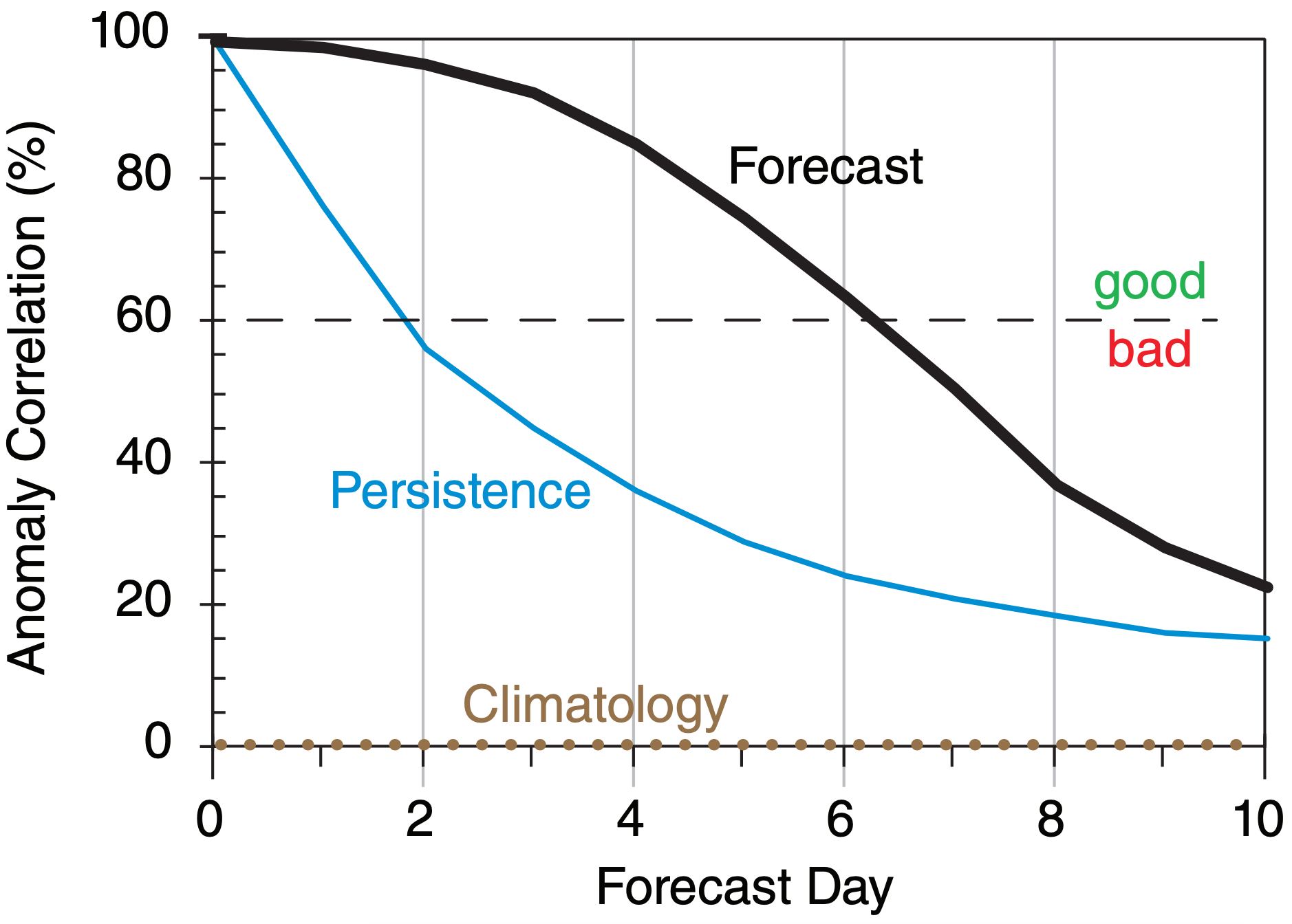
This figure shows that the forecast beats persistence over the full 10 days of forecast. Also, using 60% anomaly correlation as an arbitrary measure of quality, we see that a “good” persistence forecast extends out to only about 2 days, while a “good” NWP forecast is obtained out to about 6 days, for this hypothetical case for 50 kPa geopotential heights. For other weather elements such as precipitation or surface temperature, both solid curves decrease more rapidly toward climatology.
20.7.2. Binary / Categorical Events
A binary event is a yes/no event, such as snow or no snow. Continuous variables can be converted into binary variables by using a threshold. For example, is the temperature below freezing (0°C) or not? Does precipitation exceed 25 mm or not?
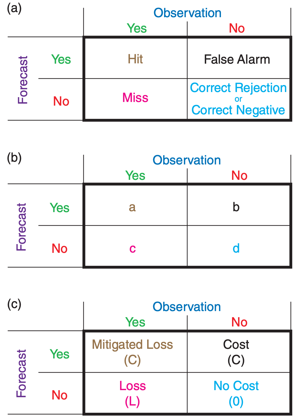
A contingency table (Fig. 20.23a) has cells for each possible combination of binary forecast and observation outcomes. “Hit” means the event was successfully forecast. “Miss” means it occurred but was not forecast. “False Alarm” means it was forecast but did not happen. “Correct Rejection” means that the event was correctly forecast to not occur.
After making a series of categorical forecasts, the forecast outcomes can be counted into each cell of a contingency table. Let a, b, c, d represent the counts of all occurrences as shown in Fig. 20.23b. The total number of forecasts is n:
\begin{align}n=a+b+c+d\tag{20.35}\end{align}
The bias score B indicates over- or under-prediction of the frequency of event occurrence:
\begin{align}B=\frac{a+b}{a+c}\tag{20.36}\end{align}
The portion correct PC (also known as portion of forecasts correct PFC) is
\begin{align}P C=\frac{a+d}{n}\tag{20.37}\end{align}
But perhaps a subset of PC could have been due to random-chance (dumb luck) forecasts. Let E be this “random luck” part of PC, assuming that your ratio of “YES” to “NO” forecasts hasn’t changed for this part:
\begin{align}E=\left(\frac{a+b}{n}\right) \cdot\left(\frac{a+c}{n}\right)+\left(\frac{d+b}{n}\right) \cdot\left(\frac{d+c}{n}\right)\tag{20.38}\end{align}
We can now define the portion of correct forecasts that was actually skillful (i.e., not random chance), which is known as the Heidke skill score (HSS):
\begin{align}H S S=\frac{P C-E}{1-E}\tag{20.39}\end{align}
The hit rate H is the portion of actual occurrences (obs. = “YES”) that were successfully forecast:
\begin{align}H=\frac{a}{a+c}\tag{20.40}\end{align}
It is also known as the probability of detection POD.
The false-alarm rate F is the portion of nonoccurrences (observation = “NO”) that were incorrectly forecast:
\begin{align}F=\frac{b}{b+d}\tag{20.41}\end{align}
Don’t confuse this with the false-alarm ratio FAR, which is the portion of “YES” forecasts that were wrong:
\begin{align}F A R=\frac{b}{a+b}\tag{20.42}\end{align}
A true skill score TSS (also known as Peirce’s skill score PSS, and as Hansen and Kuipers’ score) can be defined as
\begin{align}T S S=H-F\tag{20.43}\end{align}
which is a measure of how well you can discriminate between an event and a non-event, or a measure of how well you can detect an event.
A critical success index CSI (also known as a threat score TS) is:
\begin{align}C S I=\frac{a}{a+b+c}\tag{20.44}\end{align}
which is the portion of hits given that the event was forecast, or observed, or both. This is often used as a forecast-quality measure for rare events.
Suppose we consider the portion of hits that might have occurred by random chance ar:
\begin{align}a_{r}=\frac{(a+b) \cdot(a+c)}{n}\tag{20.45}\end{align}
Then we can subtract this from the actual hit count to modify CSI into an equitable threat score ETS, also known as Gilbert’s skill score GSS:
\begin{align}G S S=\frac{a-a_{r}}{a-a_{r}+b+c}\tag{20.46}\end{align}
which is also useful for rare events.
For perfect forecasts (where b = c = 0), the values of these scores are: B = 1, PC = 1, HSS = 1, H = 1, F = 0, FAR = 0, TSS = 1, CSI = 1, GSS = 1.
For totally wrong forecasts (where a = d = 0): B = 0 to ∞, PC = 0, HSS = negative, H = 0, F = 1, FAR = 1, TSS = –1, CSI = 0, GSS = negative.
Sample Application
Given the following contingency table, calculate all the binary verification statistics.
| Observation | |||
| Yes | No | ||
| Forecast | Yes: | 90 | 50 |
| No | 75 | 150 | |
Find the Answer
Given: a = 90 , b = 50 , c = 75 , d = 150
Find: B, PC, HSS, H, F, FAR, TSS, CSI, GSS
First, use eq. (20.35): n = 90 + 50 + 75 + 150 = 365
So apparently we have daily observations for a year.
Use eq. (20.36): B = (90 + 50) / (90 + 75) = 0.85
Use eq. (20.37): PC = (90 + 150) / 365 = 0.66
Use eq. (20.38):
E = [(90+50)·(90+75) + (150+50)·(150+75)]/(3652)
E = 68100 / 133225 = 0.51
Use eq. (20.39): HSS = (0.66 – 0.51) / (1 – 0.51) = 0.31
Use eq. (20.40): H = 90 / (90 + 75) = 0.55
Use eq. (20.41): F = 50 / (50 + 150) = 0.25
Use eq. (20.42): FAR = 50 / (90 + 50) = 0.36
Use eq. (20.43): TSS = 0.55 – 0.25 = 0.30
Use eq. (20.44): CSI = 90 / (90 + 50 + 75) = 0.42
Use eq. (20.45): ar = [ (90+50)·(90+75)]/365 = 63.3
Use eq. (20.46): GSS = (90–63.3) / (90–63.3+50+75) = 0.18
Check: Values reasonable. Most are dimensionless.
Exposition: No verification statistic can tell you whether the forecast was “good enough”. That is a subjective decision to be made by the end user. One way to evaluate “good enough” is via a cost/loss model (see next section).
20.7.3. Probabilistic Forecasts
20.7.3.1. Brier Skill Score
For calibrated probability forecasts, a Brier skill score (BSS) can be defined relative to climatology as
\begin{align}B S S=1-\frac{\sum_{k=1}^{N}\left(p_{k}-o_{k}\right)^{2}}{\left(\sum_{k=1}^{N} o_{k}\right) \cdot\left(N-\sum_{k=1}^{N} o_{k}\right)}\tag{20.47}\end{align}
where pk is the forecast probability (0 ≤ pk ≤ 1) that the threshold will be exceeded (e.g., the probability that the precipitation will exceed a precipitation threshold) for any one forecast k, and N is the number of forecasts. The verifying observation ok = 1 if the observation exceeded the threshold, and is set to zero otherwise.
BSS = 0 for a forecast no better than climatology. BSS = 1 for a perfect deterministic forecast (i.e., the forecast is pk = 1 every time the event happens, and pk = 0 every time it does not). For probabilistic forecasts, 0 ≤ BSS ≤ 1. Larger BSS values are better.
20.7.3.2. Reliability, Sharpness, Calibration
How reliable are the probability forecasts? Namely, when we forecast an event with a certain probability, is it observed with the same relative frequency? To determine this, after you make each forecast, sort it into a forecast probability bin (j) of probability width ∆p, and keep a tally of the number of forecasts (nj ) that fell in this bin, and count how many of the forecasts verified (noj, for which the corresponding observation satisfied the threshold).
For example, if you use bins of size ∆p = 0.1, then create a table such as:
| bin index | bin center | fcst. prob. range | nj | noj |
| j = 0 | pj = 0 | 0 ≤ pk < 0.05 | n0 | no0 |
| j = 1 | pj = 0.1 | 0.05 ≤ pk < 0.15 | n1 | no1 |
| j = 2 | pj = 0.2 | 0.15 ≤ pk < 0.25 | n2 | no2 |
| etc. | . . . | . . . | . . . | . . . |
| j = 9 | pj = 0.9 | 0.85 ≤ pk < 0.95 | n9 | no9 |
| j = 10 = J | pj = 1.0 | 0.95 ≤ pk ≤ 1.0 | n10 | no10 |
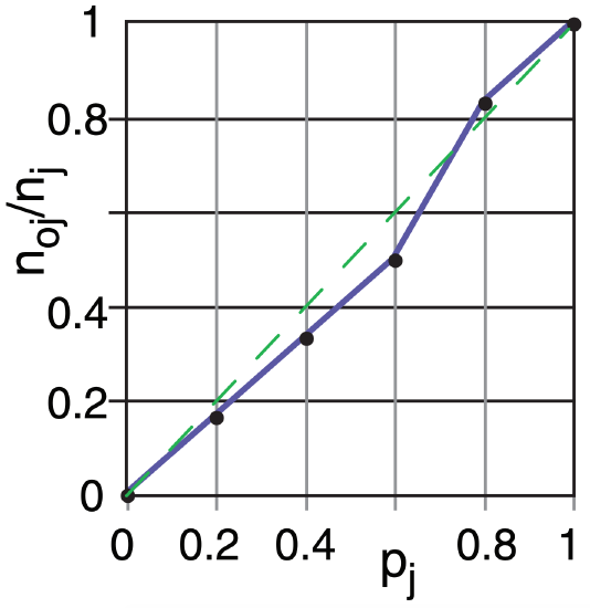
A plot of the observed relative frequency (noj/nj) on the ordinate vs. the corresponding forecast probability bin center (pj) on the abscissa is called a reliability diagram. For perfect reliability, all the points should be on the 45° diagonal line.
A Brier skill score for relative reliability (BSSreliability) is:
\begin{align}B S S_{\text {reliability}}=\frac{\sum_{j=0}^{J}\left[\left(n_{j} \cdot p_{j}\right)-n_{o j}\right]^{2}}{\left(\sum_{k=1}^{N} o_{k}\right) \cdot\left(N-\sum_{k=1}^{N} o_{k}\right)}\tag{20.48}\end{align}
where BSSreliability = 0 for a perfect forecast.
A forecast is sharp if it deviates from climatology; namely, if it “sticks its neck out.” A probabilistic forecast is calibrated if it is both reliable and sharp.
Sample Application (§)
Given the table below of k = 1 to 31 forecasts of the probability pk that the temperature will be below threshold 20°C, and the verification ok = 1 if indeed the observed temperature was below the threshold.
(a) Find the Brier skill score.
(b) For probability bins of width ∆p = 0.2, plot a reliability diagram, and find the reliability Brier skill score.
| k | pk | ok | BN | j | k | pk | ok | BN | j |
| 1 | 0.43 | 0 | 0.18 | 2 | 16 | 0.89 | 1 | 0.01 | 4 |
| 2 | 0.98 | 1 | 0.00 | 5 | 17 | 0.13 | 0 | 0.02 | 1 |
| 3 | 0.53 | 1 | 0.22 | 3 | 18 | 0.92 | 1 | 0.01 | 5 |
| 4 | 0.33 | 1 | 0.45 | 2 | 19 | 0.86 | 1 | 0.02 | 4 |
| 5 | 0.50 | 0 | 0.25 | 3 | 20 | 0.90 | 1 | 0.01 | 5 |
| 6 | 0.03 | 0 | 0.00 | 0 | 21 | 0.83 | 0 | 0.69 | 4 |
| 7 | 0.79 | 1 | 0.04 | 4 | 22 | 0.00 | 0 | 0.00 | 0 |
| 8 | 0.23 | 0 | 0.05 | 1 | 23 | 1.00 | 1 | 0.00 | 5 |
| 9 | 0.20 | 1 | 0.64 | 1 | 24 | 0.69 | 0 | 0.48 | 3 |
| 10 | 0.59 | 1 | 0.17 | 3 | 25 | 0.36 | 0 | 0.13 | 2 |
| 11 | 0.26 | 0 | 0.07 | 1 | 26 | 0.56 | 1 | 0.19 | 3 |
| 12 | 0.76 | 1 | 0.06 | 4 | 27 | 0.46 | 0 | 0.21 | 2 |
| 13 | 0.17 | 0 | 0.03 | 1 | 28 | 0.63 | 0 | 0.40 | 3 |
| 14 | 0.30 | 0 | 0.09 | 2 | 29 | 0.10 | 0 | 0.01 | 1 |
| 15 | 0.96 | 1 | 0.00 | 5 | 30 | 0.40 | 1 | 0.36 | 2 |
| 31 | 0.73 | 1 | 0.07 | 4 |
Find the Answer
Given: The white portion of the table above.
Find: BSS = ? , BSSreliability = ?, and plot reliability.
(a) Use eq. (20.47). The grey-shaded column labeled BN shows each contribution to the numerator (pk – ok)2 in that eq. The sum of BN = 4.86. The sum of ok = 16.
Thus, the eq is: BSS = 1 – [4.86 / {16 ·(31–16)} ] = 0.98
(b) There are J = 6 bins, with bin centers at pj = 0, 0.2, 0.4, 0.6, 0.8, and 1.0. (Note, the first and last bins are one-sided, half-width relative to the nominal “center” value.) I sorted the forecasts into bins using j = round(pk/∆p, 0), giving the grey j columns above.
For each j bin, I counted the number of forecasts nj falling in that bin, and I counted the portion of those forecasts that verified noj. See table below:
| j | pj | nj | noj | noj/nj | num |
|
0 1 2 3 4 5 |
0 0.2 0.4 0.6 0.8 1.0 |
2 6 6 6 6 5 |
0 1 2 3 5 5 |
0 0.17 0.33 0.50 0.83 1 |
0 0.04 0.16 0.36 0.04 0 |
The observed relative frequency noj/nj plotted against pj is the reliability diagram:
Use eq. (20.48). The contribution to the numerator from each bin is in the num column above, which sums to 0.6 . Thus: BSSreliability = 0.6/ {16 ·(31–16)} = 0.0025
Check: Small BSSreliability agrees with the reliability diagram where the curve nearly follows the diagonal.
Exposition: N = 31 is small, so these statistics are not very robust. Large BSS suggests good probability forecasts. Also, the forecasts are very reliable.
20.7.3.3. ROC Diagram
A Relative Operating Characteristic (ROC) diagram shows how well a probabilistic forecast can discriminate between an event and a non-event. For example, an event could be heavy rain that causes flooding, or cold temperatures that cause crops to freeze. The probabilistic forecast could come from an ensemble forecast, as illustrated next.
Suppose that the individual NWP models of an N = 10 member ensemble make 1-day-ahead forecasts of 24-h accumulated precipitation (R) every day for a month. On Day 1, the ensemble forecasts were:
| NWP model | R (mm) | NWP model | R (mm) |
| Model 1 | 8 | Model 6 | 4 |
| Model 2 | 10 | Model 7 | 20 |
| Model 3 | 6 | Model 8 | 9 |
| Model 4 | 12 | Model 9 | 5 |
| Model 5 | 11 | Model 10 | 7 |
Consider a precipitation threshold of 10 mm. The ensemble above has 4 models that forecast 10 mm or more, hence the forecast probability is p1 = 4/N = 4/10 = 40%. Supposed that 10 mm or more of precipitation was indeed observed, so the observation flag is set to one: o1 = 1.
On Day 2 of the month, three of the 10 models forecast 10 mm or more of precipitation, hence the forecast probability is p2 = 3/10 = 30%. On this day precipitation did NOT exceed 10 mm, so the observation flag is set to zero: o2 = 0. Similarly for Day 3 of the month, suppose the forecast probability is p3 = 10%, but heavy rain was observed, so o3 = 1. After making ensemble forecasts every day for a month, suppose the results are as listed in the left three columns of Table 20-4.
An end user might need to use these forecasts make a decision to take action. Based on various economic or political reasons, the user decides to use a probability threshold of pthreshold = 40%; namely, if the ensemble model forecasts a 40% or greater chance of daily rain exceeding 10 mm, then the user will take action. So we can set forecast flag f = 1 for each day that the ensemble predicted 40% or more probability, and f = 0 for the other days. These forecast flags are shown in Table 20-4 under the pthreshold = 40% column.
Other users might have other decision thresholds, so we can find the forecast flags for all the other probability thresholds, as given in Table 20-4. For an N member ensemble, there are only (100/N) + 1 discrete probabilities that are possible. For our example with N = 10 members, we can consider only 11 different probability thresholds: 0% (when no members exceed the rain threshold), 10% (when 1 out of the 10 members exceeds the threshold), 20% (when 2 ensemble members exceed the threshold), and so on out to 100%.
For each probability threshold, create a 2x2 contingency table with the elements a, b, c, and d as shown in Fig. 20.23b. For example, for any pair of observation and forecast flags (oj , fj ) for Day j, use
| a = count of days with hits | (oj , fj ) = (1, 1). |
| b = count of days with false alarms | (oj , fj ) = (0, 1). |
| c = count of days with misses | (oj , fj ) = (1, 0). |
| d = count of days: correct rejection | (oj , fj ) = (0, 0). |
For our illustrative case, these contingency-table elements are shown near the bottom of Table 20-4.
Next, for each probability threshold, calculate the hit rate H = a/(a+c) and false alarm rate F = b/ (b+d), as defined earlier in this chapter. These are shown in the last two rows of Table 20-4 for our example. When each (F, H) pair is plotted as a point on a graph, the result is called a ROC diagram (Fig. 20.24).
| Table 20-4. Sample calculations for a ROC diagram. Forecast flags f are shown under the probability thresholds. | ||||||||||||
| Day | p (%) | Probability Threshold pthreshold (%) | ||||||||||
|---|---|---|---|---|---|---|---|---|---|---|---|---|
| 0 | 10 | 20 | 30 | 40 | 50 | 60 | 70 | 80 | 90 | 100 | ||
| 1 | 40 | 1 | 1 | 1 | 1 | 1 | 0 | 0 | 0 | 0 | 0 | 0 |
| 2 | 30 | 1 | 1 | 1 | 1 | 0 | 0 | 0 | 0 | 0 | 0 | 0 |
| 3 | 10 | 1 | 1 | 0 | 0 | 0 | 0 | 0 | 0 | 0 | 0 | 0 |
| 4 | 50 | 1 | 1 | 1 | 1 | 1 | 1 | 0 | 0 | 0 | 0 | 0 |
| 5 | 60 | 1 | 1 | 1 | 1 | 1 | 1 | 1 | 0 | 0 | 0 | 0 |
| 6 | 30 | 1 | 1 | 1 | 1 | 0 | 0 | 0 | 0 | 0 | 0 | 0 |
| 7 | 40 | 1 | 1 | 1 | 1 | 1 | 0 | 0 | 0 | 0 | 0 | 0 |
| 8 | 80 | 1 | 1 | 1 | 1 | 1 | 1 | 1 | 1 | 1 | 0 | 0 |
| 9 | 50 | 1 | 1 | 1 | 1 | 1 | 1 | 0 | 0 | 0 | 0 | 0 |
| 10 | 20 | 1 | 1 | 1 | 0 | 0 | 0 | 0 | 0 | 0 | 0 | 0 |
| 11 | 90 | 1 | 1 | 1 | 1 | 1 | 1 | 1 | 1 | 1 | 1 | 0 |
| 12 | 20 | 1 | 1 | 1 | 0 | 0 | 0 | 0 | 0 | 0 | 0 | 0 |
| 13 | 10 | 1 | 1 | 0 | 0 | 0 | 0 | 0 | 0 | 0 | 0 | 0 |
| 14 | 10 | 1 | 1 | 0 | 0 | 0 | 0 | 0 | 0 | 0 | 0 | 0 |
| 15 | 70 | 1 | 1 | 1 | 1 | 1 | 1 | 1 | 1 | 0 | 0 | 0 |
| 16 | 70 | 1 | 1 | 1 | 1 | 1 | 1 | 1 | 1 | 0 | 0 | 0 |
| 17 | 60 | 1 | 1 | 1 | 1 | 1 | 1 | 1 | 0 | 0 | 0 | 0 |
| 18 | 90 | 1 | 1 | 1 | 1 | 1 | 1 | 1 | 1 | 1 | 1 | 0 |
| 19 | 80 | 1 | 1 | 1 | 1 | 1 | 1 | 1 | 1 | 1 | 0 | 0 |
| 20 | 80 | 1 | 1 | 1 | 1 | 1 | 1 | 1 | 1 | 1 | 0 | 0 |
| 21 | 20 | 1 | 1 | 1 | 0 | 0 | 0 | 0 | 0 | 0 | 0 | 0 |
| 22 | 10 | 1 | 1 | 0 | 0 | 0 | 0 | 0 | 0 | 0 | 0 | 0 |
| 23 | 0 | 1 | 0 | 0 | 0 | 0 | 0 | 0 | 0 | 0 | 0 | 0 |
| 24 | 0 | 1 | 0 | 0 | 0 | 0 | 0 | 0 | 0 | 0 | 0 | 0 |
| 25 | 70 | 1 | 1 | 1 | 1 | 1 | 1 | 1 | 1 | 0 | 0 | 0 |
| 26 | 10 | 1 | 1 | 0 | 0 | 0 | 0 | 0 | 0 | 0 | 0 | 0 |
| 27 | 0 | 1 | 0 | 0 | 0 | 0 | 0 | 0 | 0 | 0 | 0 | 0 |
| 28 | 90 | 1 | 1 | 1 | 1 | 1 | 1 | 1 | 1 | 1 | 1 | 0 |
| 29 | 20 | 1 | 1 | 1 | 0 | 0 | 0 | 0 | 0 | 0 | 0 | 0 |
| 30 | 80 | 1 | 1 | 1 | 1 | 1 | 1 | 1 | 1 | 1 | 0 | 0 |
| Contingency Table Values | a = | 13 | 13 | 12 | 11 | 11 | 10 | 9 | 8 | 6 | 3 | 0 |
| b = | 17 | 14 | 10 | 7 | 5 | 4 | 3 | 2 | 1 | 0 | 0 | |
| c = | 0 | 0 | 1 | 2 | 2 | 3 | 4 | 5 | 7 | 10 | 13 | |
| d = | 0 | 3 | 7 | 10 | 12 | 13 | 14 | 15 | 16 | 17 | 17 | |
| Hit Rate: H = a/(a+c) = | 1.00 | 1.00 | 0.92 | 0.85 | 0.85 | 0.77 | 0.69 | 0.62 | 0.46 | 0.23 | 0.00 | |
| False Alarm Rate: F=b/(b+d) | 1.00 | 0.82 | 0.59 | 0.41 | 0.29 | 0.26 | 0.18 | 0.12 | 0.06 | 0.00 | 0.00 | |
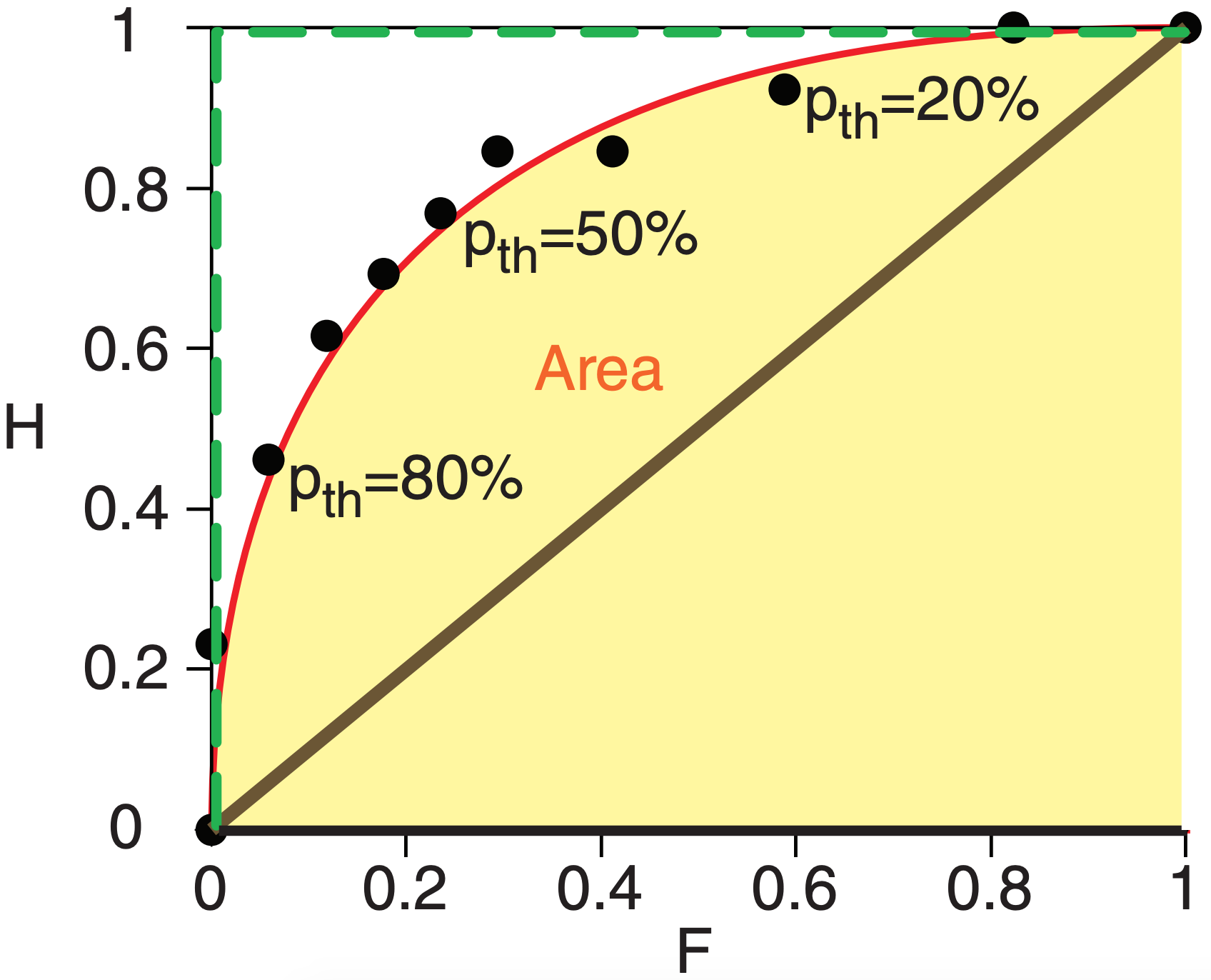
The area A under a ROC curve (shaded in Fig. 20.24) is a measure of the overall ability of the probability forecast to discriminate between events and non-events. Larger area is better. The green dashed curve in Fig. 20.24 illustrates perfect discrimination, for which A = 1. A random probability forecast with no ability to discriminate between events has a curve following the thick diagonal line, for which A = 0.5. Since this latter case represents no skill, a ROC skill score SSROC can be defined as
\begin{align}S S_{R O C}=(2 \cdot A)-1\tag{20.49}\end{align}
where SSROC = 1 for perfect skill, and SSROC = 0 for no discrimination skill.
Although a smooth curve is usually fit through the data points in a ROC diagram, we can nonetheless get a quick estimate of the area by summing the trapezoidal areas under each pair of data points. For our illustration, A ≈ 0.84, giving SSROC ≈ 0.68 .
20.7.3.4. Usage of Probability Scores
For many users, the Brier Skill Score gives an overly pessimistic measure of the value of the probabilistic forecast. Conversely, the ROC Skill Scores gives an overly optimistic measure.
The ROC diagram is somewhat sensitive to ensemble size (i.e., number of ensemble members). The Brier Skill Score is relatively insensitive to ensemble size. This diversity is one reason that users prefer to look at a variety of skill measures before making a decision. An additional tool utilizing probabilistic forecasts is the cost/loss model.
20.7.4. Cost / Loss Decision Models
Weather forecasts are often used to make decisions. For example, a frost event might cause L dollars of economic loss to a citrus crop in Florida. However, you could save the crop by deploying orchard fans and smudge pots, at a cost of C dollars.
Another example: A hurricane or typhoon might sink a ship, causing L dollars of economic loss. However, you could save the ship by going around the storm, but the longer route would cost C dollars in extra fuel and late-arrival fees.
No forecast is perfect. Suppose the event is forecast to happen. If you decide to spend C to mitigate the loss by taking protective action, but the forecast was bad and the event did not happen, then you wasted C dollars. Alternately, suppose the event is NOT forecast to happen, so you decide NOT to take protective action. But the forecast was bad and the event actually happened, causing you to lose L dollars. How do you decide which action to take, in consideration of this forecast uncertainty?
Suppose you did NOT have access to forecasts of future weather, but did have access to climatological records of past weather. Let o be the climatological (base-rate) frequency (0 ≤ o ≤ 1) with which the event occurred in the past, where o = 0 means it never happened, and o = 1 means it always happened.
Assume this event will continue to occur with the same base-rate frequency in the future. If C ≤ o·L for your case, then it would be most economical to always mitigate, at cost C. Otherwise, it would be cheaper to never mitigate, causing average losses of o·L. The net result is that the expense based only on climate data is
\begin{align}E_{\text {climate}}=\min (C, o \cdot L)\tag{20.50}\end{align}
But you can possibly save money if you use weather forecasts instead of climatology. The expected (i.e., average) expense associated with a sometimes incorrect deterministic forecast Eforecast is the sum of the cost of each contingency in Fig. 20.23c times the relative frequency that it occurs in Fig. 20.23b:
\begin{align}E_{\text {forecast}}=\frac{a}{n} C+\frac{b}{n} C+\frac{c}{n} L\tag{20.51}\end{align}
This assumes that you take protective action (i.e., try to mitigate the loss) every time the event is forecast to happen. For some of the individual events the forecast might be bad, causing you to respond inappropriately (in hindsight). But in the long run (over many events) your taking action every time the event is forecast will result in a minimum overall expense to you.
If forecasts were perfect, then you would never have any losses because they would all be mitigated, and your costs would be minimal because you take protective action only when needed. On average you would need to mitigate at the climatological frequency o, so the expenses expected with perfect forecasts are
\begin{align}E_{\text {perfect}}=o \cdot C\tag{20.52}\end{align}
Combine these expenses to find the economic value V of deterministic forecasts relative to climatology:
\begin{align}V=\frac{E_{\text {climate}}-E_{\text {forecast}}}{E_{\text {climate}}-E_{\text {perfect}}}\tag{20.53}\end{align}
V is an economic skill score, where V = 1 for a perfect forecast, and V = 0 if the forecasts are no better than using climatology. V can be negative if the forecasts are worse than climatology, for which case your best course of action is to ignore the forecasts and choose a response based on the climatological data, as previously described.
Sample Application
Given forecasts having the contingency table from the Sample Application 4 pages ago. Protective cost is $75k to avoid a loss of $200k. Climatological frequency of the event is 40%. Find the value of the forecast.
Find the Answer
Given: a=90, b=50, c=75, d=150, C=$75k, L=$200k, o=0.4
Find: Eclim = $?, Efcst = $?, Eperf = $?, V = ?
Use eq. (20.50): Eclim = min( $75k, 0.4·$200k) = $75k.
Use eq. (20.35): n = 90+50+75+150 = 365.
Use eq. (20.51): Efcst =(90+50)·$75k/365 + (75/365)·$200k = $70k
Use eq. (20.52): Eperf = 0.4 · $75k = $30k.
Use eq. (20.53): V = ($75k – $70k)/($75k – $30k) = 0.11
Check: Units are OK. Values are consistent.
Exposition: The forecast is slightly more valuable than climatology.
\begin{align}r_{C L}=\$ 75 \mathrm{k} / \$ 200 \mathrm{k}=\underline{\bf{0.375}} \text { from eq. }\tag{20.54}\end{align}
If you are lucky enough to receive probabilistic forecasts, then based on eq. (20.56) you should take protective action when p > 0.375 .
Define a cost/loss ratio rCL as
\begin{align}r_{C L}=C / L\tag{20.54}\end{align}
Different people and different industries have different protective costs and unmitigated losses. So you should estimate your own cost/loss ratio for your own situation.
The economic-value equation can be rewritten using hit rate H, false-alarm rate F, and the cost/loss ratio rCL:
\begin{align}V=\frac{\min \left(r_{C L}, o\right)-\left[F \cdot r_{C L} \cdot(1-o)\right]+\left[H \cdot\left(1-r_{C L}\right) \cdot o\right]-o}{\min \left(r_{C L}, o\right)-o \cdot r_{C L}}\tag{20.55}\end{align}
You can save even more money by using probabilistic forecasts. If the probabilistic forecasts are perfectly calibrated (i.e., are reliable and sharp), then you should take protective action whenever the forecast probability p of the event exceeds your cost/loss ratio:
\begin{align}p>r_{C L}\tag{20.56}\end{align}
The forecast probability of the event is the portion of cumulative probability that is beyond the event-threshold condition. For the frost example, it is the portion of the cumulative distribution of Fig. 20.20 above Mthreshold = 80 km h–1 on Day 4.